Web forms are a crucial communication channel between your organization and your audience - so making sure they deliver a first-class User Experience (UX) is imperative.
Turning a one-way flow of information into a two-way dialogue with your users, web forms can play a key role in facilitating the completion of tasks that are more often than not inextricably tied to the success of your organization. This may be an online purchase for those in the e-commerce sector, an application for membership of a particular institution or service, or a request for information for those operating in B2B industries.
Download Premium Resource – Improving Results from your website: 7 steps guide
Use a structured review to increase leads, sales and satisfaction from your site.
Access the
However, audiences today are fickle, and many users will be unlikely to persevere with a form that’s unclear and difficult to use, no matter how much they might want what lies on the other side. It’s crucial, therefore, that you optimise these business-critical tools to ensure maximum usability, accessibility, and satisfaction.
In this article I’ll cover five key techniques that will help you do just that; helping deliver significant improvements to the user experience of your web forms, and supporting your wider Conversion Rate Optimisation (CRO) efforts as a result.
1. Reducing form length
It’s important to remember that, for every form you include on your site, your users have to:
- Read (and understand) what is required from them
- Decide on a response
- Input that response
In order to reduce this cognitive burden then, and so increase completion rates, be sure to keep your forms as short as possible while remaining coherent and useful. And if there’s any non-essential information you do wish to record (such as secondary contact details, or data that will help you provide more tailored marketing communications), consider whether this could be captured at another stage of the journey instead.
For example, moving optional fields to a confirmation or account settings page where appropriate will not only help increase conversion rates for your newly-streamlined forms, but will ensure these additional questions are asked when users are in a more positive frame of mind; delivering improvements to data quality as well as quantity.
Remember too that if some fields in your form are business-critical, but the reasons for this are unlikely to be immediately apparent, you’ll need to supplement your form with content explaining why you need this information, along with how it will be used (a technique I’ll look at in more detail later in this post).
2. Progressive disclosure
Alongside ensuring that your forms ask for only essential information, you can also use progressive disclosure to tailor the fields displayed according to the specific goals and context of your individual users, and so reduce cognitive burden even further.
For example, when a user registers to receive updates from your organization, you may wish to replace multiple fields requesting different contact details (e.g. email address, postal address, phone number) with a single “How would you like to be contacted?” question. This allows the user to select their preferred channel/s and enter the relevant information accordingly, making the form significantly less intimidating to complete.
Similarly, as logged-in users will likely have already provided you with a certain amount of information, they shouldn’t be expected to have to answer the same questions as new users. In these cases, form length can be minimised by displaying details as static text with the option to edit if needed, and fields unlikely to need updating (such as “Date of birth”) can even be removed entirely, as in the following example.
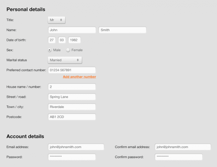
Figure 1: a traditional returning customer form
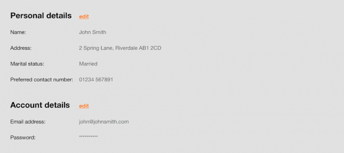
Figure 2: a progressive disclosure returning customer form with hidden fields (clicking ‘edit’ would revert to the traditional display)
3. Default selections
Setting form fields to default to known or presumed information will help increase the efficiency of your application process; a key ingredient of good usability. There are typically two types of default - Member and Smart.
Member defaults
As referenced in the previous section, if your site or app has a dedicated login area, visitors to this space will most likely have already supplied you with personal details and other key information; data that can then be used to pre-populate the fields of any additional forms these users may complete.
In addition to this, member defaults can also be applied to users that have already begun the form submission process. By allowing these individuals to save their applications, then presenting previously-entered information by default on their return, you can reduce friction and save time, helping reduce drop-off.
Smart defaults
Even if you don’t have access to explicit, verified user information, in some cases, you can include default responses in your form fields that are based on the demographics/preferences of the majority of your audience. For example, using research and web analytics you can identify information such as :
- Common locations
- Popular products
- Account preferences
Users should, of course, be able to override these default selections (as they should with Member defaults), but attempting a ‘best guess’ about what they are likely to pick based on the choices of other users can help make your forms easier to complete.
4. Supporting content
When crafting supporting content to aid users through the form submission process, it’s important to strike a balance between excessive instruction that is like to frustrate, and insufficient support which may negatively affect conversion rates.
Features such as checklists and questionnaires can prove particularly useful here, offering a clear and concise means of communicating key information as well as making the corresponding form simpler too. For example, listing the items a user will need to have to hand before they begin the process will help safeguard completion rates while asking for some personal information upfront (such as location, job title or interests) might help tailor the services and offers displayed.
Additionally, the response options you present can further help support your users through the submission process. For example, by asking people to choose from a range of options rather than input plain-text answers, you’ll reduce the potential for confusion, and also help standardize responses to deliver you a cleaner database too.
Of course, there remains information that should be included as part of best practice - so be sure to check all of your forms contain the following:
- Contact/support details in case of questions/errors
- An indication of how long the form will take to complete
- Any required security and data protection policies
- A summary of the user’s previous selections (for multi-step forms)
5. Great visual design
Good visual design is obviously an important aspect of any element of your site or app, but it’s especially crucial when it comes to web forms. By following the steps listed above you should already have a clear, concise and non-intrusive form, but there are a number of additional techniques that can make these forms more appealing still, and even inject a small amount of joy into the process.
For example, the aesthetic choices you make can have a big impact on the contrast, readability and ultimate accessibility of your forms, which should be optimised to enhance scannability and increase conversion rates.
Your labels should also be bold and clearly associated with their related fields, and while the exact format you use to achieve this will depend on a number of factors (such as your brand guidelines, the amount of horizontal space available, and the device you’re targeting) generally speaking top-aligned labels are the easiest to parse, and can be applied across both desktop and mobile devices.
The length of your input fields can also be used to set expectations in your users, making your form easier to fill in and minimising the risk of incorrect or incomplete information being submitted. A great example of this is the “Card number” field needed for many transactional forms, where the length of the input is known at the outset and so can be set up accordingly. As users then don’t have to think about this (or indeed, if there should be spaces or not between the numbers) cognitive burden is reduced, and completion time will increase as a result.
A great example of this is the “Card number” field needed for many transactional forms, where the length of the input is known at the outset and so can be set up accordingly. As users then don’t have to think about this (or indeed, if there should be spaces or not between the numbers) cognitive burden is reduced, and completion time will increase as a result.
Finally in this section, think about your forms’ Calls to Action (CTAs), which are vital in helping guide and inform the user as they work towards completion. These should always stand out so that the users don't have to search for them and clearly signal what the primary next step is, avoiding presenting too many options which may confuse the user.
In summary
When your web forms are critical to the achievement of your strategic goals, it’s vital that every element is optimised to deliver an exceptional experience that drives value for your users organization alike. Before you start to apply the techniques covered in this article, however, it’s vital that you first and foremost understand the purpose of your form, using this understanding to guide all subsequent decisions.
This understanding can (and should) also be enhanced throughout the process with real-world insight from end-users and other key stakeholders, helping you iteratively refine your designs accordingly. Conducting regular usability testing is a great way to do this, and there are a range of different approaches available to suit your specific requirements and objectives
In this way, you’ll create forms that have the needs of your users and business at their centre; supporting a lean, informative and enjoyable user journey.
Do you have any more top tips for designing effective web forms? Let me know in the comments below.
Thanks to Gavin Harris for sharing their advice and opinion in this post. Gavin is a Senior User Experience Consultant at
BoxUK, specialising in user testing, information architecture, HTML prototyping and web accessibility. For more advice on UX check out their article on the comparison of
popular usability testing methods


