How to focus your efforts to improve mobile conversion performance by using the full range of mobile user research techniques and tools
For the past few years in the digital industry every year has talked about as ‘the year of mobile’. Despite this, many digital marketeers are still focusing CRO activity on desktop and leaving mobile devices as an afterthought. Latest stats show that mobile continues to be a growth platform for people accessing websites, and that those people are getting more comfortable using their phones for buying online.
As shown on Smart Insights last year, mobile traffic overtook desktop as mobile phone use continued to rise at a staggering rate. Stats from the same report also show that desktop users are around three times more likely to convert than those visiting a site from a smartphone; showing that there’s a lot of potential for improvement for mobile conversion rates.
This case study from Google shows that ProFlowers saw a 20-30% increase in conversions after optimising their site for smaller screens, and there are many other examples of the big improvements that come from focusing on mobile.
As well as a lower conversion rate there are other mobile specific issues that should be considered. In April of last year Google released an algorithm update, dubbed ‘mobilegeddon’ by some, which affects how websites rank in search results on mobile devices. Search visibility was impacted by what Google considered to be mobile ‘usability issues’ on sites, leading to a drop in rankings for those which were difficult to use on smartphones.
This blog post will give guidance 5 techniques and relevant tools to review and improve mobile user experience and mobile conversions to ensure that your site performs better for mobile users across a range of mobile devices. At the end of the article I take a look at some common challenges of creating and testing mobile experiences.
1. Website analytics service
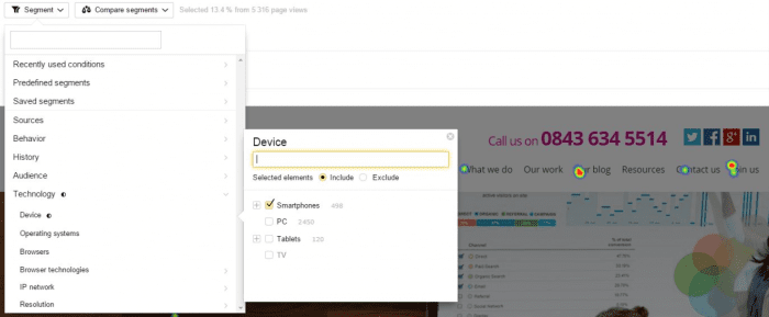
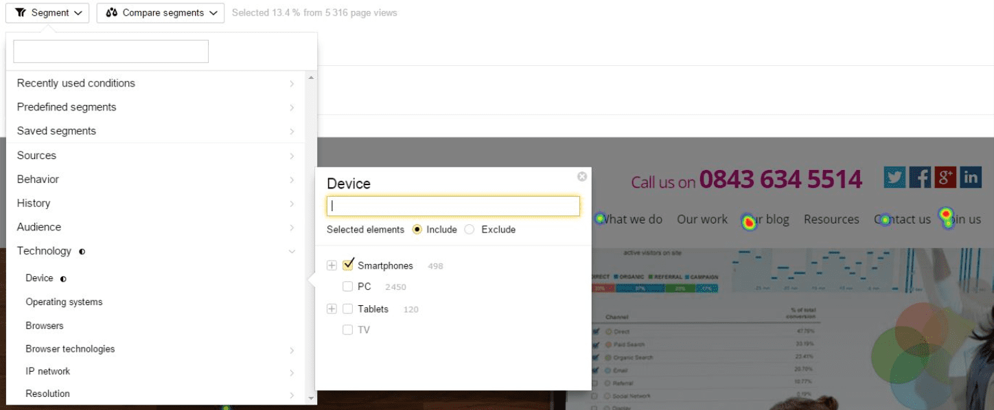
People don’t use mobile devices in the same way and for the same things as desktop or laptops, so research has to be different. An essential starting point for this research should be your analytics service. Segmenting your audience into mobile and desktop users will show you how these two audiences differ in their behaviour on your site, and will also highlight any particular problem areas.
2. Other online user research tools
Other analytics tools, such as ClickTale and Hotjar, provide not only heat maps and session playbacks, but also the tracking of mobile gestures such as tap, double-tap, zoom, pinch, scroll, swipe and tilt. Analysing these mobile specific analytics is key to delivering a good mobile experience. A user’s behaviour on mobile can be quite different to their behaviour using a desktop. Not only is the screen size likely to be different but the input (touch) is different too. The context in which people use your site may also change for mobile device types.
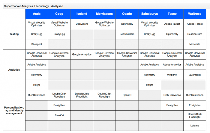
This analysis of optimisation tools used by online grocery retailers prepared in advance of eCommerce Expo shows the range of tools for reviewing and improving customer journeys across desktop and mobile. Which are you using?
3. Stakeholder interviews
Rather than just using insight from analytics it’s a good idea to conduct stakeholder interviews to get feedback from people who work with the site on a regular basis. People who are employed in the customer service team for a site will often have a good idea of the type of frustration that mobile users report to them on a regular basis.
4. Customer feedback survey tools
You can also ask for customer feedback through your site on a mobile to find mobile specific issues. Using tools like Qualaroo will help make this process simple, but be careful not to frustrate your users by continually asking for feedback. This can be harder to obtain from mobile device users, due to difficulties using mobile keyboards, but as long as you keep your questions short and simple, or ideally limit yourself to one question, then the feedback can be very valuable.
5. User testing
User testing is vital here to get a clear picture of how ‘real’ users find their way through your website. User testing often involves setting users a series of tasks to complete on a website and seeing how easy they find them. Observing people using the site in this way is insightful and often shows people using your site in a completely different way to how you imagined!
User testing on mobile devices can require more thought and planning than desktop tests. Users may be more comfortable using their own device, and also using it from their own home. At Fresh Egg we often use usertesting.com as this enables people to do both. Another option is to run in-person ‘moderated’ testing using a tool like UX Recorder.
In order to record natural interactions and get valid results it’s important here to replicate the real user experience as closely as possible, this may mean using a room with low light or encouraging users to lounge on a sofa. You may want to draw the line at encouraging people to complete the test on the toilet though!
Common mobile usability problems
Despite more focus on mobile development there are still some very common issues that occur across a range of sites.
Menus - Hamburger menus have been a regular subject for A/B testing. Despite this there are conflicting results from different studies:
Some studies show that users understand and interact with hamburger menus, others have shown that they have a negative impact on engagement. I generally recommend using the word ‘menu’ alongside a hamburger icon. This not only helps with clarity but also provides a larger target area for people to press. If you are working with a multilingual website though then this can be an issue as the word ‘menu’ can be quite long in some languages.
- Category pages – When showing categories on mobile it’s often better to use a list rather than grid view for products to avoid overcrowding the small screen. Filtering products (by type, size, colour etc.) can be an issue, as it often is on desktop sites too. User testing on mobile is useful here to ensure that your filtering options are clear and usable to your audience.
- Forms – Mobile forms can be difficult to complete due to the lack of space and also the lack of a separate keyboard. When designing mobile forms particular attention should be applied to the type of input required from the user; avoiding dropdown menus is often a good starting point. Other tips for improvement here include; minimising the number of fields, placing labels above fields, showing the correct version of the keyboard and ensuring that all form elements are ‘thumb friendly’ and big enough to select on small screens. Good form accessibility can also help boost conversions.
- Checkout – When Checkouts suffer usability problems they can often lead to a big impact on revenue. As with designing mobile forms, the elements used throughout the checkout process need to be large enough to be selected easily. It is also important that users can save their details on mobile, preventing them from having to enter them again each time they return. Using a clear tabbed (or layered divs), step-by-step process will avoid overwhelming the user with one big form that they need to fill out. The form recommendations in the section above are also all important to the checkout process.
- Payment options – Mobile users will often want to make their payment quickly and simply, without having to get their credit card out. Offering alternative payment methods such as PayPal (and PayPal Express Checkout) is a must to help streamline the payment process.
- Speed – The time it takes for a site to load on mobile is critical. Although connection speeds are increasing mobile load times still often lag behind those of desktop sites. Slow load times can frustrate users, and also have a serious impact on the likelihood of them converting. To combat slow load times you should reduce the file size of your images, enable caching and use a tool (such as Google PageSpeed Insights) to check for additional ways to speed things up.
Remember, your mobile and desktop users are the same people, cross-device tracking and content delivery is key. Detailed customer personalisation is great, but even offering a simple wish list or giving users the option to save items in their basket will often lead to good results. This is particularly useful for people who are visiting your website from different devices over time. Over 90% of people use multiple screens sequentially, and 67% of people do this to shop , use this to your advantage by making the transition between desktop and mobile as seamless as possible.
Split testing your mobile designs
One way to better understand how your designs work on mobile devices is to split test them. Most split testing tools will give you the ability to target specific types of user, such as a mobile or tablet audience. These means that you can run tests purely for these users, and monitor their impact accordingly.

If tests are run on all versions of a site then the results can still be segmented to show their impact on smartphone users. A recent Fresh Egg test ran across tablet and mobile devices to see the impact of a new mobile designed site. This saw an increase in revenue per visitor of 41% on tablet and 32% on mobile.
To ensure that your split tests are set up correctly and not causing any issues you should be sure to run thorough Quality Assurance (QA) testing before making them live. To do this you may need to use various different devices to make sure that it works on the most popular smartphones. If you have your own device lab then that’s great! If not though then you might want to find out which are the most used mobile device types (by checking your analytics) and then borrow those phones to run you QA testing. Another alternative would be to use a phone browser simulator, BrowserStack offer a good tool for this. While these are not a perfect substitute for the real thing, they will uncover most of the issues that would be found when using the site on a particular smartphone.
Summary
Mobile users should be a key focus for your CRO campaigns. With mobile and tablet usage now making up the majority of website traffic it’s more essential than ever to make sure that your site is easy to use on small and touchscreen devices.
You should start with mobile research, both quantitative and qualitative, to find out where there are opportunities to improve your site on mobile devices. Common problem areas on mobile devices that you might want to focus on include:
- navigational menus
- category pages
- forms
- the checkout process
- payment options
- site load speed
Once you’ve highlighted some areas to focus on, alternative designs can be split tested to measure their potential impact
As it’s often an overlooked area of website design, running A/B testing on mobile devices is a great way to see some positive results from your tests.

Thanks to
Luke Hay for sharing their advice and opinions in this post. Luke is the senior conversion strategist at
Fresh Egg where he works with a range of clients across different sectors. Fresh Egg are an integrated digital marketing agency who help brands optimise their online performance. You can follow Luke on
Twitter or connect on
LinkedIn.


