Avoid these mistakes to prevent costly email marketing errors
If you’ve marked 2017 as your year to grow your e-mail list, congratulations! Email marketing is a powerful tool that can help enhance your business, bring in new leads, and keep your company name on the tip of customers’ tongues. However, the reality is that it’s quite easy to make mistakes while you attempt to build a list. Those mistakes can result in lost time, customers, and money.
Blunder #1: You Don’t Give a Good Reason to Sign up
In 2017, an email address is nearly as personal as a phone number. Think about the times that you go to a store at the mall and they ask for your email address for their records. You probably cringe and envision all the spam email that will soon flood your box—and you better believe that your customers do the same thing.
One of the first steps to building an email list this year is to give your potential customers a reason to register their email account to your list. This means that you need to offer content that resonates with your audience on a deeper level than something you simply rehashed. You can offer content such as:
- A custom eBook
- Whitepaper
- Case study
- Checklist
- Printout
Kissmetrics suggests that e-mail subscription rates can boost from 6% to 60% by offering upgraded and high quality content in exchange for an email address. In this instance, think downloadable content that’s an upgrade from a standard blog post. Convert checklists, whitepapers, and other content into PDFs to help boost perceived value.
Blunder #2: Your Opt-in Form Placement is Wrong
After you’ve put a lot of time and effort into a blog, email, or other type of downloadable content, you simply put your opt-in form at the bottom of the page and call it a day. New subscriptions will surely come flooding in at any time now, right?
Not so fast. Believe it or not, opt-in form placement is both an art and a science. There are numerous places where you can add your opt-in form for maximum subscriptions, including:
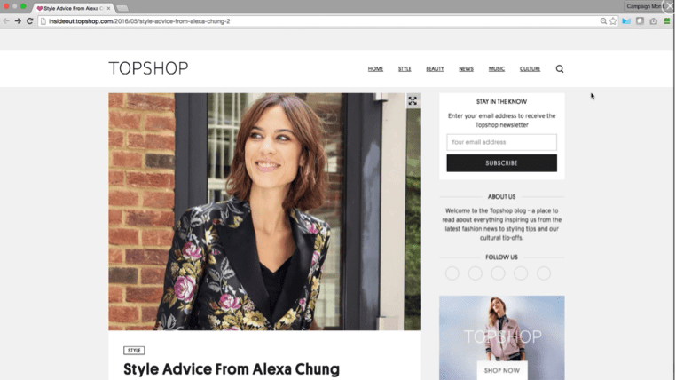
- Top of the sidebar: This is one of the most common areas to add an opt-in form, and with good reason. It’s no secret that your customers read content from left to right, and it’s hard to miss an opt-in form that is at the top right of the page.
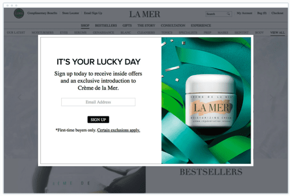
- Popup signup forms: The popup subscription forms have boomed in popularity over the last few years. While you can certainly overdo it with this option and push customers away, they can also be very effective when it comes to building your email list. Be sure that your popup form is highly customized and beautifully designed. It needs to be eye-catching while offering an incentive to sign up to your list, but beware of Google’s interstitial update. On January 10, 2017, Google updated their algorithm to penalize sites who use intrusive interstitials, like popup ads and email sign forms, on mobile that hinder users from reading content on the page.
- Header opt-in form: The header opt-in form is a bold approach. It takes up more real estate on your page and it simply can’t be missed.
- Slide-in form: Slide-ins are like a popup form but a little less intrusive. They simply slide in from the left or right of your page as your customer browses your blog—a simple yet effective approach to build your email list subscription.
What’s the right opt-in position for you? There is no magic rule or guarantee that one will work better than another. Consider split testing over time to determine your best results.
Blunder #3: You Didn’t Keep Mobile in Mind
Mobile friendly emails are more important than ever in 2017. According to email marketing platform, Campaign Monitor, Email opens on mobile devices grew 30% from 2010-2015, and it’s showing no signs of slowing down. This means that you must design your e-mail templates with mobile in mind.
If you’re still not convinced that mobile is important, consider these statistics:
Keep your email marketing mobile friendly by offering snappy subject lines, presenting obvious calls-to-action, and including responsive e-mail design templates for the best user experience.
Blunder #4: You’re Firing off Generic Email Content
Customers can smell generic and sales-centric content from a mile away. Remember that you need to personalize your e-mails and make it feel as if the content is designed specifically for the customers. Personalized e-mails can increase click-through rates by 14% and conversions by 10%. Furthermore, personalized emails can offer 6 times higher transaction rates.
One way to personalize your email marketing is with custom e-mail subject lines that include the recipient’s name. This can increase the open rate by 29%.
By keeping your efforts mobile-friendly, personalized, and valuable in terms of user experience, you’re sure to achieve email marketing success in 2017.

Thanks to
Megan Totka for sharing their advice and opinions in this post. Megan Totka is the Chief Editor for
ChamberofCommerce.com. Chamber specializes in helping small businesses grow their business on the web while facilitating the connectivity between local businesses and more than 7,000 Chambers of Commerce worldwide. As a small business expert, Megan specializes in reporting the latest business news, helpful tips and reliable resources, as well as providing small business advice. She has significant experience with the topic of small business marketing, and has spent several years exploring topics like copywriting, content marketing and social media.


