Pop-ups aren't always good for your conversion rate
The website pop-up can be the most hated, dumb, and annoying feature of a website. In fact, some go so far as to claim that they're more likely to trust a TV ad, than trust or respond to a banner ad or a pop-up. But it’s no secret that a website pop-up is likely to get you “new” leads and email addresses faster than any other tool on your website.
However, pop-ups are really effective for growing email lists, so it makes sense, that if we are to use them, we do so in such a way they don't annoy the majority of our users.
So, whenever the question of whether or not to use pop-ups arises, experts say that it’s best to stick to them as long as you’re not being too annoying or making a few mistakes that could bust, rather than boost, your conversion rates.
These are some common mistakes that I still often see when pop-ups are used - I'm sure you recognise them too!
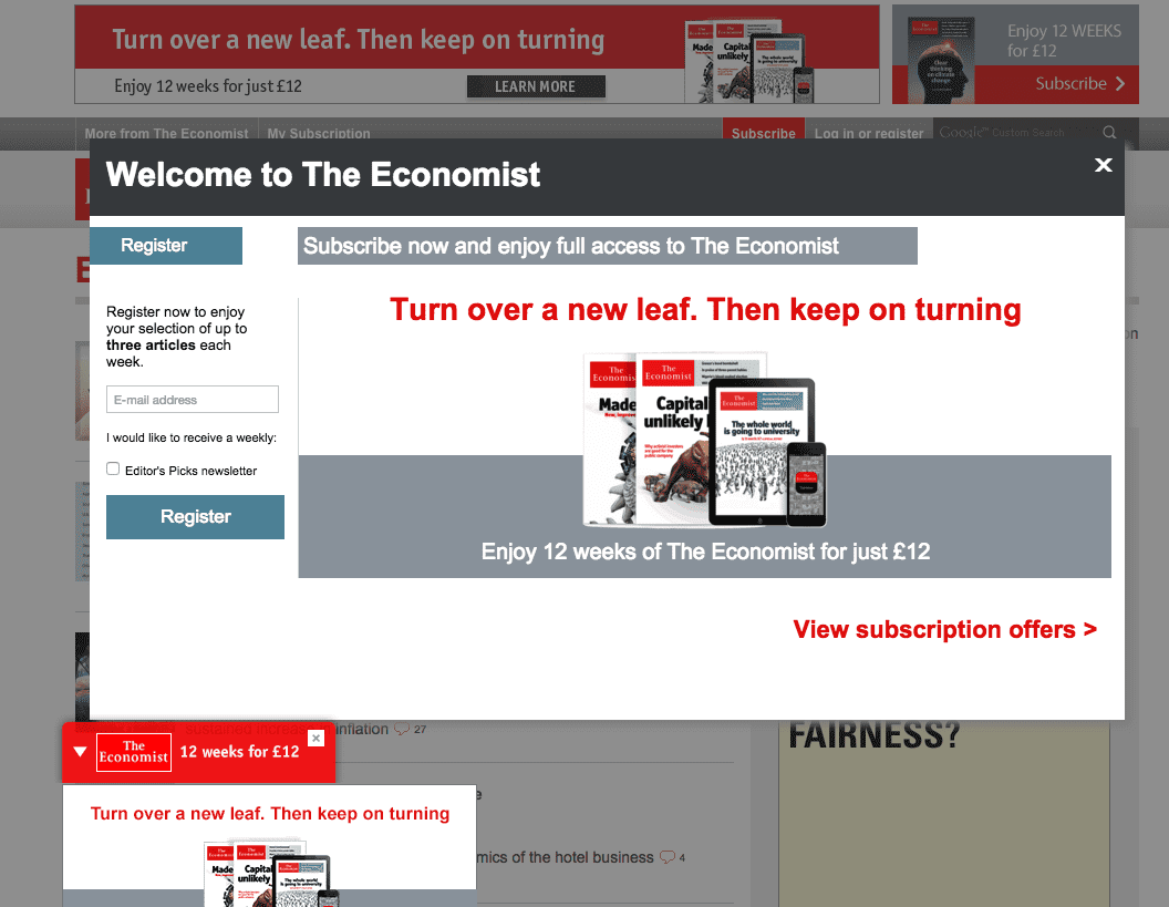
- #1 Using a full-page pop-up: In can be quiet disconcerting when you’re reading a page and then suddenly a huge, full-sized banner just pops up out of nowhere to block the view of what you were just reading. The idea of a pop-up is definitely to introduce something that gains attention, but most certainly not to try and annoy the visitor with something that screams “I want you attention, right now!”Don’t do this (or at least test it). Keep the pop-up small and allow it to grab their attention in a less irksome way. You also need to think about whether this is an issue on Smartphone devices and potentially change those if they are full-screen.
- #2 Not clarifying what the CTA does: The message on your CTA button needs to be as flashy, loud, and clear as the CTA button itself. The easiest way to do this is to this is to highlight the benefit they will be receiving from the action. For example, “Download Me My Free Ebook” is much more tempting than “Download”. Make sure you clarify what it does, otherwise there’s a high change your visitor is not going to click it.
- #3 Using Pop-Ups Only: You shouldn’t solely depend on pop-ups as a method to increase your conversion rates or grow your email lists. There’s a variety of other things you can try such as including a link at the bottom of a post, including site footer, top sticky bar, fixating a featured box to the side, etc. Keep split testing and exploring!
- #4 Messing up the timing: The timing of your pop-ups is crucial to how visitors respond to it. As a rule of thumb, it’s best not to allow the pop-ups to appear too soon (obviously because it can be extremely annoying and rude) but try not to delay it for longer than 10 seconds (by which time may they not even be on the page anymore). So, what is the best delay time for a pop-up? Experts say that five seconds is the perfect timing because it’s neither too fast nor too slow.
- #5 Not having a clear way to close the pop-up: One of the things that visitors hate the most about pop-ups is when they feel they are being forced to subscribe to something against their will. Using tactics such as positioning the exit button in a confusing location or having no exit button at all is only going to frustrate your visitors till the point they may decide to leave your website and never ever visit again. To avoid this mistake, do the opposite. Allow more than one way to exit the pop up (i.e. clicking out, exit sign, etc) and provide a clear “X” button at the top-right corner of the pop-up. You can also include a gray CTA button right beside a colored one, but make it appear less appealing.
- #6 Prompting Pop-ups Too Often: You may think it’s a good idea to prompt a pop-up every single time they visit a new page on your website, but this is another surefire way to annoy your visitors and keep them from taking full advantage of your website. Try not to over-promote by prompting a pop-up several times in a single browsing session. Instead, stick to one pop-up per browsing session, and no pop-ups if they have already subscribed.
- #7 Not recognizing that no means no: Another huge mistake many website owners are making nowadays it not respecting a visitors choice to ignore or having nothing to with what you pop-up is offering. So, if they’re exiting the pop-up or clicking the “no thanks” buttons it means they really don’t want to waste their time and deal with the pop-up anymore. Triggering a pop-up repeatedly even after they’ve made that choice is a big mistake. Use the cookies feature to allow the website to know exactly when and where to trigger a pop-up. If a visitor has already made a choice, accept it, respect it, and deal with it!
In Conclusion:
One of the best ways to know if you’re being likable enough to convert visitors rather than pester them with annoying pop-ups that are hurting, and not helping, your conversions is to put yourself in a visitors shoes. If you were a visitor, what would you do? Your answer to that question could reveal a lot about what you how pop-ups on your website could be affecting the user experience.

Christina Matthew is a marketing executive and specializes in generating leads through tried and tested marketing strategies. When not strategizing marketing plans, she writes informational blogs on the topics of her liking.


