Now mobile is the norm, marketers need to re-think how they approach a broad range of tactics
By the end of last year there were 2 billion mobile users worldwide. This amounts to 400% growth in just a decade and the figure is bound to have increased since this date. 80% of internet users access it via their mobile phones and this should be a huge warning signal to all businesses that their marketing, sales and communications strategies must all have a 'mobile-first' focus.
All business owners have had it drummed into them that their website must be responsive, it’s what customers expect, and whilst this is true , it can’t stop there. Your entire strategy needs to be based on the assumption that users could be viewing your online communications, emails, social posts and more from practically any device, and more than likely a smartphone or tablet. How is mobile-first changing the business world? What can you do to ensure your business isn’t left behind?
Mobile-First Outreach Strategies
All businesses need to look at their wider sales and marketing strategy, as well as their communications and modify to adapt to the needs of the mobile-driven world.
In October 2016, mobile and tablet browsing worldwide took over from desktop browsing for the first time and this is a trend which is cannot be ignored. Increasing numbers of people reach for their smartphone or tablet rather than desktop so all businesses need to keep these users at the front of their mind.
Reimagining the Sales Process
The sales process is also significantly impacted by the massive uptake in smartphones and other mobile devices, with 82% of smartphone users turning to their phones to influence their purchases when they are physically in store. Smartphone users rely heavily on their devices even when shopping in store. Research shows 39% of consumers specifically read reviews prior to purchase in store, with this number increasing to 54% for online shoppers.
The role of mobile in the sales process goes beyond simply decision making and comparing options. 93% of people who use a mobile phone for research will then go on to make a purchase and one study found mobile accounts for 35% of all retail eCommerce transactions. Mobiles have made it simpler for different media streams to come together and lead to purchases, with 84% of smartphone and tablet users turning to their devices as they watch television, providing a huge opportunity for advertisement linking the two.
The Scale of Mobile Social Media
It is impossible to ignore the impact mobile use has on social media. Recent research suggests are 1.65 billion social media accounts around the world and 1.968 billion active mobile social users. Whilst this volume may seem insurmountable, it is a clear indication that social media is primarily a mobile medium and the benefits of being social of your business are well-documented. A non-mobile focused social media strategy may deliver results but they will be significantly impaired compared to those with a core mobile focus.
E-mail Marketing and Mobile
E-mail marketing is essential and marketers claiming it is ‘dead’ or over only need to look at the evidence out there to see otherwise. Despite the critics, 89% of marketers still consider e-mail their primary channel for lead generation and a report from 2015 found 69% of emails were opened on mobile devices, with this figure more than likely to have increased by now. The easy access smartphones provide to e-mail means users naturally sync and check their mail throughout the day, so if you want your campaigns and communications to be noticed, they need to be fully mobile-ready. Whilst many users will look at their email across their devices, 25.4% on average will first check their mail via their mobile, so it is important to make a powerful first impression.
Harnessing a Mobile-First Approach
It would be unfair to say the business world and brands haven’t reacted to the need for a mobile-first strategy but for many, this stops at the website. The need for a responsive website has been made so clear that many businesses now tick this box, but why stop there? So many brands are putting together an effective, optimised and fully responsive website but then forgetting their other communication channels. E-mail marketing for example is highly trusted and highly effective, but this won’t be the case if you’re neglecting mobile users.
Strengthen E-mail Marketing with Responsiveness
By 2020 there will be over 3 billion email users and they are increasingly using their mobile devices to access their inboxes. Smart business owners ensure they are ready for this by positioning themselves accordingly. Email marketing does not come without its challenges and it is one aspect of any strategy which requires in-depth and rigorous testing before finding the perfect formula. This formula then needs to evolve with the market and today. It is, therefore, an absolute must that email marketing campaigns have responsiveness at their heart.
Design is a significant concern for many businesses planning their e-mail marketing strategies. Getting it right is essential but this takes and money, the right resources and the right personnel or skillsets to deliver the desired results. Knowing you need a responsive email design for your campaigns is only the beginning, you also need to remember the importance of personalisation and testing methods.
Not investing time and effort into responsive email design delivers the same result as not adopting a mobile-first approach across any of your platforms – you are actively positioning yourself behind your competitors. It is effectively telling mobile users that you weren’t considering them when you put together your campaign or mail-out and this instantly puts people off and in turn, sees them click off. Mobile phones have been deemed responsible for shortening the average attention span and with this in mind, all brands need to be focused on capturing it as quickly as possible. Ill-fitting, non-responsive email designs will not achieve this.
Responsive Options for E-Mail
It is understandable that many businesses may not have the development prowess on staff to deliver fully customisable, responsive and professional-looking email campaigns, which is why there are options available on the market. Here is a look at how some companies are offering responsive options for e-mail. Most providers offer either a ‘drag and drop’ style interface, what’s known as a WYSIWYG (“What you see it what you get”) interface or a hybrid of the two:
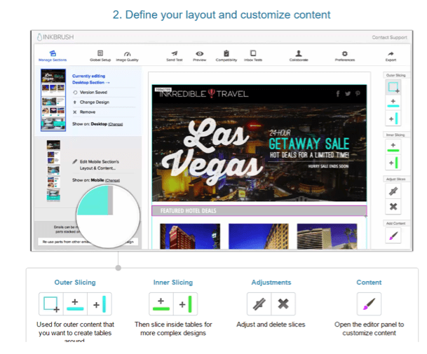
Inkbrush by Movable Ink
A web-based online solution. An integrated email template builder allows businesses to create their own professional, responsive emails quickly and efficiently, using a range of customisable features:
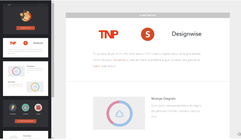
Zurb
With eleven standard types of responsive email template, the design focus behind Zurb is easy to target and customise to the individual audience. It incorporates a responsive grid which works for your content, not vice versa.
Stampready
With an easy to use interface and responsive design as standard, Stampready is popular because of how easy it is to use. The range of templates is not exhaustive but each is fully ready to mobile-use.
Conclusion
Early adopters of a mobile-first approach are already reaping the rewards that focusing on the largest segment of internet users brings. Any brand’s position in the market is under threat if they don’t take the role of mobile seriously and look at ways of allocating spend more effectively in this area. A responsive website is a must-have but it isn’t a singular, removed thing from the rest of a business’ online presence. Coherent, responsive and connected communications, social channels and online platforms are essential for future business success.

Dan Purvis is Founder & Director at
Comms Axis, a fast-growth, full-service marketing agency specialising in content marketing, social media and digital marketing for businesses of all sizes. Ranked by Brand Republic as one of the Top 50 UK Marketing and Social Media influencers, Dan Purvis is passionate about the philosophy behind Comms Axis: we bring content, marketing and sales together to connect businesses with their audiences.


