SEO and UX are both vital to ensuring your site ranks and converts. Despite this, many sites make big mistakes with both SEO and UX that can have negative effects
A website can significantly boost a company’s popularity, bring new clients, and improve its ROI. At the same time, a low-quality website can cause the company to lose out on those aspects. The Plerdy team has prepared an overview of popular SEO and UX mistakes that can repel customers and have a knock-on effect in terms of revenue, as well as rankings.
SEO mistakes
Quality website optimization is one of the most important elements of content-marketing, With its potential to attract new users to the site and eventually level up the business, SEO remains in the spotlight of marketing professionals’ attention.
Download our Free Resource – 10 business-limiting SEO mistakes
Our guide takes you through some of the big SEO mistakes you really want to avoid and what you should do instead.
Access the
User demands are constantly growing while search engines strive to satisfy those requirements, which in turn encourages the development of SEO methods. Since following the latest trends in optimization and conducting timely audits can be rather challenging at times, companies often make the wrong decisions and leave serious SEO mistakes unnoticed until they adversely affect their websites’ performance.
So what are some of the most common mistakes sites still make?
Common SEO-mistakes
Not enlisting professionals
The first mistake many companies make, especially when they start out, is attempting to do everything on their own. SEO is a very complex task, which not only takes knowledge and continuous development, but also a lot of time.
Many marketers know the very basics but still firmly believe that they can handle any task on their own - be it audits, UX analysis, or SEO; which may cost their companies a lot of time and money. In this case, entrusting these tasks to professionals who are aware of the latest trends in the industry and are ready to work on the project at any time is a much better idea.
Targeting the wrong keywords
This is another common SEO mistake. At this point, it is crucial to understand that your definition of the products you aim to market does not always match the key phrases that users enter in the search box on your site or search for online. For this reason, quality SEO needs properly selected and research keywords.
Too many keywords
Stuffing your content with keywords is a losing strategy. As a result, the content on your website will sound unnatural and won't be useful to your audience. Your site is also likely to be penalized by search engines. Take a better approach by studying your audits to see which keywords are performing best. You should also aim to make use of latent semantic indexing (LSI).
Using "Black Hat" methods
We all want results quickly but the use of fast promotion methods, such as “Black Hat” tactics is a trap awaiting those who try to get everything at once. For quality SEO, you should employ safe methods and conduct continuous usability audits rather than seeking quick solutions.
Search engines do not welcome websites that are trying to crack the system and thus introduce restriction policies or even ban such resources. Shady SEO methods will only bring in fines and bans, so they should be avoided at all costs.
Spam links
The use of spam backlinks is another “black” SEO method. It is aimed at getting additional links to your resource using shady SEO methods. Not only is this method not really effective, but it can also see your website get penalized.
Not using analytics to control conversion rates
Very often high-volume key words are less efficient than phrases that offer less traffic. This is quite obvious: traffic alone does not do the trick; conversion is what matters. It can be tracked with analytics packages such as Google Analytics and Google Search Console.
Not adapting to changes in the search engines
Search engines are constantly updating their algorithms to ensure the best UX, filtering out scam websites. To ensure adequate SEO that translates into high conversion rates, one should keep up with the latest SEO trends and undertake regular website audit.
Low-quality content stuffed with keywords
This is a very serious blunder as search engines strive to offer websites with relevant information of high quality, so their filtering methods are constantly improving. It's important to invest time and money into quality content for it to yield a long-term effect.
Non-unique content
By using text borrowed from some other website, you put your resource at risk of being filtered out of search results. As a rule, search engines identify the primary source of the content and hide the duplicate texts, so you need to be creating unique and informative content.
Ignoring user experience
You have to audit your website regularly. all pages should load fast, have a mobile adaptive design, and fully comply with the user requirements. Usability is now a signal taken seriously by Google and other search engines so it can affect your rankings.
Forgetting about headings and meta descriptions
Lack of unique headings and meta descriptions is a serious mistake, which is often caught during website audits. Remember that each page should have a unique title tag not only for SEO purposes but also for usability. Meta descriptions, which advertize your page in the search results, are also important.
Ignoring social media
Not using social networks and promotional websites is one more common SEO mistake. Nowadays, social networks offer many chances for attracting attention to a web resource, so it is important to give your users an opportunity to share your content in social networks.
Usability mistakes
Web design is an art responsible for combining both the form and useful functions of a website. Your site should be visually attractive, interesting, and user-friendly in order to encourage visits and conversion. To achieve these goals, it is essential to follow certain rules, conduct regular UX audits, and constantly improve the website usability.
Download our Free Resource – 10 common website customer experience mistakes
This guide reveals examples of poor website design from different sectors which are commonly seen, but best avoided.
Access the
However, even though any information can be found on the web and specific website audit templates are available, there are still a lot of sites that are extremely far from the modern UX design standards.
The most common web design mistakes
No specific call to action
Quality UI should provide the user with all the necessary information on who to contact, where to find a particular product or service, and who will answer the questions that might arise. Only such a UX design can smoothly lead the user to the next
No analytics
Website usability audits should be performed continuously, but many website owners forget about this control method. Remember that you can only protect your investments if you keep track of the progress and analyze any potential issues. With ready-made templates at your service, you can easily test and adjust the ways your website works, as there are a lot of specific tools designed for this purpose.
Lack of proper SEO strategy
Top ranks in search engines are not achieved in a day or without any effort. There is no magic wand that can get you there instantly. That is why it is so important to work on SEO, test the website design, and conduct audits, taking into account all of the latest trends in the industry and avoiding shady optimization methods. Ensuring a good SEO strategy will help provide better UX.
Not including contact information
Another common mistake is the lack of easy-to-access communication channel. Web design should attract users’ attention, and the company’s contact details must be easy to find on the website in case any issues arise.
Ignoring mobile
Not having a mobile version can translate into a total failure for a website as mobile adaptiveness is one of the prerequisites of quality UX. Nowadays, the main bulk of internet traffic is accessed from smartphones and tablets, so users are not willing to visit websites that look awkward and cumbersome on their mobile devices.
Slow page loading
Page load time should not exceed three seconds. Believe it or not, three seconds equals to eternity for most users when it comes to loading websites - especially if they are using their mobile device to search. UX design should be quick and efficient, so you need to get your site loading as quickly as possible.
Font choices and content length
Illegible fonts, lengthy texts are also a common problem in UX design. Complex and verbose content prompts visitors to switch to a more user-friendly source.
Lack of headings and subheadings
As tests show, most users look at H1 and H2 tags to find out if the website offers the information they need, so do not ignore this aspect. Ensure that your headings are unique and informative.
Poor site navigation
Bad UX is also associated with complicated and confusing website navigation. Ensure that the navigation menu and the information provided on your website are presented in an easily understandable way. Avoid using complex templates, extra-long pages, especially when it comes to mobile versions.
To show you exactly what these mistakes can look like, we've outlined some of those that have been made by real companies on the web.
A review of TOP ten SEO and usability mistakes made by ten companies
1. Pino
SEO mistakes found on the website
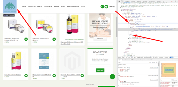
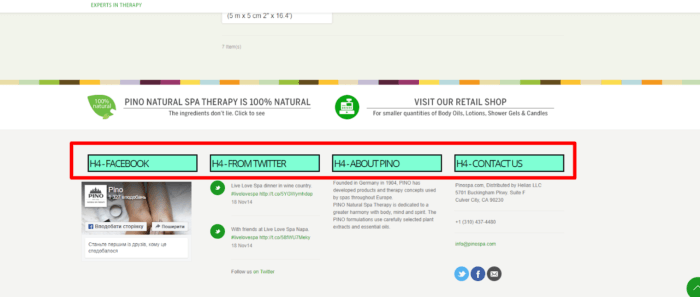
- Website logo functions as the Н1.

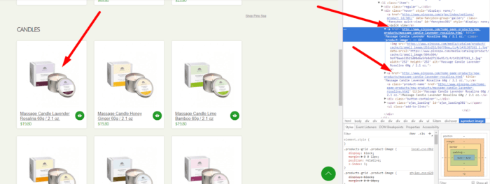
- Two links lead to one product page.

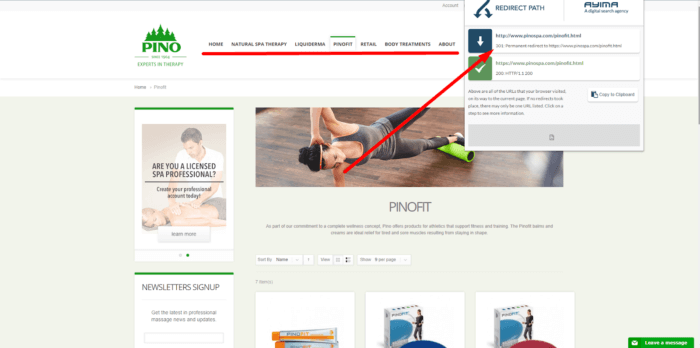
- The entire main menu leads to categories with a 301 redirect.

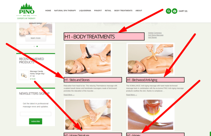
- The page https://www.pinospa.com/body-treatments/ contains multiple H1 tags.

- The headings should be changed to span with the styles retained as headings must contain key semantic queries.

Usability mistakes found on the website
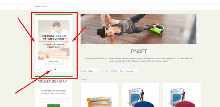
- There are no buttons on the slider element. It is recommended to add these buttons for use on mobile devices.

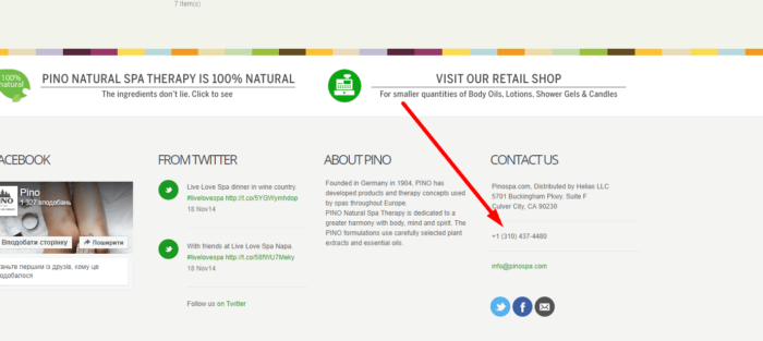
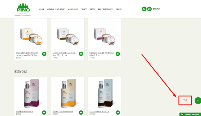
- The telephone number is not “callable”. This makes the website not convenient for use on mobile devices.

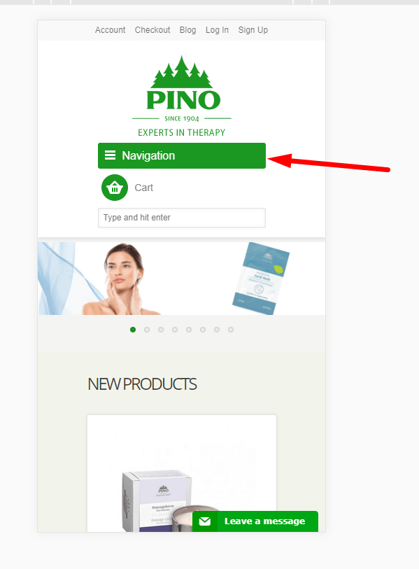
- The navigation bar should be frozen at the top of the page for scrolling on mobile devices. This minimizes the bounce rate as users would not have to scroll back to the top to click on another page.

- It would be a good idea to add an active phone button for more convenient communication between the store and its clients.

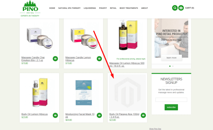
- Some product pages do not have photos. Make sure each product comes with a photo.

2. Tous

SEO mistakes found on the website
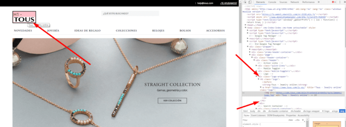
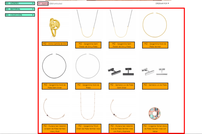
- Н1 tag contains the logo. This is incorrect as H1 should include the main key phrases.

- The product title is H2. Should be changed to span with the styles retained. Н2 tags are used in SEO texts and should contain key phrases.

- Incorrect numbering. Pages in a paginated series should contain "no index", follow to avoid duplicate content. In this case, web crawlers can visit pages without indexation of SEO texts.

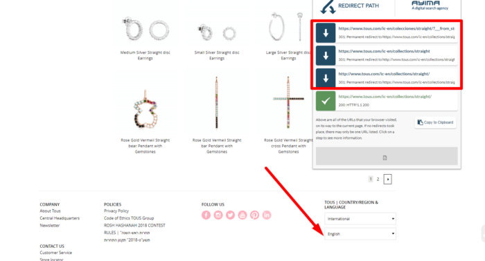
- There are three permanent redirects when the language is changed.

- Alt texts for product images should reflect the semantic kernel to allow users to find products via image search.
Usability mistakes found on the website
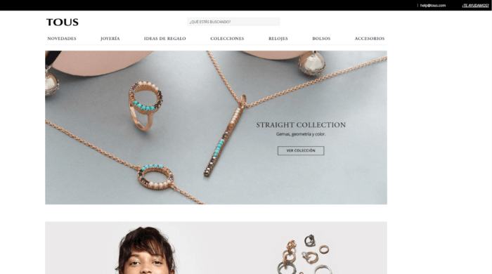
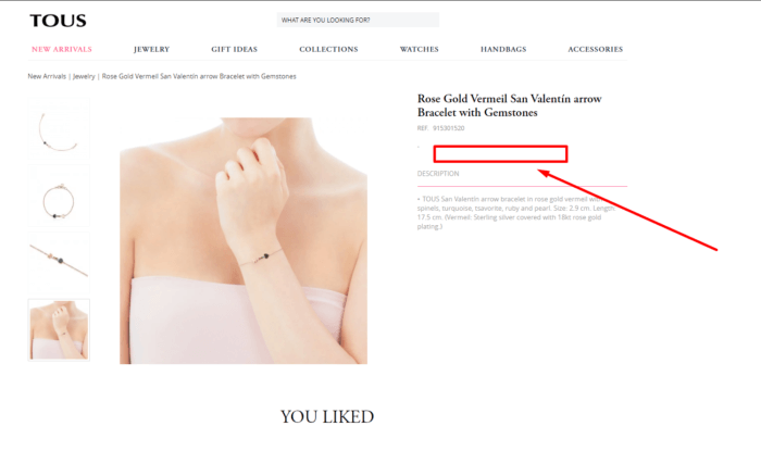
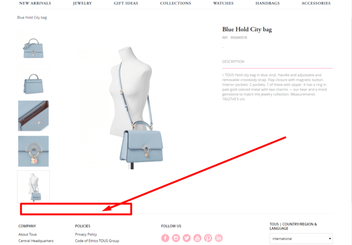
- Product pages do not feature the prices or buy buttons.

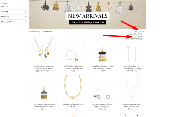
- Category pages show no prices or buy buttons though products can be sorted by price.

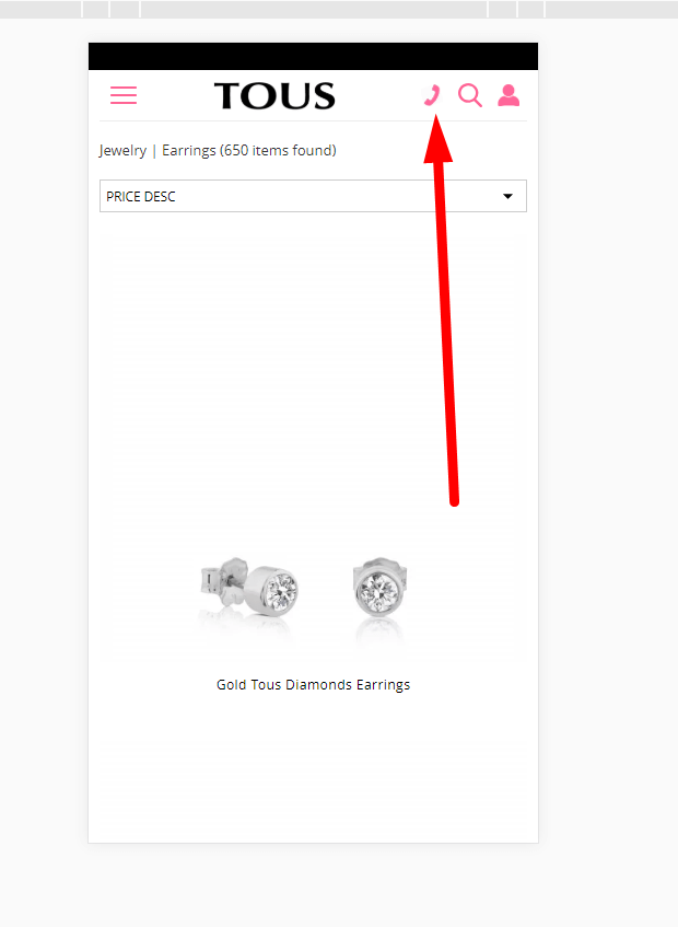
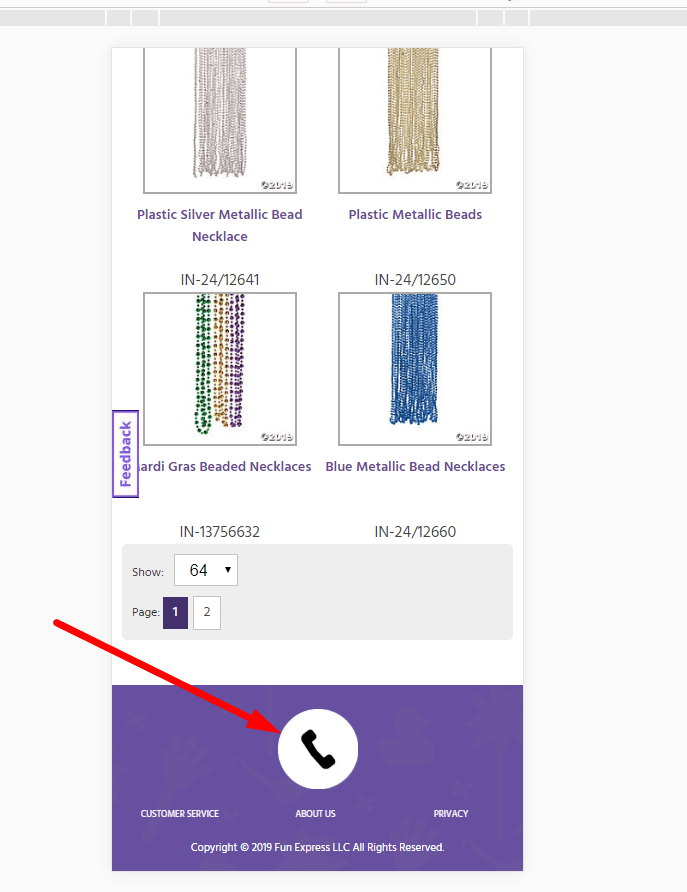
- Mobile version of the website features an active call button.

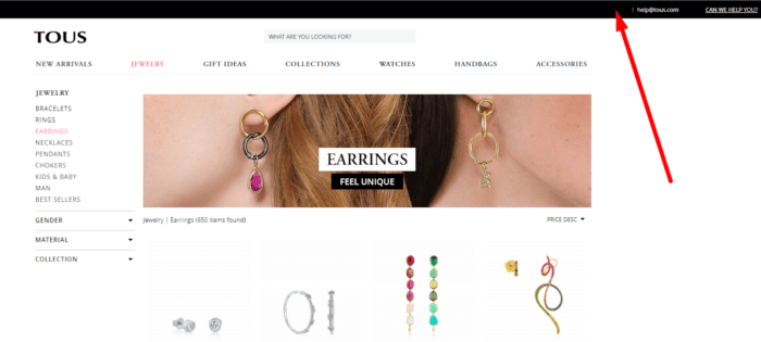
- However, the desktop version does not show any contact information.

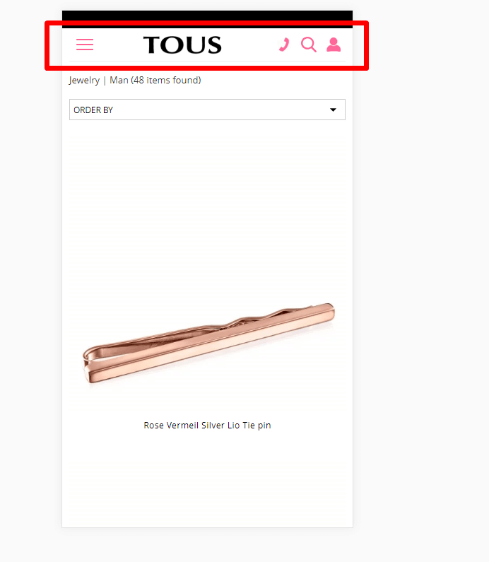
- The nav bar should be frozen at the top of the page for convenient scrolling on mobile devices.

- The feedback tab is missing.

3. Fun Express
SEO mistakes found on the website
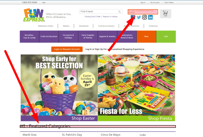
- There are multiple Н1 tags almost on every page.

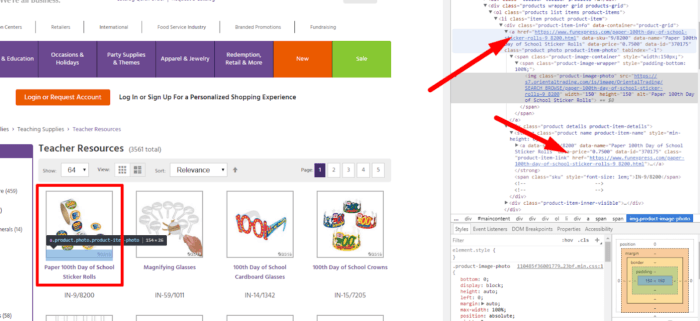
- Two links lead to one product. There should be a single link with the proper anchor.

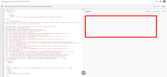
- There is no micro-markup schema.org.

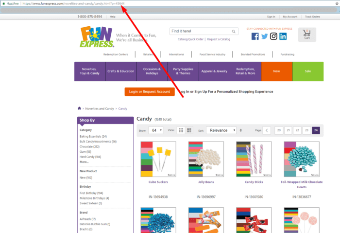
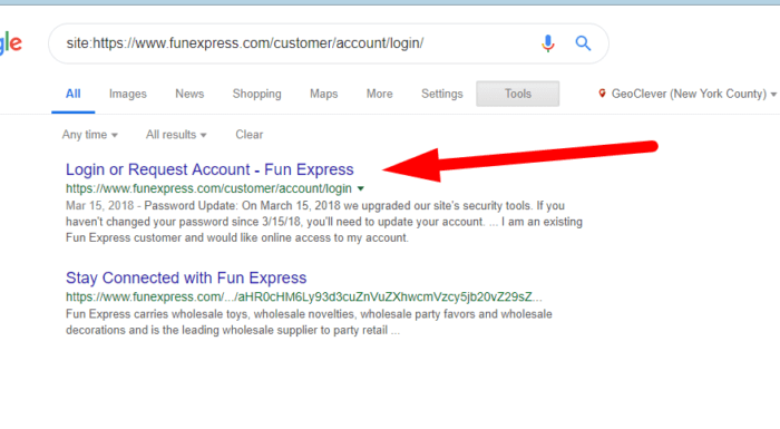
- Such a page should return a 404 status code.

- Technical pages are not hidden from search engines.

Usability mistakes found on the website
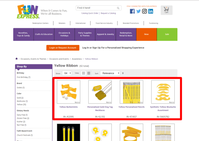
- Pages feature no prices or buy buttons. They are available only to registered users, which increases the bounce rate among first-time visitors.

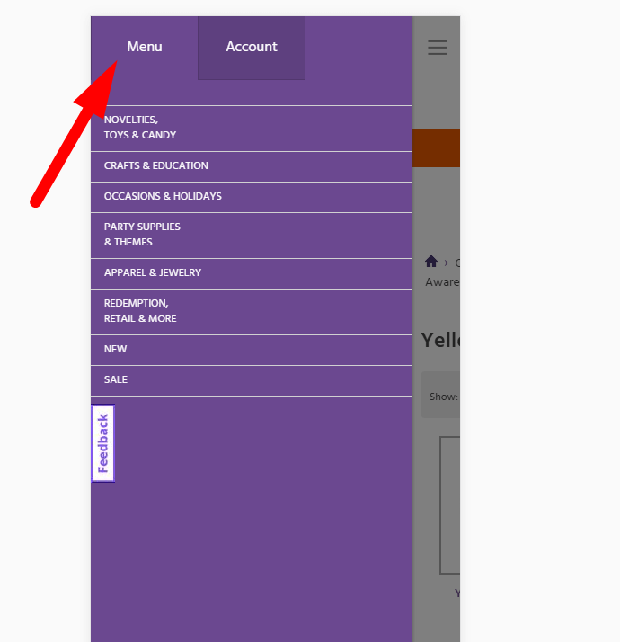
- The navigation menu of the mobile version is somewhat confusing. The active tab gets the background color, while the inactive one is highlighted. The design should be changed not to confuse the users with an unusual colour scheme.

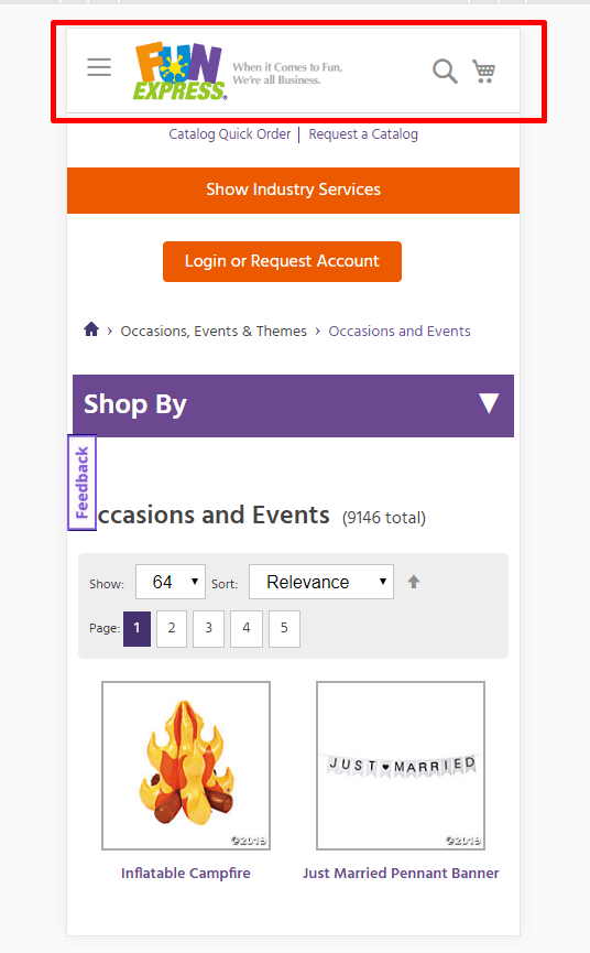
- For convenient use of the mobile version of the website, the navigation bar should be frozen at the top of the page.

- The click to call button should be smaller and frozen at the top for convenient scrolling.

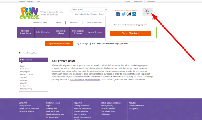
- If only the registered users can buy products, then it would be better to hide the shopping cart from the unregistered ones.

4. Obramax
SEO mistakes found on the website
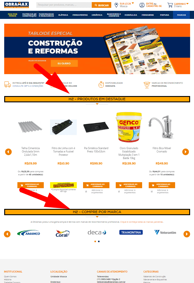
- There are no H1 tags on the landing page Н1.

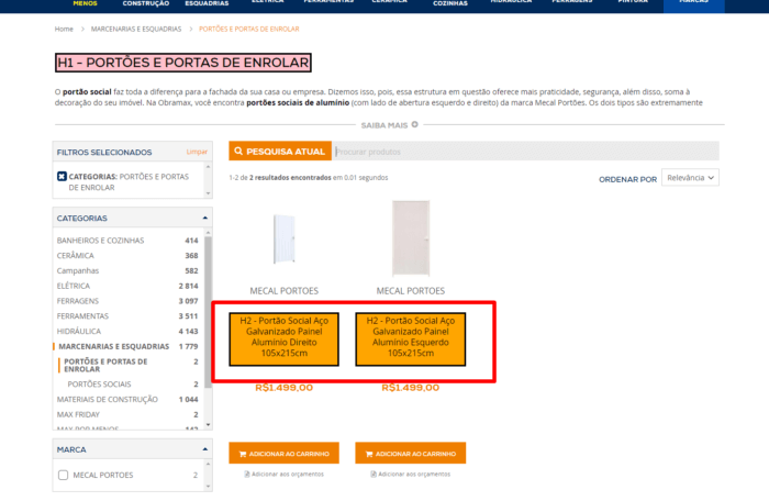
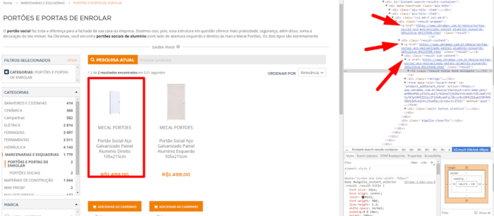
- The product title should be changed to span with the styles retained.

- Three links lead to the same product page.

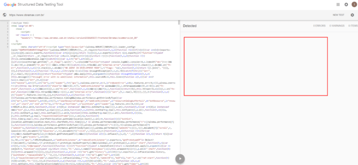
- No micro-markup schema.org.

- There are several duplicate pages. The page https://www.obramax.com.br/hidraulica/aquecimento-de-agua.html features the same content as https://www.obramax.com.br/mooca/hidraulica/aquecimento-de-agua.html. One of the pages should have the "rel canonical" tag.
Usability mistakes found on the website
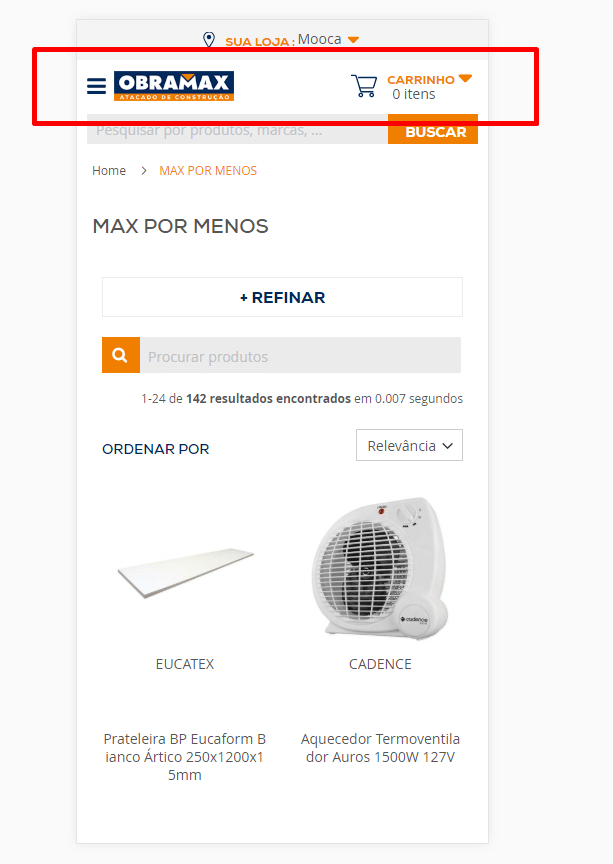
- The navigation bar should be frozen at the top of the page for scrolling on mobile devices for better usability.

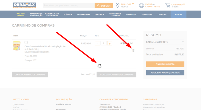
- When products are deleted from the shopping cart, the website freezes.

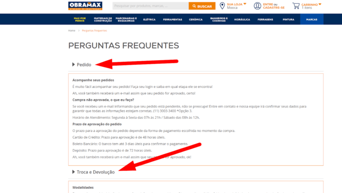
- These tabs are active but do not perform any function.

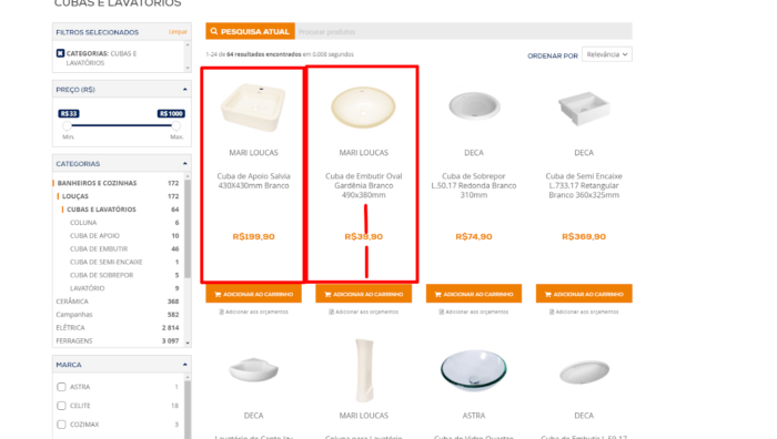
- There is too much blank space on the categories page. Larger images would solve the problem.

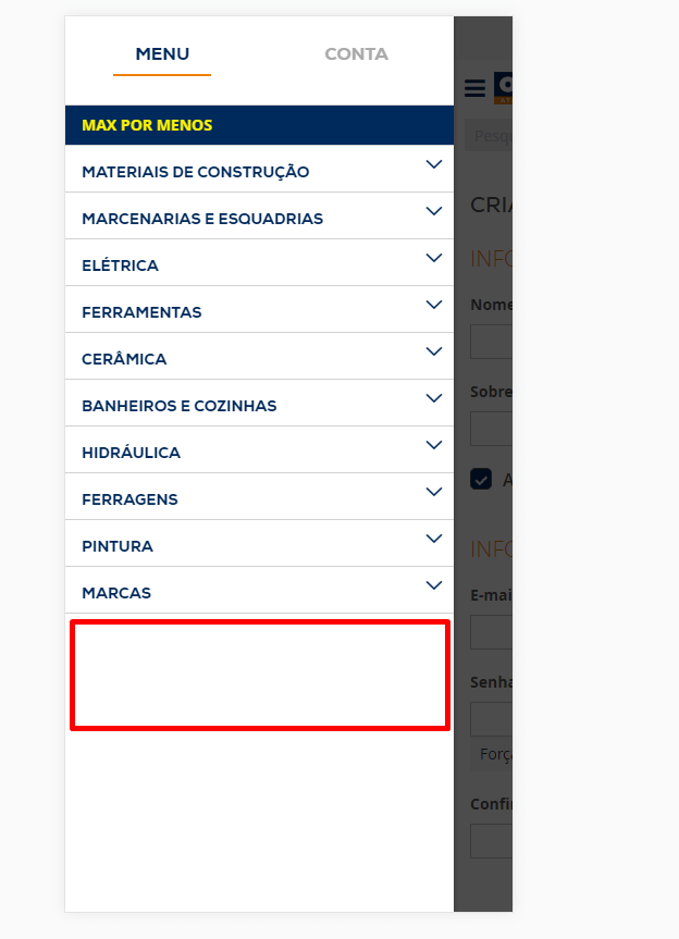
- The main navigation menu of the mobile version of the website should feature contact information under the categories list.

5. Rubik’s
SEO mistakes found on the website
- The Н1 tag on the landing page contains an image.

- These pages and categories have no Н1 tags.

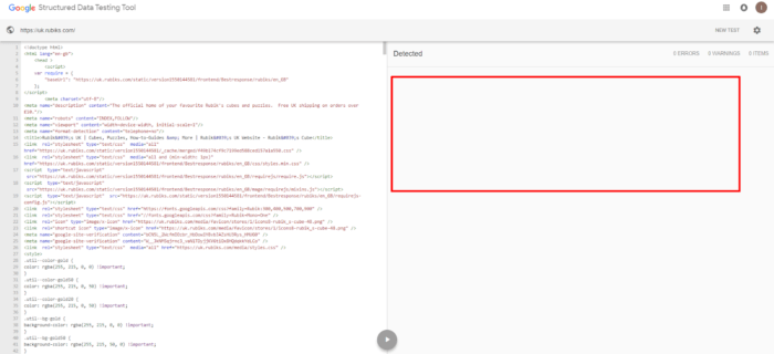
- There are no structured data.

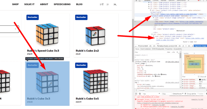
- Several links lead to one product page. There should be only one link.

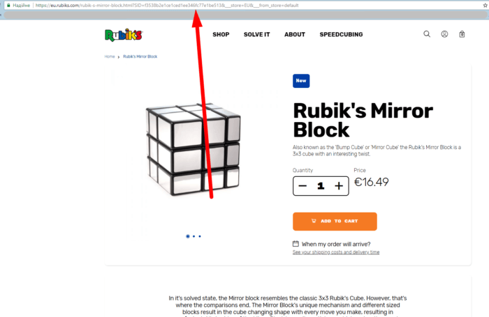
- Problems in the friendly URL have been detected.

Usability mistakes found on the website
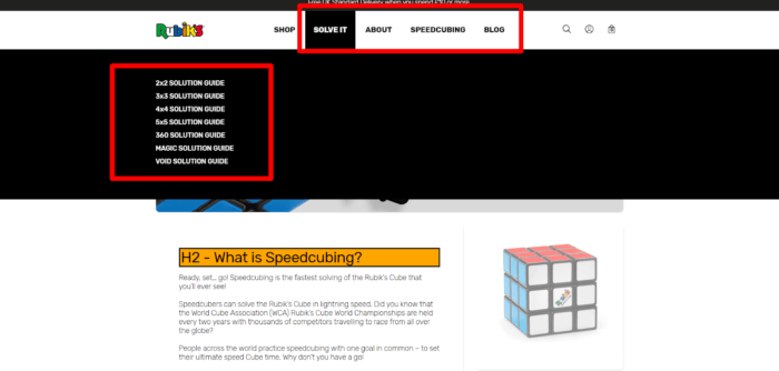
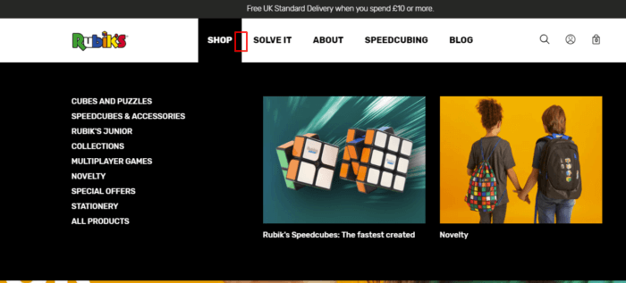
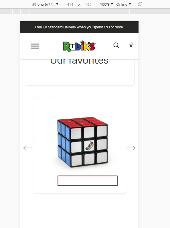
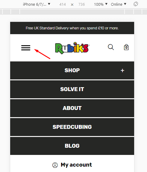
- A drop-down menu icon should be added here.

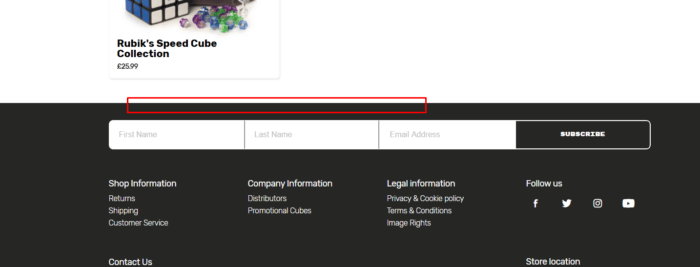
- There is no call to action, so hardly anyone will subscribe.

- Again, there is no call to action and the purpose of the element is not clear https://uk.rubiks.com/blog/2018/12/14/rubiks-in-film/. This page also lacks internal linking. Here, the bounce rate is likely to be high.

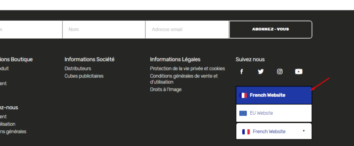
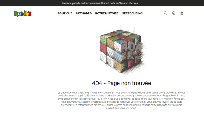
- When switched to French, the page returns a 404 error.


- The hamburger menu should be replaced with a close icon.

6. Mason Jars
SEO mistakes
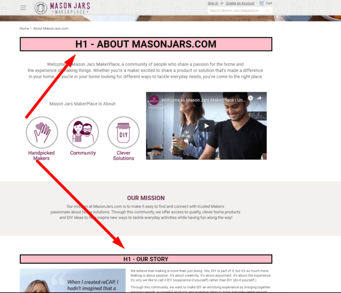
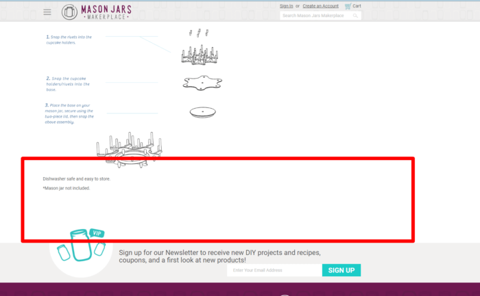
- The H1 is missing from the landing page and this page.

- Several links lead to one product page.

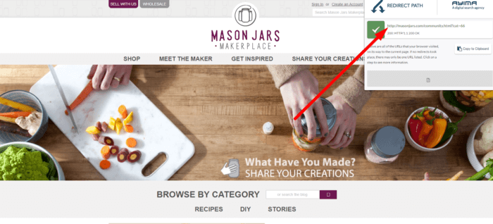
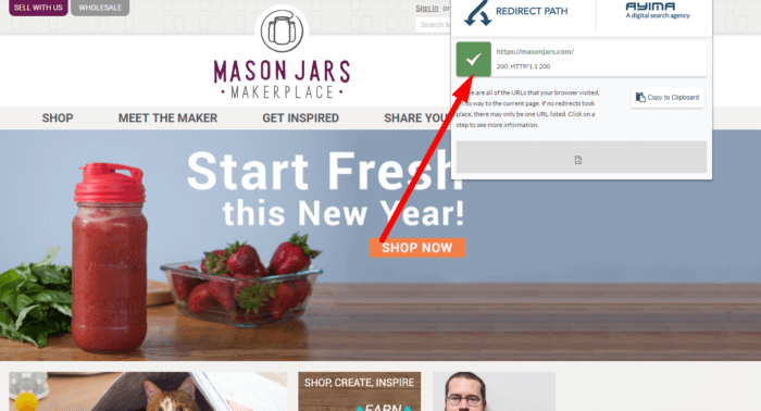
- The website functions on http and https at the same time.


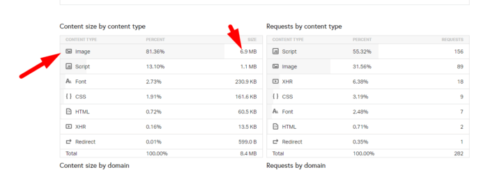
- We recommend speeding up the website by optimizing the images.

- The company information page features multiple Н1 tags.

Usability mistakes
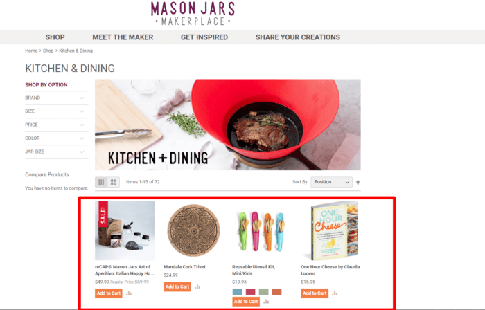
- The layout should be aligned, while the buttons should be placed at the same level.

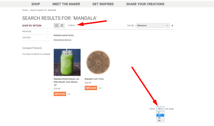
- If there are fewer than 15 products, the display options should be hidden.

- The website features no contact phone numbers.
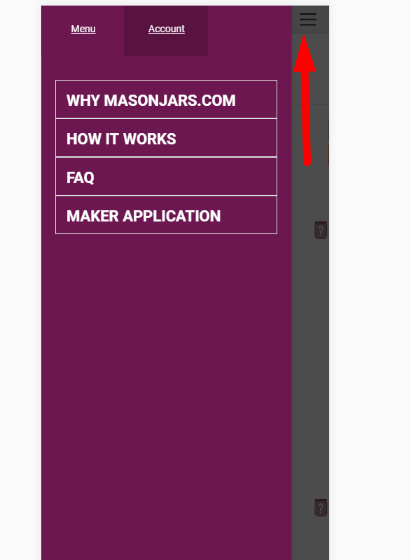
- The close button in the mobile version should be more noticeable, while the hamburger icon should be replaced with the close icon

- The product page has no internal links to similar products. They are necessary for reducing the bounce rate.

7. Cabinets
SEO mistakes
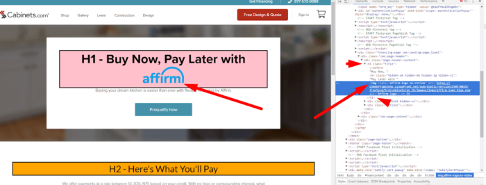
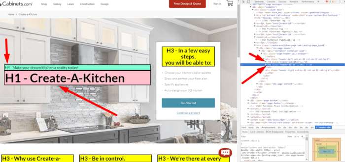
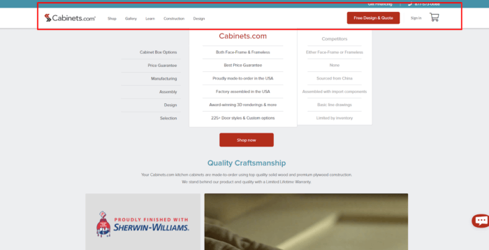
- There is no H1 tag on the landing page and on the design page.
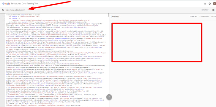
- There are no structured data.


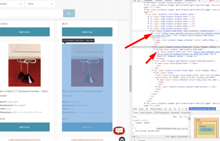
- Two links lead to the same product page.

- Headings are arranged incorrectly. The H1 tag should always come first.

Usability mistakes
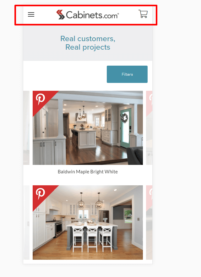
- The navigation menu of the mobile version is not frozen when the page is scrolled.

- There is no icon indicating a drop-down menu.

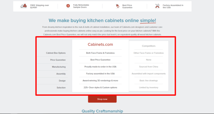
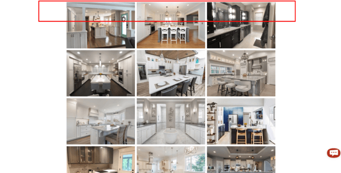
- This block attracts the users’ attention but does not perform any functions.

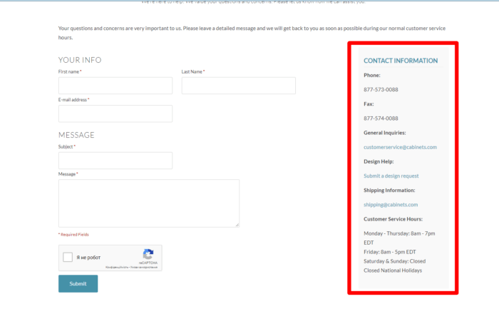
- The address of the store is not provided; there is no map showing how to get there either.

- The navigation menu is fixed on the landing page but not on the others. For better UX, we recommend freezing the menu on all pages.


8. Little Lovely Company
SEO mistakes
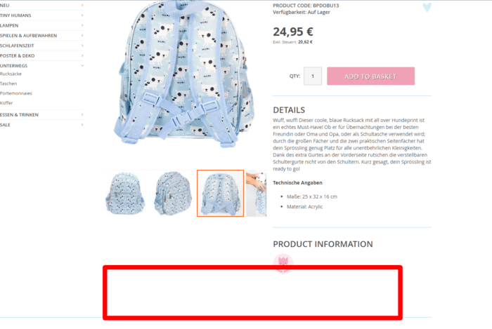
- There is no H1 tag on the landing page and some category pages.
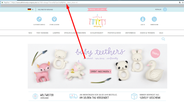
- When switched to German, the website’s URL becomes unreadable.

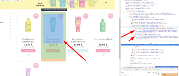
- Two links leading to the same product page have been found.

- There is no feedback option on the product pages.

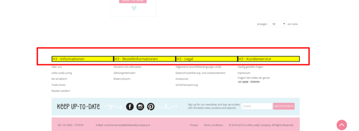
- These headings should be changed to span with the styles retained.

Usability mistakes
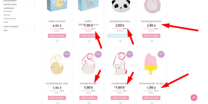
- Some of the product pages have an incorrect layout. The price covers the product title.

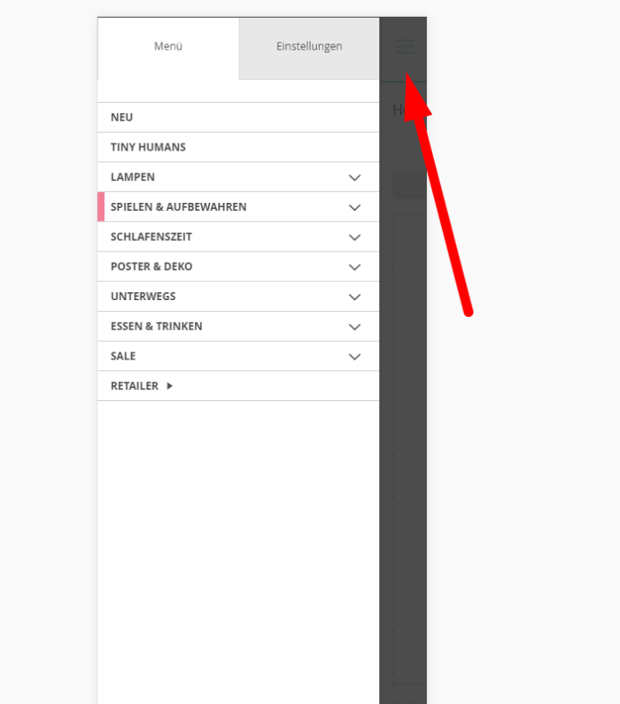
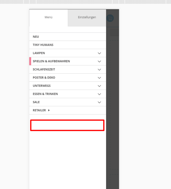
- The close button of the navigation menu in the mobile version should be more noticeable. The icon also needs to be replaced.

- The contact number of the store should be added to the navigation menu.

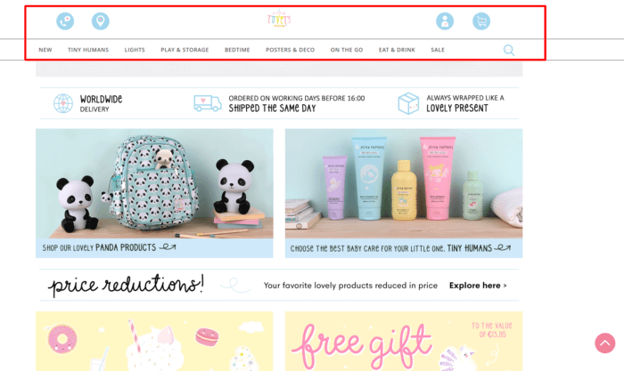
- The nav menu is frozen only on the landing page. We recommend fixing it on other pages as well.

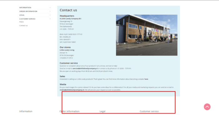
- The store location map should be added.

9. Rossignol
SEO mistakes
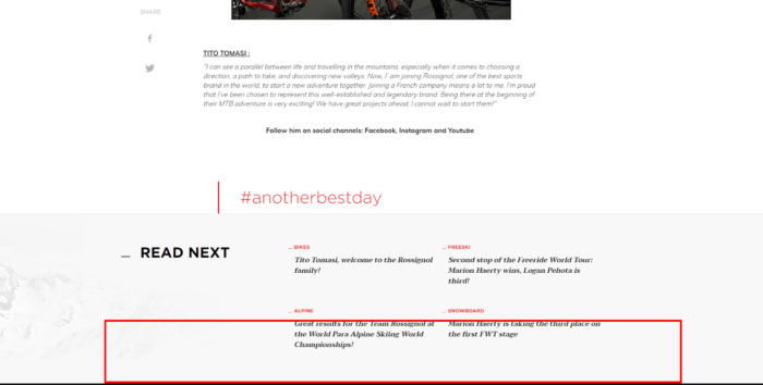
- There are no H1 tags on the landing page, category and product pages.
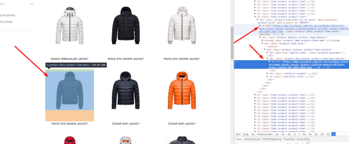
- To links lead to the same product page.

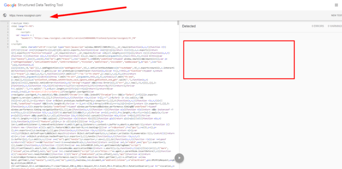
- The website contains no structured data.

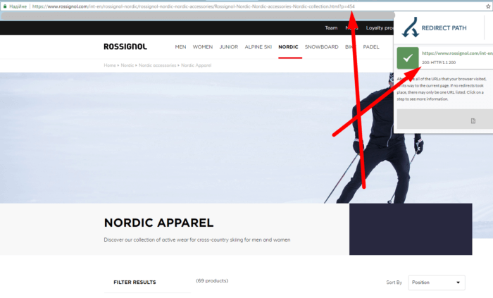
- Such a page should return a 404 status code or at least have a rel canonical tag.

- We recommend increasing the website’s rate in Google Page Speed.

Usability mistakes
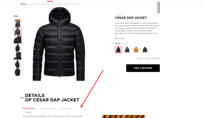
- There is no feedback option.

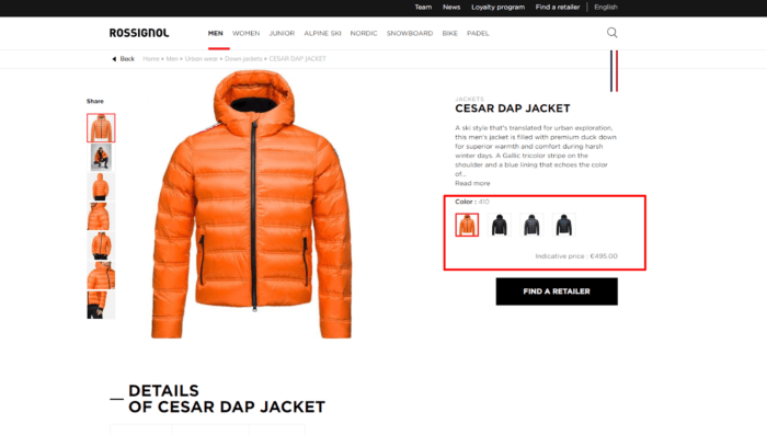
- Products cannot be selected in a different size.

- There are no internal links to the corresponding products on the Articles page.

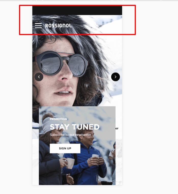
- The navigation menu in the mobile version of the website is not fixed, and the “Scroll Back to Top” button is missing.

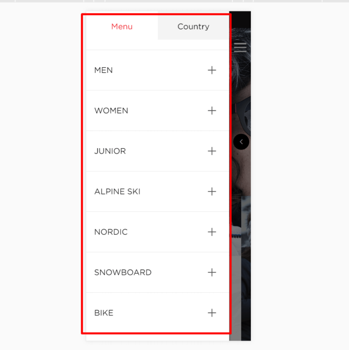
- For better UX, we recommend using smaller fonts in the navigation menu of the mobile version.

10. Beer Hawk
SEO mistakes
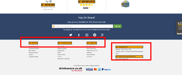
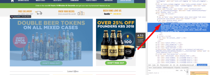
- These headings should be changed to span with the styles retained.

- Some images lack alt text.

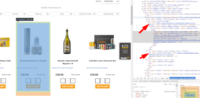
- Two links lead to one product page.

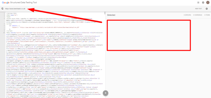
- Structured data is missing.

- The website should have a higher rate on Google Page Speed.

Usability mistakes
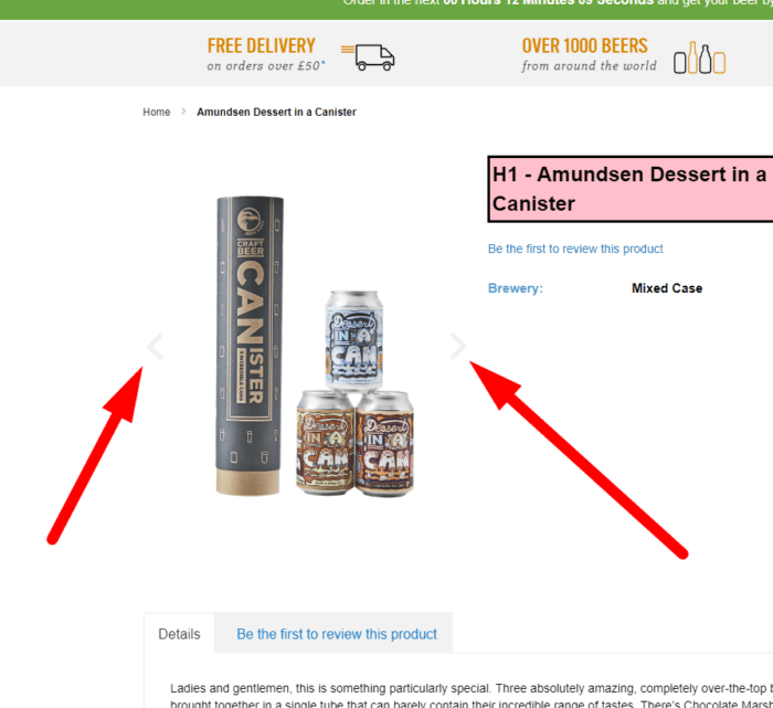
- If the product page features only one photo, it’s better to hide these scroll elements.

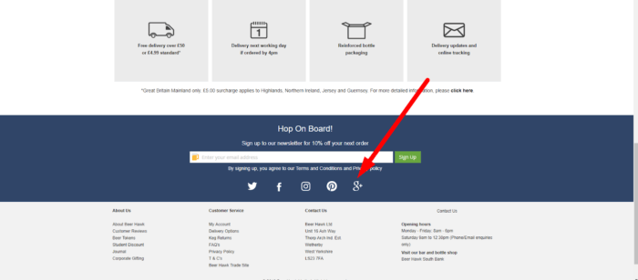
- Links to G+ should be deleted because Google has officially announced that this service will be closed in the nearest future.

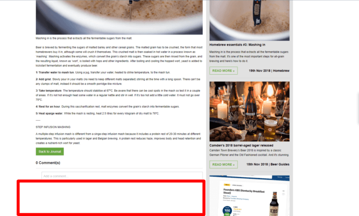
- No link to the relevant product is provided under the article.

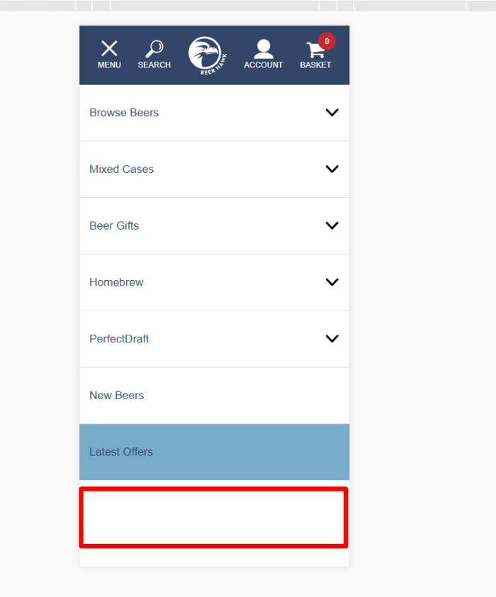
- The contact number ought to be added to the navigation menu of the mobile version.

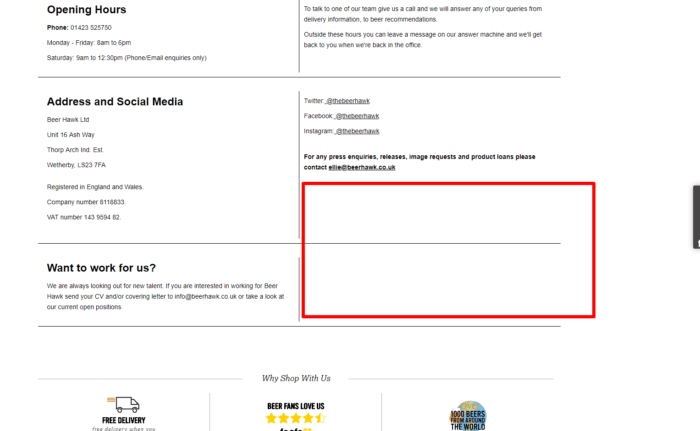
- We also recommend providing a store location map on the contacts page.

Conclusions
Search engines, which should be studied diligently by any marketing and SEO specialist, are not a formal discipline that can be learned once and for all. They are constantly changing and developing and so require the constant engagement of the specialist who works with them.
That’s why so many myths and misleading information surround them, which often causes serious SEO and UX mistakes. By collaborating with unreliable companies, trying to do everything on your own, or using fast and dirty solutions, you can practically bring your website to its end.
So, we have listed some of the most common mistakes in SEO and web design for you to avoid them. The ten website examples can clearly show the absolute dos and don’ts of SEO and web design that should never be disregarded if you wish your website to live a long life and bring great results.
Andrew Chornyy has ten years of experience in internet marketing and e-commerce. He worked as Head of SEO, UX analytics, CMO in web agencies and startups. He is also a certified Google Analytics Specialist.
Taking part in the design and development of more than 400 online stores, the turnover of which is from 0 to million dollars, now he is an ideologist and CEO of PLERDY — SaaS for advanced Internet marketers.


