Use these stunning designs and useful tools to improve your Ecommerce UX
Just about anyone can create their own ecommerce store, with the ecommerce site builders available today, it's a 'piece of cake'. Creating a good ecommerce store, now that's a bit harder. But creating one exceptional enough to stand out from the infinitely large crowd and wow your audience. That takes a special something.
The key to building a loyal base of customers and attracting more at the same time is building a genuinely exceptional user experience. Achieving this requires sensational visuals, beautiful design, elegant and intuitive menus and features which actively help your users. Doing this for your ecommerce store is not easy by any means, but it is possible, and learning lessons from the most innovative online stores in business is a great way to give your ecommerce stores user experience a big boost.
So we thought we'd showcase 3 of the most innovative designs and features which can really give your ecommerce store an edge.
Stuart Weitzman- Cinemagraphs
I'm just gonna come right out and say it; I bloody love Cinemagraphs. They're essentially part image, part gif, which may not sound like much but they open the door to loads of beautiful and creative ecommerce site designs. The luxury footwear store Stuart Weitzman used them to great effect.
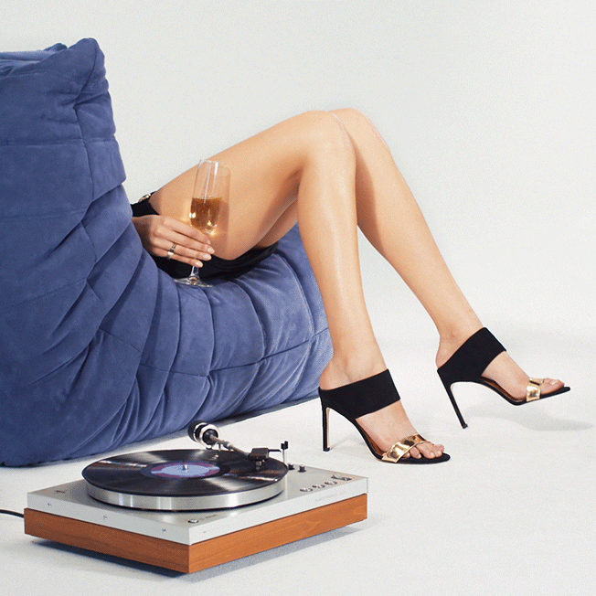
The image is so powerful it pretty much speaks for itself. By showing the shoes in this way it connotes the luxury which the brand uses to define itself. It makes the product stand out and yet feels subtle and tasteful rather than being in your face. There are plenty more of fantastic cinemagraphs used by Stuart Weitzman to show off their footwear line, see some more Cinemagraphs here if you want more inspiration.
Cinemagraph's aren't just for fashion retailers though, all kinds of online businesses can use them to show off their products in a way simple not possible in static images. If you operate an online travel business, this cinemagraph should show you how effective they can be at making your products look appealing.

House of Fraser - Innovative fitting tool
One of the perennial issues with online fashion stores is returns. You have to have a generous returns policy, otherwise your customers aren't going to trust you. But because people come in all different shapes and sizes, your customers are always going to buying things that don't quite fit and want to return them. It's not their fault, but it ends up costing retailers a bomb in free shipping for returns. It's annoying for the customer too- they don't like not knowing if the clothes will fit them right, and nor will they be fans of faffing on with returning the items, no matter how good your returns policy.
It seems like one of those problems which you just have to accept as par for the course and move on. C'est la vie. Plenty of sites offer size guides to try to help the situation, but this doesn't really do much. Ask any woman who's been dress shopping and she'll tell you she's a size 8 in one shop, a 10 in another and a 12 in one.
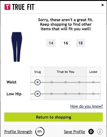
That's where House of Fraser's tool comes in. It's much more than just a size guide, it's actually pretty darn clever. It's also the exact kind of really helpful feature that will make customers keep coming back to your site because they find it so useful. Here's how it works:
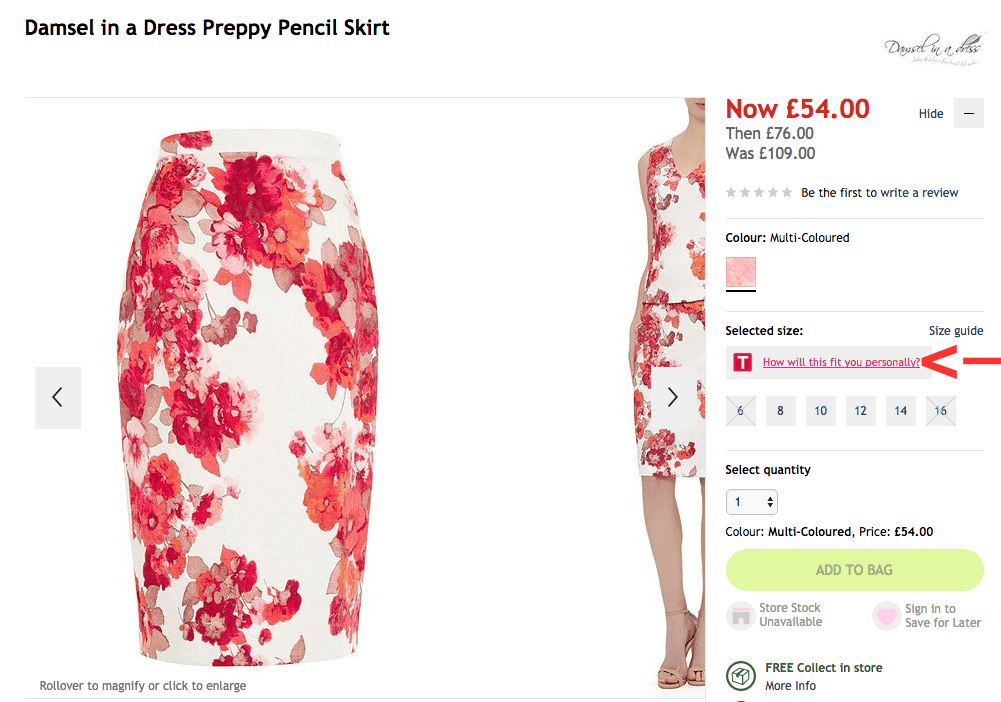
On any product page there is a 'How will this fit you personally?' button above the available sizes. When clicked on it takes the user through a series of questions designed to establish the individual shape of the user. It appears as a pop-up and takes the user through 1 step at a time, and you can see the steps in order below:
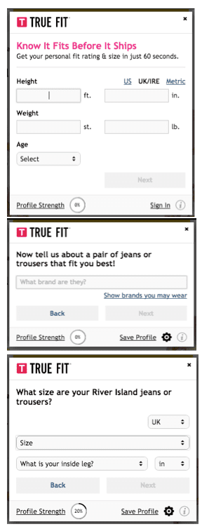
Once you've given this information to help it establish your unique shape (where once you only trusted your tailor with you inside leg, now you have to trust the machine, thank god for those EU data protection rules!) it will tell you how the item will fit and what size would be best for you.
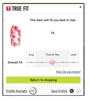
And before you think it'll go telling you ever garment will be 'true to you' in an attempt to get maximum sales, I have got it to tell me that some things just aren't going to fit right so I should look at other items. It may seem like talking yourself out of a sale, but actually, it's just saving you a costly returns process.
Just make sure you work out a way to phrase it well, you don't want go offending any of your customers!
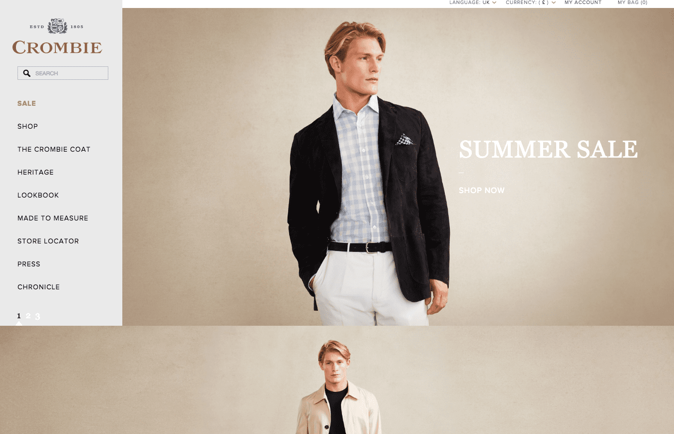
Crombie -visuals & layout
Crombie really stand out thanks to their elegant site design. Often eCommerce sites can be a tad overrun with menus and things trying to stand out with big bright offers, which ends up leaving the whole thing looking a bit messy. Not so with Crombie. They make the most of their visuals by putting them front and center. Scroll down and you'll see a video that's seamlessly embedded into the site so it doesn't appear to have any player which would detract from the aesthetics. The site does a great job of impressing upon the visitor that it is a high end, luxury brand, and the simple and easy to navigate menu doesn't confuse visitors.
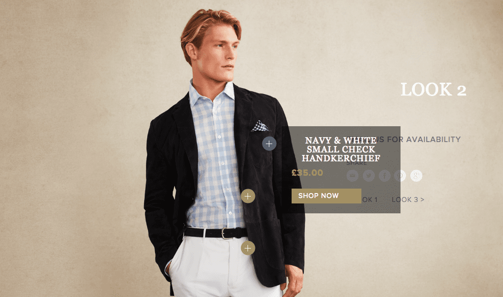
It's not just Crombie's aesthetics that make it stand out. They have created a 'look book' which allows the site to showcase completed looks whilst featuring the individual products which comprise it. Right down to the handkerchief. Plenty of ecommerce sites have 'look books' now, but they've really hit the nail on the head visuals which are both appealing and consistent, thus really helping to reinforce that luxury feel.
Conclusion
I hope these 3 examples of genuinely innovative ecommerce store design and features have inspired you to create a better user experience for your own ecommerce store. A beautiful site and features which help your customers out will do wonders for building a loyal fan base. Promotion, clever re-targeting ads and social media campaigns can get you so far. But it's fantastic UX and visuals that gets people coming back time after time.


