Are you really getting the most value from your landing page?
While businesses often focus on getting the word out to consumers, they often fail to give the same attention to setting up the best trail of breadcrumbs. Landing pages are key to conversion, and if your snappy email sends people to a confusing or bland landing page, good luck getting anyone to answer your call to action.
To create a better landing page and improve your conversion rates, you must understand the challenges in front of you, recognize your areas of weakness, and implement a data-based strategy to overcome your flaws.
Common Landing Page Mistakes
The modern Internet user has an attention span of about eight seconds. If your page requires too much focus from your site’s visitors, you’ll struggle to convince them to do anything but close the page and go elsewhere. For every second your page takes to load, say goodbye to 7 percent of your conversions.
That attention span isn’t confined to the desktop, either. People check their emails and social networks on their mobile phones frequently throughout the day, yet many businesses still don’t optimize their sites for mobile. Optimized sites load four times faster than non-optimized sites, using 80 percent fewer bytes and increasing traffic by 50 percent.
Let’s do the math on this. An eight-second load time on mobile — cut to two seconds with optimization — could mean a 42 percent increase in conversions. That’s a massive increase by anyone’s standards.
Other landing page factors, such as shortening form lengths, also play a role in increasing conversions. Ensuring uniformity between promotional materials and the offer on the landing page inspires user trust. The best landing pages load quickly, send a clear message, and eliminate barriers to interaction that would otherwise prevent visitors from converting.
Building a Better Page
Creating an ideal landing page begins with identifying the building blocks that paint a clear, actionable picture users can interact with.
Every good landing page must have a clear and prominent call to action. If users are interested in the content but have to search the page to determine next steps, your conversions will drop sharply.
If your call to action requires users to fill out a form, keep it short and simple. The longer your form gets, the less likely users will be to complete and submit it. If your product or service requires a lot of information by nature, consider using the form as an invitation to connect further rather than as a sign-up in itself. Or have the submission of the form pre-fill information on the next page where users can complete a more thorough sign-up.
Your landing page should be an avenue for conversions, not an introduction to your company and its services. Display the benefits of your offer in a way that allows users to skim through information. Dense paragraphs will drive away potential conversions and waste valuable space on your page. Utilize bullets, bolded subheadings, power words, videos, and eye-catching images to give users an easy pathway toward a successful conversion.
Testimonials work well, but don’t include entire paragraphs on your landing page. Use a short quotation, and include a link to a video or blog. If it makes sense for your business, show a before-and-after picture or include a key statistic or graph that answers what your business can do for your site visitors.
Finally, include trust seals to show users the legitimacy of your service. The Better Business Bureau logo or the Google Trusted Stores logo, along with links to those organizations, can go a long way toward making your users feel comfortable entering their personal information on your site.
Make Data and Landing Page Tools Work for You
Optimization and tracking tools can be used to great effect, tweaking your landing page to get maximum value from each visitor.
For starters, every page on your site should use Google Analytics for page view tracking and goal or conversion tracking to keep metrics of landing page success. CrazyEgg is a high-quality resource for analyzing click tracking, while LookTracker conducts eye-tracking tests to see which elements your users focus on and which ones they ignore. Merging your click data and eye data will paint a picture of how to optimize your landing page.
Use Optimizely to A/B test page variations for factors such as CTA colors, CTA button messaging (e.g., “Start My Free Trial” vs. “Start Your Free Trial”), CTA and form positioning, headline and subheading content, and other elements such as urgent countdown timers.
This may seem like overkill, but there is a wide variety of avenues through which you can help your landing page really go the extra mile.
Work with your designers to implement these strategies on your landing pages. If you struggle to communicate your ideas to your designers effectively, remember to share the results and data from your testing metrics and focus on working toward a better page together. Make conversion strategies a part of your company culture. Making changes to a page based on metrics does not mean that the original design was wrong — it simply means that pages must evolve over time to meet the needs of the people who are visiting them.
This free Smart Insights guide has categories on Landing Pages and Page Engagement tools that can be used
Download resource – Essential Digital Marketing Tools
This free 100+ page guide explains covers 150 tools in 30 categories for optimising digital marketing.
Access the Essential digital marketing tools
What Success Looks Like
An eye-tracking study was conducted for Mint to evaluate where users were looking, gazing, and fixating on the sign-up landing page.
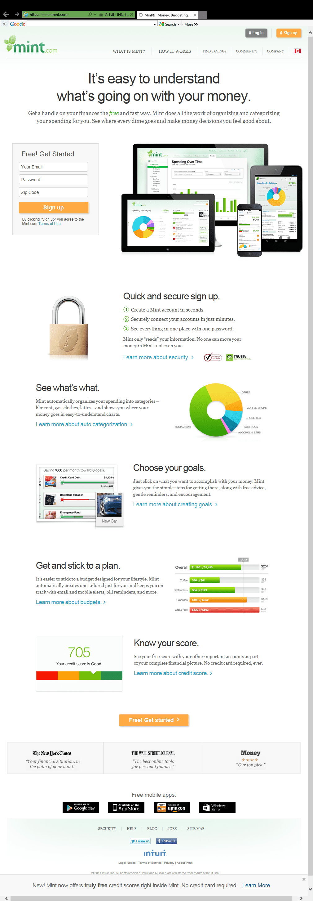
In the initial version, the heat map indicated that users did not focus on the call to action buttons. Too much text caused users’ eyes to flit around the page, and the unintuitive layout made users digest too much information before leading them to sign up, hampering the possibilities for potential conversions.
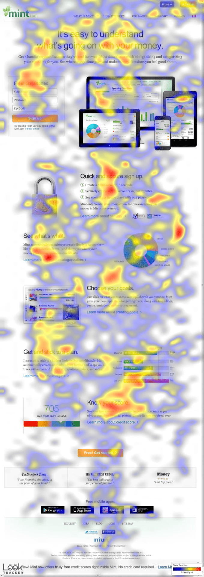
In the updated version, Mint tried to eliminate the clutter and create a cleaner, more effective page that dramatically improved its conversions. The darker background contrasted with the orange call-to-action button in the banner and on the top-right corner of the page. The team removed the form entirely, giving the call to action in the banner the attention it deserved.
The messaging was also adjusted, converting “Sign Up” to “Sign Up Free,” which more clearly articulated Mint’s dedication to personal budgeting and encouraged increased conversions. Rather than force users to read through several paragraphs of information, any large blocks of text were eliminated and replaced with bullet points that allow for much easier skimming. All of these changes encouraged users to digest key bits of information quickly and directed them toward the call to action, dramatically improving Mint’s conversions.
Don’t neglect the importance of your landing page. Streamline your design and simplify your content so you can start turning those short visits into monetized conversions.

Nick Chasinov is the founder and CEO of Teknicks, an agile Internet marketing agency specializing in adaptive and analytics-driven strategies powered by client collaboration and goals. Connect with Teknicks on Twitter.