Custom landing page examples and best practice advice. Always use your data to inform your digital marketing strategy
Discussion of web design in companies who don't know the power of a strong landing page still often focuses on the homepage. But savvy companies who are effective in their traffic building know that many visitors reach the site on other landing pages.
These include both standard website page templates like category or product pages and custom landing pages dedicated to maximizing the conversion of leads when using inbound marketing techniques like SEO, Google Ads, and social media to drive visitors to a site.
Whether you use standard page templates or dedicated landing pages will depend on your sector. For retailers or travel companies, it's impractical to create bespoke landing pages for each category and product. However, for business-to-business service and Software-as-a-Service (SaaS) businesses, dedicated pages are still commonly used to maximize conversion. In other sectors like financial services, it may be a combination, with some dedicated, custom landing pages. In this article, we focus on this form of custom landing pages focusing on B2B examples.
So this prompts the question, which factors make for the most effective custom landing page? Is a 'Perfect Landing Page' possible? This post gives a summary of my top 12 tips and places to look to find more examples.
Core Module

Define landing pages
Part of the Content marketing Toolkit
Learn how to increase conversion rates by improving landing pages
Learn MoreDefining landing pages
Before we look at the best practices in detail, we should look at landing page definitions. Not everyone knows this jargon and actually, there's no simple answer.
My definition is that landing pages are:
"Specific page(s) on a web site created for visitors referred from marketing campaigns, which are designed to achieve a marketing outcome."
Anything referred to as a landing page is intended to maximize the conversion of visitors to a page or series of pages towards a sale.
Most typically, the outcome is conversion to action, typically data capture where a site visitor fills in an online form to generate a marketing lead.
Landing page goals
Effective landing pages are those that meet their objectives, so let's start with typical objectives. Often, it is thought that response is everything - so objectives are not thought through, but this can lead to data capture pages that are too simple.
Typical communications objectives in order of importance are:
- Achieve registration typically to generate a lead, which ultimately leads to sales.
- Profile and qualify the site visitor to deliver more relevant follow-up marketing communications.
- Explain the value proposition offered by the company to differentiate from other sites the visitor may visit during the buying process i.e. Answer the visitor's questions.
- Communicate the brand values of the organization running the campaign.
- If the visitor doesn't want to disclose their details right now, provide contact details for traditional sales channels such as a phone number, or give the visitor reasons to return to the site or engage them through other relevant content or offers.
It is important to run through these objectives as, sometimes, it is just the two primary objectives related to data capture that mainly determine landing page design and not the secondary objectives, which are equally important. The majority of the visitors to the landing page won't convert, so it is important to give them a favorable experience also.
Core Module

Review performance of landing pages in GA4
Part of the Search engine optimisation (SEO) Toolkit
Review the performance of landing pages using Google Analytics
Learn MoreDifferent types of landing page
We have to bear in mind that there are different types of landing pages that work best depending on the campaign objectives and whether it is a short-term or long-term campaign.
There are three main choices. The first is a landing page integrated into the site's structure and is consistent with standard page templates and navigation for the site. The second is a single landing page specifically created for a campaign with a different look and feel, typically with the top navigation removed. The third is a tabbed landing page or microsite that provides more information.
Here are some of the pros and cons of these options.
Option 1. Landing page(s) integrated into site architecture and style
It is most efficient in terms of effort in content creation to make landing pages part of the main site information architecture. The downside is that they may not work so well in terms of converting both direct referrers and browsers navigating from elsewhere on the site. They also need to be search optimized, which may add to the costs of the campaign.
Such landing pages in a particular category or product pages use what is known as deep linking.
Option 2. Bespoke landing pages that are not part of the main site structure or style
These are used where a more "stripped down" page that focuses on converting visitors from an online ad campaign is required. Alternatively, if it is a short-term branding campaign then it may be more straightforward to create a microsite separate from the main site with a different look and feel.
This often happens where the resource cannot be found to create a microsite within the main site, or it is felt that the existing site look and feel cannot deliver the brand impact required. So this approach is used since it can potentially produce higher conversion rates or produce a microsite more consistent with the campaign goals and style.
The disadvantages are that this approach requires more effort and maintenance and often result in poorer user experience since the page will look and work differently to the rest of the site. If it is a completely separate site with a separate domain, a big disadvantage of this approach is that due to the Google sandbox effect, it is not likely to be included in the search results for several months. Given this, the site must be incorporated within the same domain - for example, www.quotemehappy.com redirects to the main Norwich Union site.
Option 3. Microsites with several pages or tabbed landing pages
There is an obvious problem with option two, many visitors to the page will not be at the right point in the buying cycle to convert. Yes, such a landing page will often increase single visit conversion rates because of its simplicity - limited choice and simplified messages - but it doesn't offer sufficient information for site visitors not in "buying mode".
Companies need to work out whether the cost of producing landing pages is offset by the potentially higher conversion rates and better campaign results. Although this approach is surprisingly quite common, I think the approach is often taken for convenience, even though it is more expensive in the long term.
I know of one e-commerce manager for a multi-national technology vendor who tries to educate their hundreds of web and traditional marketing specialists to not use the bespoke landing page approach but to always try to integrate into the existing site structure.
Often though, there is no one right or wrong approach and a hybrid can be used, i.e. you create tailored landing pages only for high volume/high expenditure generic Google Ads pages or for major offline ad campaigns.
The home page can be a landing page
Note that a landing page can potentially be the homepage, although this is not traditional best practice. But, if a company has a limited range of products or the main campaign objective is to generate awareness rather than response, this method can be helpful.
Different referrer types
To make a landing page effective, we also need to think through the full range of places the visitor may originate. There are three main origins we need to design the landing page to accommodate:
- Online media placement: Visitors can be referred by clickthrough from any online referrer such as a search engine, online ad, affiliate site, or e-mail campaign. There are two main types of landing page for these placements:
- Offline media placement: Offline ads or direct mail may have a specific campaign URL (CURL) such as 'www.quotemehappy.com'.
- Visitors that navigate from elsewhere on the site: Such visitors are not using the page(s) as a "landing page", but still need to be accommodated if you are using a deep linking strategy.
Webpage success factors
To be effective, your webpage needs to combine the following:
- Usability
- Accessibility
- Persuasion
- Develop trust in the brand
Core Module

Digital strategy success factors
Part of the Digital marketing strategy and planning Toolkit
Learn how to define a structure and scope for your omnichannel marketing strategy
Learn MoreSalesforce.com - an example of the evolution of a B2B SaaS landing page
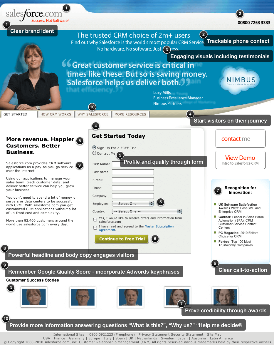
To illustrate the tips included in this blog, I'm going to use an example I've used in training for many years - it's the B2B Salesforce.com lead generation page for its CRM service targeting searchers who are looking for CRM systems. As you look at these, consider the messaging hierarchy based on different forms of trust factors:
- Category. Page title confirming CRM/cloud CRM as a context for people clicking on an ad.
- Benefits. Business growth and relationship building. The middle example has the clearest benefits linking to features.
- Trust factors. Reassuring about the credibility of the provider through the number of companies and users plus featuring icons of well-known brand idents.
- Calls-to-action. Gated demo and free trial.
The Salesforce.com Google Ads landing pages illustrate many good practices. I've marked up what I see as good about this format. It may not perfect, but it's much better than most. Let me know what you don't like about it or how things differ for consumer sites.
This is the original 'classic' landing page example that I used to use in training for over 10 years. It shows many good practices but has one big problem.
It's not mobile responsive, so it isn't effective on smartphones. So, in this later c2017 version, we see a much longer-form landing page still using tabs...
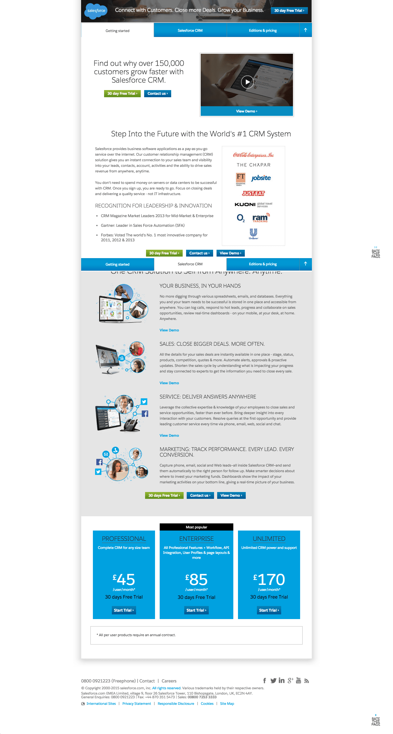
The initial type of three-column tabbed design doesn't work well at all well on a smartphone, so the second design is a mobile responsive page that naturally tends to be longer and can typically only support two columns.
Second, consumer behavior has changed such that with so many landing pages it can be more difficult to get people to disclose their details, so there is often a two-phase data capture where data is captured at the next stage.
Thirdly, testing has shown that long-form pages with more content that build an argument can persuade better for a major investment in time, such as starting a trial.
The latest iteration in 2020 has removed tabs and focuses more on four services rather than benefits. While benefits appear less clear, what Salesforce is trying to achieve is a segmented landing page approach appealing to different personas, i.e. for people managing marketing, sales, customer service, and app development. By having these four choices, the benefit of a segmented path is that Salesforce can communicate more specifically to each audience and can see the number of people interested in each. Effectively, they have replaced tabs on the previous landing pages with the links for the four personas and recommend services.
The calls-to-action (CTAs) are now more prominent - both at the top and the bottom of the page. The use of dual CTAs for watching a demo and try for free for people at different stages in the buying journey is interesting. Both of these are gated by a form.
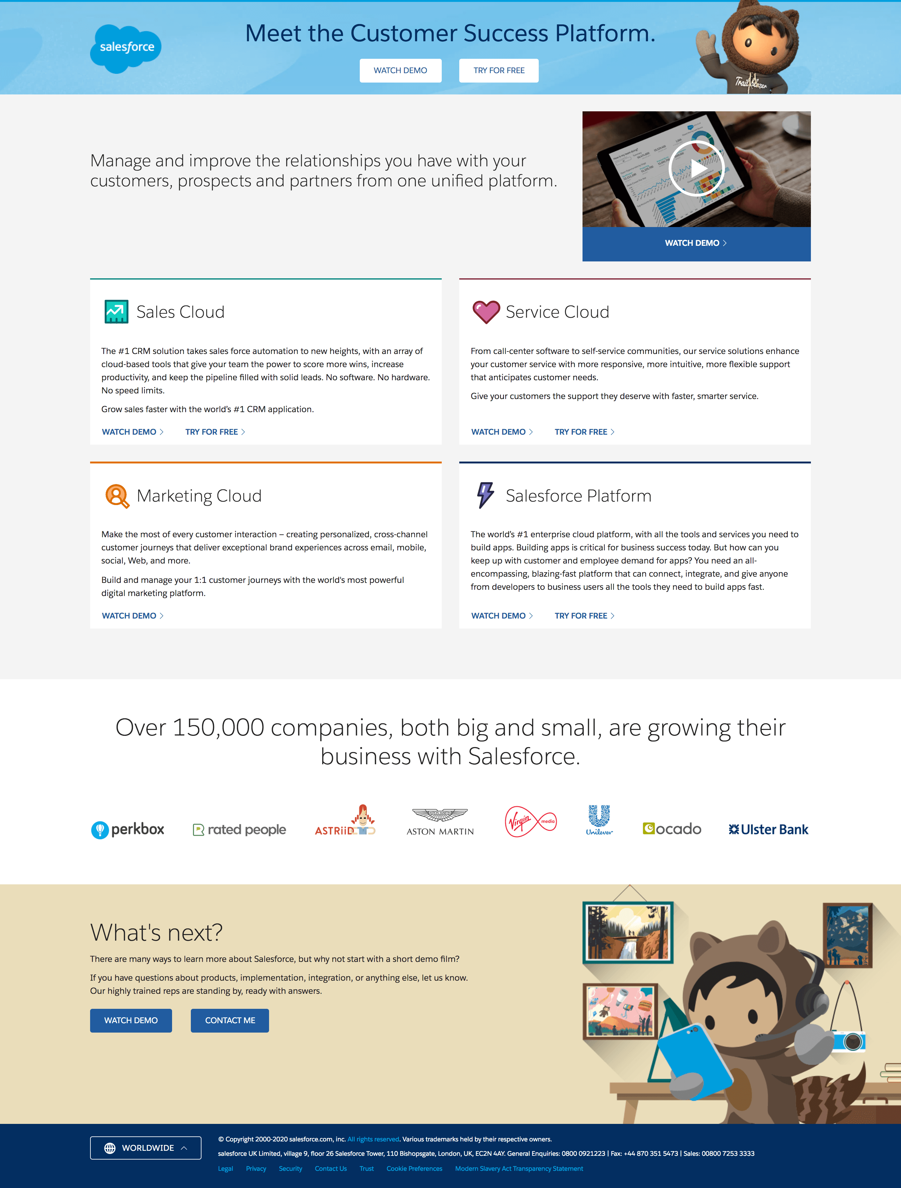
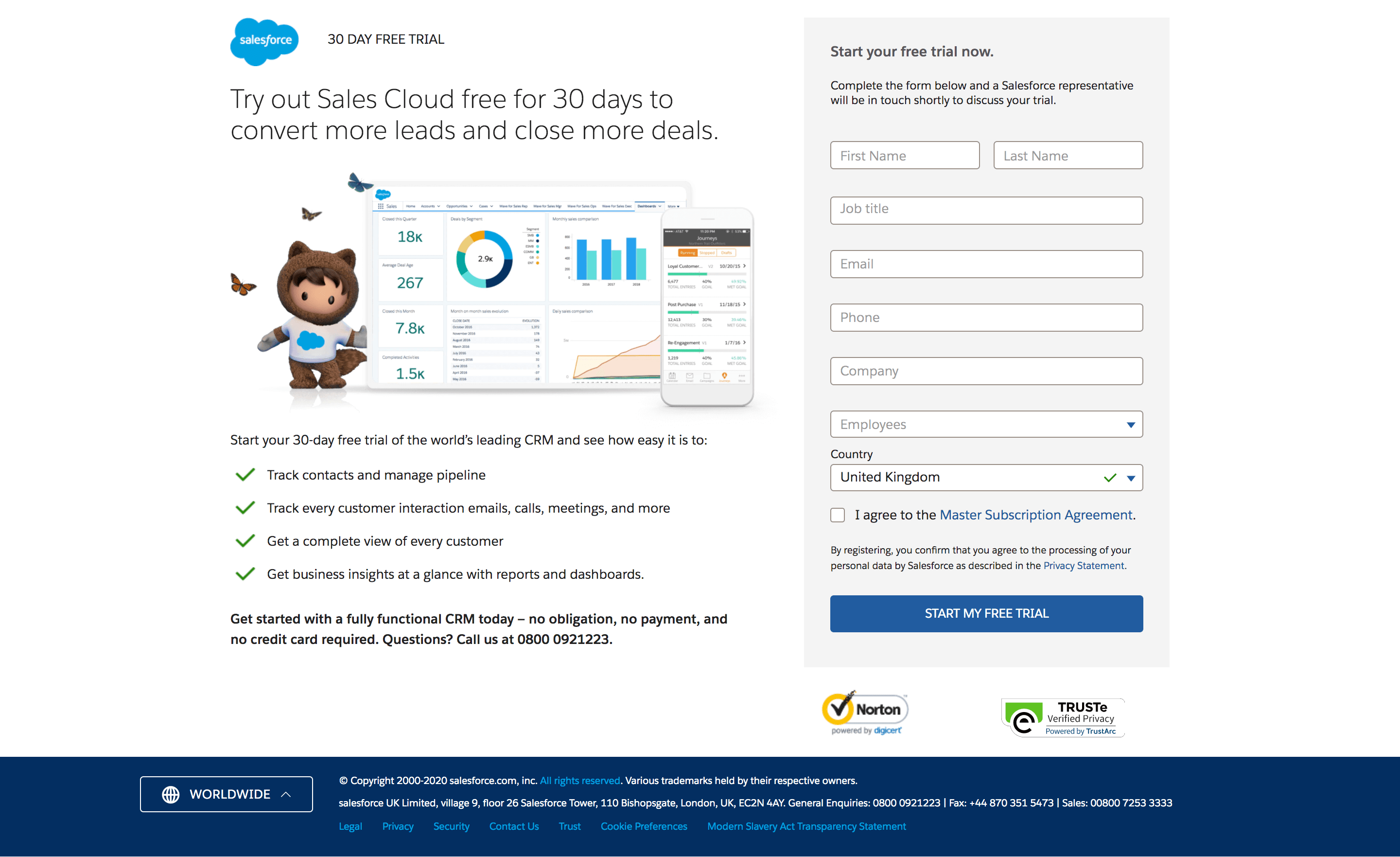
Since data collection isn't practical in this case until someone has read the copy, there is now an additional mobile responsive page to access the demo or trial using this gated form.
My 12 landing page success factors
Finally, before I run through the success factors, remember that guidelines are only guidelines, they, of course, have exceptions. The only way to be sure of what works for your audience and your market is to conduct tests such as usability studies, A/B testing, or multivariate testing. Having the right web analytics tool is vital to this.
As a minimum, you should readily be able to view data on bounce rates (the proportion of visitors who leave the page without visiting more pages) and conversion rates (the proportion of visitors who complete the intended outcome) for different referral sources (e.g. paid vs natural search vs online ads). Ideally, it should also enable you to complete A/B testing where different visitors are served different pages so differences in bounce and conversion rates can be assessed.
Secondly, remember that the guidelines are dependent on the users' typical viewable area of the screen. Ten plus years ago, target screen resolutions were relatively straightforward with a minimum of 1064 x 768 or even 800 x 600. However, the latest data on-screen resolutions show that today it's larger and more complex, although this is skewed by the designer audience of that source, so check your analytics. Statcounter has these screen resolution stats which shows that the mobile 360 x 640 is the most common, so these need to be used to review landing pages.
So finally! these are my top 12 guidelines for landing page effectiveness:
1. Deliver relevance
Unlike casual visits by browsers, visitors arrive on a landing page with a directed goal or intention in mind. So the first thing you have to do is instantly show relevance to help visitors achieve that goal.
A clear headline should show relevance and also engage the visitor to scan down the page. You need to show them they have selected the right place to find the brand, product, deal, information, or experience they are looking for, so the headline must indicate this.
Other key "relevance messages" should be readily scannable through choosing the right headlines and with panels drawing the eye to the different areas. Tests tend to show that larger fonts give a better response.
Since hitting the landing page is often the first experience of a company, we have to answer basic questions that the customer has about the company such as "Who are you?", "What do you do?", "Where are you?" "Do I trust you?" You may have these messages on the homepage, but does the navigation on the landing page allow these questions to be answered? Standard menu options such as "About Us" or "Contact Us" can achieve this.

2. Integrate with referral source(s)
The customer journey to your website started elsewhere. Delivering relevance also requires consistency with what they have already read and seen to meet their expectation.
So in terms of message, branding, and creative, the landing page needs to deliver an integrated communication. This applies, particularly to offline ads, interactive ads, and emails.
The key message on the landing page needs to be consistent with the key message of the referral source. So again, you need to show the visitor they have selected the right place to find the brand, product, deal, information, or experience they are looking for, so the headline must indicate this.
3. Provide sufficient detail to support the response decision
The whole experience and content need to be right to generate a response. For me, one of the most important aspects of landing pages - and one that is often not right - is that there isn't enough detailed information on which the visitor can decide to signup. This is why I recommend option three above.
To help determine the right level of information, the best practice is to use web design personas to identify typical information required and the gap relative to what you deliver. Also, think about the level of "domain knowledge" the user has - do your technical product descriptions make sense? You should also think about "tool knowledge" - where your landing page requires using additional tools, what knowledge is required to use them effectively, and whether you are providing the right explanations.
4. Start the user on their journey
The design should make the next step clear and minimize the number of clicks required for a response since every extra click required in response will generally reduce the chances of a response by 10%. It is best practice to include the initial data capture on the first page, as shown in the Salesforce.com example.
If the response mechanism is on another page, use multiple calls-to-action to gain responses since some visitors will respond to images and some text hyperlinks. Make all images clickable, for example, by making them look like buttons.
Form-related approaches to improve the journey:
- Limiting the options on each page is an effective technique.
- Grabbing attention in first 30 seconds through a headline and lead that reflects ad copy and "isn't too clever", i.e. be direct.
- If it is a multi-page form, then draw users in with easier initial questions.
- Allow the form to be saved part way through the quotation.
- Use dynamic headlines related to referrer including search keyphrase to help deliver relevance.
- Use focus groups to decide what to test - marketers who are too close to the problem may disregard factors that are important to customers.
This charity landing page example, provided by Liam in the comments ticks many of these boxes!

The words used to form calls-to-action are critical to creating a scent trail that users of the site follow. An effective scent is delivered where the words match what the user wants to know or achieve.
5. Use the right page length
This is a difficult one to give guidelines on. The right copy/page length is one that minimizes the knowledge gap between what the user wants to know and what you tell them.
Some designers would suggest that content must fit on one page that doesn't require scrolling at 800 by 600 resolution. But short copy is often inconsistent with my first guideline. Also, tests have shown that pages can be scrollable - users will scroll if they appear scrollable. However, it is best if key information, including a response mechanism, is above the fold.
To summarize, I would say, make it short (for impulsive readers) but also long (for readers who want to read more).
6. Use meaningful graphics
Graphics must be consistent with the campaign and generate empathy for the audience. Don't underestimate the importance of quality graphics - stock graphics rarely work. It is difficult to assess how graphics influence conversion rate, so the implication is to test, test, test to get an idea of what works best for your site and your audience.
7. Remove menu options?
Another guideline that causes disagreement. Removing menu options will often increase conversion rates as you provide less choice when it comes to where users can click. But for those who don't respond, removing these options will give a poor experience and prevent them from browsing other parts of the site. Often a compromise is best with a reduction in menu options to top-level options only.
8. Consider using a "flowable" or liquid layout design
This maximizes real estate at a given resolution on different devices. These days it's also called responsive design.
Although this can work well for a retailer to show more products above the fold in a category, this is achieved with a loss of control of the design. For landing pages, a controlled, fixed design will often work best.
9. Remember search marketing
There are three aspects to this. First, an offline campaign will lead to people searching for your brand or the campaign strapline. Make sure you are using paid search to direct visitors to the relevant pages particularly during the campaign.
Second, if the page is integrated into the web site and will be used in the long-term, optimize it for relevant search keyphrases using standard search engine optimization techniques.
Core Module

Understanding consumer keyword search behaviour
Part of the Digital experience management Toolkit
Learn about consumer search behaviour in relation to keywords and keyphrases
Learn MoreThirdly, Google sends out a robot "Adbots Google" to test landing pages for relevance and speed, so make sure your <title>, headings and body copy include the keywords you're using to trigger your ad and including in ad copy.
10. Remember the non-responders.
Provide a choice for those who don't respond despite your carefully crafted landing pages. Include a reasonably prominent (trackable) phone number or perhaps a call-back/live chat option. Also, provide some options for them to browse or search elsewhere on the site.
11. TIMITI
TIMITI is a term coined by Jim Sterne, author of Web Metrics. It stands for Try It! Measure It! Tweak It! i.e. online content effectiveness should be reviewed and improved continuously rather than as a periodic or ad-hoc process. Today, using AB or multivariate testing tools like Google Website Optimizer is an essential part of landing page optimization.
Because the web is a new medium and the access platforms, user behaviors and competitor approach all change continuously, what works at the start of the year will certainly not work as well by the end of the year.
Core Module

Reporting on marketing activities using Google Analytics
Part of the Google Analytics Toolkit
Learn how to use reports to review performance in Google Analytics
Learn More12. Consider landing page longevity
Landing pages are often used for short-term campaigns. If this is the case, you need to carefully manage when they and links to them from within the nav are expired. Risks include out-of-date offers and visitors typing in URLs that are no longer valid. The use of a custom 404 Error page is essential to manage these problems gracefully.
Final thoughts
Remember that there are always exceptions to guidelines and some have suggested that many of the commonly held usability guidelines are myths. Always use your data to inform your landing page decision marking.


