Learn how we updated and improved our key membership pages to increase conversion and improve the quality of leads with simple customer-centric copy changes
To stay ahead of the competition, you need to keep monitoring and reviewing your key sales pages - are they converting, how much is it costing per user to convert and how can you improve conversions?
At Smart Insights, we'll hold our hands up and admit our key Business Membership sales pages were due an update and so we started work on these at the beginning of the year. Here's how it went...
The problem
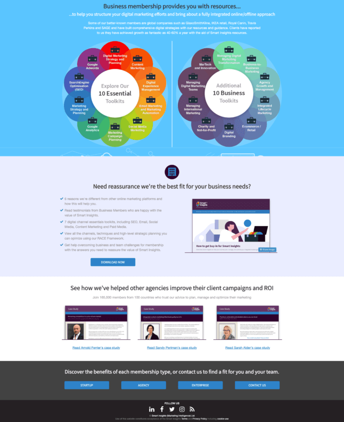
We had four landing pages that were designed to describe the value proposition of Business Membership and direct users to relevant pages to find out more:
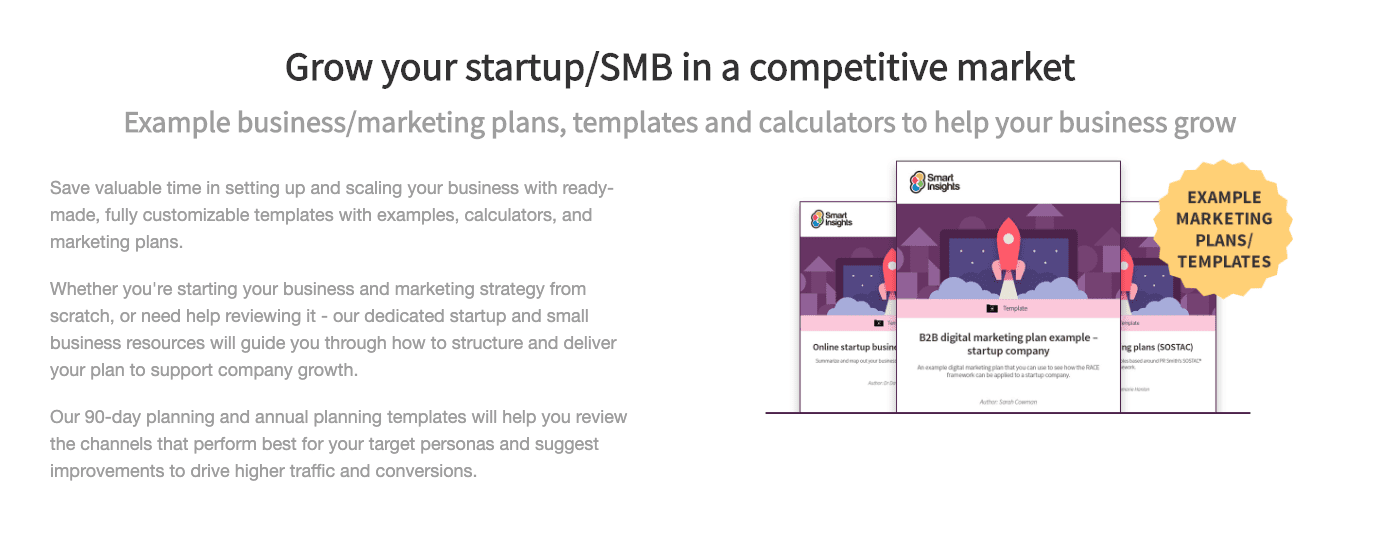
- The overall generic filter page that is used to capture leads who would like to learn more about the different types of Business Membership, without delving too deep into the tiers.
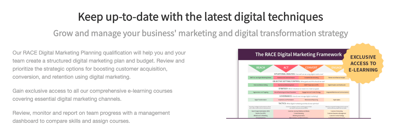
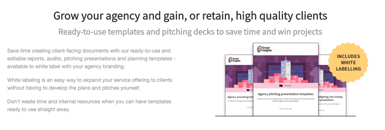
- Three specific industry pages (Startup, Enterprise, Agency) that were designed to educate users about the three different tiers of Business Membership, specific to their needs.
In doing this, we had hoped that leads would be more qualified and have a better understanding of our product, however...
The main problem was the similarity in the copy. Almost all the copy was identical, which - as you'll know - from an SEO perspective, is a red flag for search engines scanning for duplicate copy.
On top of this, the three industry pages weren't performing as well as they should have been. We primarily blamed the lack of specific value proposition and industry pain points for the lack of user engagement in these pages. They weren't giving visitors to the pages the reason why they needed us or showing how we could help them. They were too generic, and not customer-centric.
Looking at the three industry pages side-by-side, users would find little difference in the memberships, as we had been previously bad at communicating how each industry would benefit from our range of guides, templates and e-learning.
We knew these pages were a problem, but due to a lack of internal resources, time and other projects looming in the near future, we made the mistake of letting them perform poorly for far too long.
Below is an image of the three industry pages side-by-side. From a design perspective, they are following brand guidelines and look like a suite of pages to educate visitors. The problem lies in the copy:
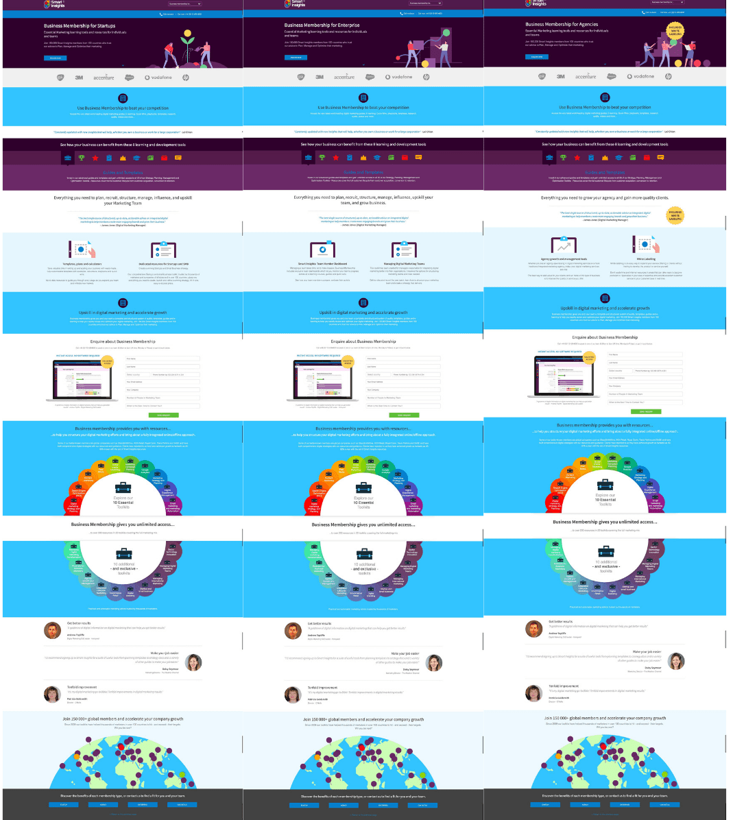
So what's wrong with the copy?
- It's 95% identical on every page.
- It gives only basic information about Business Membership and is not tailored to specific member tiers.
- It repeats the same testimonials on each page and is not tailored to members in the specific industries that have found value in our membership.
- Although it tells members what they get, it doesn't tell them why they should buy and how membership will help them.
Our core aims
Overall, we had three core aims we wanted to achieve by redesigning and rewriting the Business Membership landing pages:
- Increase the volume of leads/conversation rate for each page.
- Increase the quality of leads: To increase the quality of leads we needed to better educate users about the features and benefits of Business Membership, target their specific pain points and address any barriers they may have whilst researching membership options. This would mean when they submitted an inquiry, they were better educated about our product and ready for a conversation about a membership that best suited their needs.
- Increase value per sale: By targeting larger organizations and improving the Enterprise page, as we realized this was one of the lowest converting Business Membership pages.
Essentially, we wanted to increase the quantity and quality of leads, but we were fully prepared to take a hit on the volume of leads if it meant an improvement in quality. We needed leads to have an understanding of our membership offer in order for the Sales Team to work with them to offer a package that they needed.
The process of optimization
1. Messaging and key value propositioning
First, we sat with the Sales Team and discussed what each industry's pain points are, why they come to us for help, and what they need to achieve since our Sales Team and Account Managers are at the core of understanding our customers' needs from talking to them every day. They understand why a lead converts and why they don't, so extracting this information was essential in getting our messaging on the new landing pages correct.
We then had the core features, benefits, and values for each membership tier, which would provide the foundations for the targeted copy. Overlaying the key messaging matrix with our knowledge of our Business Membership personas and we were ready to start creating the wireframes and copy.
The most important part of this process was categorizing the copy into three key groups:
- What is the essential information they need to know to make a basic decision if we're the right fit for their needs?
- What is the "nice to know information" - mainly this copy was what the Sales Team would explain on calls and emails to interested prospects. By adding this onto the pages, it would help the Sales Team have a more qualified conversation about potential customers expectations.
- What is the information that helps increase social and emotional trust - these came in the form of new case studies and testimonials.
2. Wireframing and UX design
We then had a decision to make: update just the copy and keep the design/navigation the same, or create completely new pages that followed a more up-to-date brand redesign?
We made our first mistake here.
We decided to change the navigation/UX and the copy. Instead of having a landing page that only had a top banner with our logo and an Enquire Now button, we wanted to make the site feel cohesive and decided to put the main navigation bar on the pages.
As we learned when we tested the new pages, this gave users too much choice, distracted from key messaging and gave them an option to go to other pages on the site without submitting an enquiry.

What we thought would be useful to users - adding in the universal navigation bar - actually distracted them from the messaging, meaning there were fewer enquires submitted compared to the original pages that had a minimal header bar.

In the end, we changed the header back to a minimal design to create a fair test comparing copy with copy with a fresh new page design that didn't interfere with the UX.
What copy changes did we make?
As I've mentioned before, we made sure all copy was customer-centric and either answered their questions or discussed the benefits of the product to them.
Each industry had its own main point of interest/marketing pain point (which we found out through speaking to the Sales Team), so this became the talking point for the first section of membership copy on the page. All unique and specific to their needs, this displayed the main reason they found themselves on our site.
We know that our personas in startups and SMEs are looking for pre-made and easy-to-use templates to help them develop their marketing plan. For them, it's all about saving time and being able to get their business running smoothly as quickly as possible, which is why our ready-to-use marketing plans, templates, and budget calculators are always the most popular content types. We, therefore, highlighted these content types at the top of the page.
We then replicated this for Enterprise and Agency, but ensured each page had its own unique selling point.
Finally, we had the main point of interest - now we needed to expand on other barriers to purchase and make sure we were targeting all their specific needs and challenges.
The design would stay the same, but the copy in each section would be tailored.
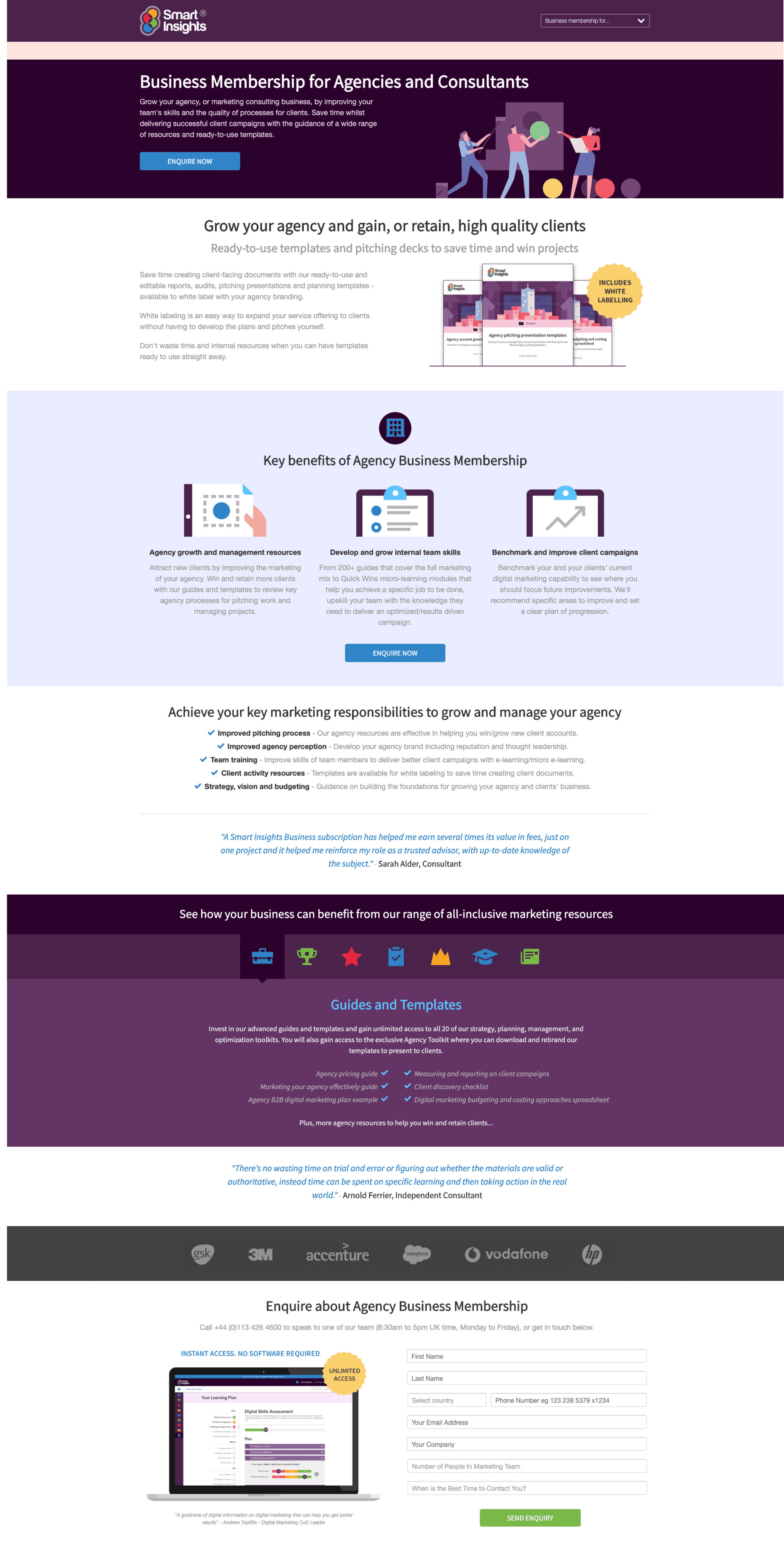
Agency Business Membership page - example
So what did we do?:
- Included the title of the membership and a brief introduction of how we can help in the top banner.
- Added a top CTA to give easy access to the enquiry form for returning visitors who already know our product and want to enquire.
- Included the main point of interest for membership (in this case Agency members are most interested in our white label content to help them present plans, reports and presentations to clients).
- Added three other key benefits of membership (as agreed with the Sales Team - this is the extra benefit of membership and the added value they gain from purchasing).
- Included five key emotional benefits of membership (this is where we targeted their emotional needs, the jobs they need to do to succeed in their role).
- Drip fed testimonials in-between copy to increase social proof.
- Added an interactive panel that details our product and the resources specifically suited to their needs.
- Included the enquiry form.
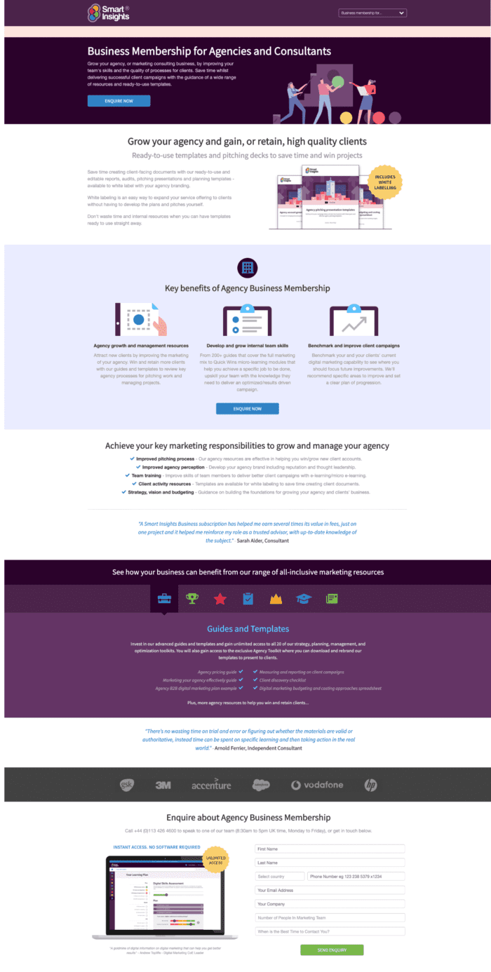
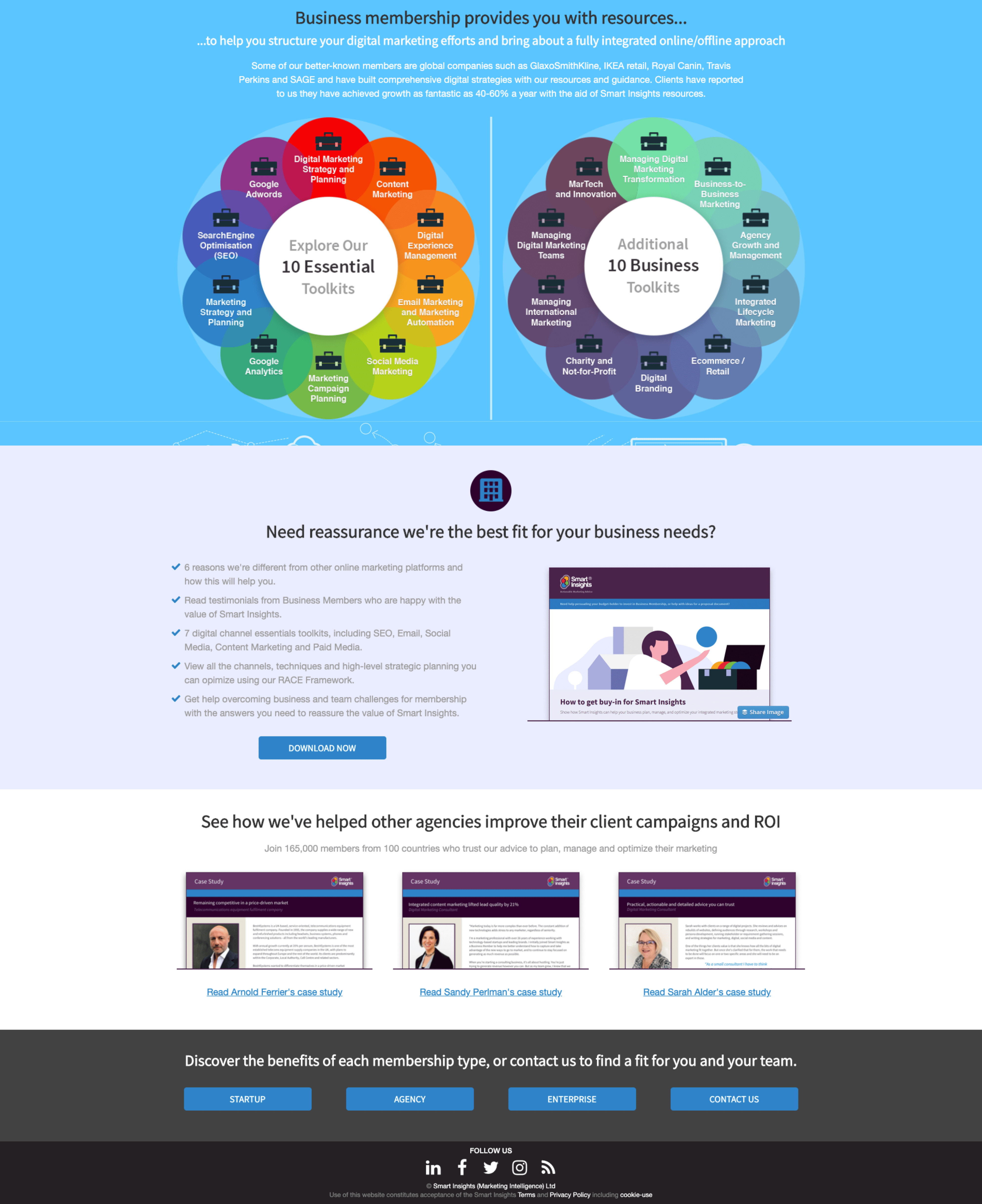
One key design issue you might spot is how low the enquiry form is on the page. You might be saying to yourself that it's too low, that users have to scroll a few folds to be able to enquire. However, we found that they needed all the above information to make an informed decision about whether our membership was suited to their needs.
Essentially this helped us make sure those who enquired were well informed and, therefore, more qualified leads. By taking the time to read and enquire, it showed that they were serious about membership, making them higher quality leads.
But we didn't just rely on this as the top banner header is a sticky banner and so followers the user down the page with an "Enquire Now" button. This means there is always a visible CTA if a visitor wants to enquire before getting to the form.
However, our event tracking data suggests that more users click on the very first CTA on the page or the CTA in the "Key Benefits" section. This makes me a very happy copywriter, as people are actually wanting to read my copy.
Success!
There is also more information under the enquiry form, which we decided is "nice to have" but was not 100% necessary for visitors to make a decision. This includes a downloadable buy-in guide and case studies.
We didn't want to push case studies in front of visitors until they understood the product, the value and the key benefits it offers to them. Social proof is a great way to showcase your product credibility, but it can sometimes be too pushy and users want to know why it's useful to them before they read about why it's useful to someone else. This is why we decided to drip feed testimonials throughout the copy and leave the case studies to the end as a final persuasive tool.
How did we measure results?
We opted to A/B test the new pages against the old ones by using Google Optimize to direct 50% of the original traffic to the new variant pages. Because we had a new filter page, plus three new industry pages we needed to make sure that if users saw the new filter page they would always see the new industry pages to keep the test fair.
If they submitted an enquiry on any of the new pages it would fire a Google Analytics goal to which page prompted the submission. However, this way Google Optimize wouldn't distinguish the difference between the filter and the page conversions but helped us see it as one suite of conversions.
We then used our own WordPress form tracker to individually check each form conversion (this can be set up on GA is separate goals for each form, but we had already exhausted our 20 goals on GA).
The results
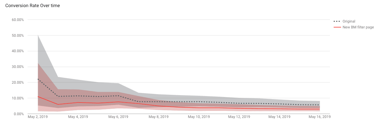
Our first 50/50 split test was a learning curve.
The new variant failed with the highest range conversion being 4.9% compared to the original's conversion of 8.2%. We ran the test for two weeks before deciding there was enough proof that the new version was not performing.
We then looked at the original pages and the new pages to compare differences.
Bear in mind that the new pages were significantly different from the originals because of the duplicate copy/SEO issues. This wasn't a "standard" A/B split test where we only changed one section/variant on the page - it was, in essence, a brand new page.
We concluded that we couldn't determine the precise reason the new pages lost the test because we had changed so much (navigation and copy), so, as previously stated, we decided to change the new pages back to the original navigation so we could fairly test copy vs copy.
It was a rookie error, but we made it and quickly learned from it.
We tested the original against the new variant for the second time - and this time, the new pages won. No navigation distraction meant the new copy was serving its purpose, it was persuading visitors to enquire about our membership.
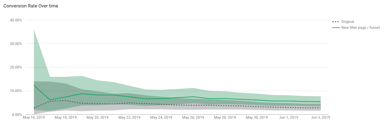
So overall, the new pages won. But how did they each individually perform?
- Original filter page - 0.1% conversion
- Original startup page - 5% conversion
- Original enterprise page - 1.4% conversion
- Original agency page - 3.4% conversion
All original pages were converting at 5% or less.
- Variant filter page - 0.6% conversion
- Variant startup page - 6.3% conversion
- Variant enterprise page - 2.8% conversion
- Variant agency page - 6.9% conversion
The new pages increased conversion on all forms, the highest being for the Agency page where we saw double the conversion compared to the original page.
I can also confirm that from the new leads we've seen a 27% increase in revenue, supporting the goal that the quality of leads coming through is higher, with people being more engaged with the brand/product and ready to buy.