It's best to test these 4 design elements before using them across your site
It’s real easy to jump on the band wagon and employ design and usability elements that everyone else is using. But have you done your research to see if those elements could be detrimental to your conversions?
Before you leap, here are a few elements that should be considered before implementing them.
1. Rotating Picture Sliders
Slids or carousels, often used on a home page can make a dull site feel more flashy and active. And they make the most of a websites limited space above the fold by displaying several messages.
Perfect. Right?
Well, not exactly.
A study by usability expert, Jakob Nielsen , revealed that participants found it extremely difficult to answer even the simplest of questions when it came to the marketing messages in rotating picture sliders or carousels.
Participants simply couldn’t grasp each message when so many messages were thrown at them.
A study by Notre Dame goes further to show that only 1% of visitors seem to even engage with the slider. And out of those that do, it appears that they really only engage with the first slider. Rendering the remaining slides as not being very effective.
Why are these pretty sliders that make the most out of space so ineffective?
Well, there seems to be several reasons.
For starters, there is too much movement. Since humans by nature focus on movement, the very movement of the sliders becomes the center of focus rather than the marketing message itself.
Then there’s all those messages. As Jakob Nielsen pointed out, bombard visitors with too many messages and they aren’t able to absorb any of the messages at all.
Speed is a factor too. Many websites set the rotation speed far too fast where visitors can’t finish one slide before they are presented with the next slide. And that could really frustrate visitors.
Remember banners? Or maybe you don’t. The constant display lead to banner blindness where visitors began to not even notice them. The same thing is beginning to happen with rotating picture sliders. Visitors are beginning to ignore them.
This doesn’t mean you have to get rid of your slider al together. Conduct a split test to make sure it’s not harming your conversion rate. Slow down the speed so visitors have time to read each message. Or, give your visitors the power to click to see the next slide if they so choose.
2. Captchas
Captchas definitely serve a purpose. They make sure that humans, not bots, are submitting webste messages.
Bots can spread malicious code, add links to improve search engine rankings or mass advertise.
CAPTCHA is an abbreviation for Completely Automated Public Turing tests to tell Computers and Humans Apart.
Despite serving an important purpose, they still come with their problems.
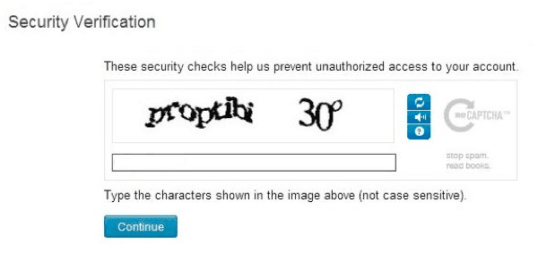
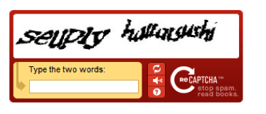
For one thing, they can be very difficult to read. Take a look at the captchas below… When is the last time you saw a key on your keyboard for a degree sign? Or is that a letter O or the number zero following 3?
How confident are you about the code below?
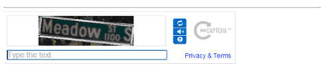
Or how about this street address? How exactly should it be spaced when submitting it?
If your visitors keep getting rejected for the inaccurate code they’ve entered, it’s very likely they will give up all together. Thus, never submitting a message at all.
Another important factor to consider is that visitors don’t appreciate having to fill out so many forms.
A study by Hubspot’s Dan Zarella revealed that redcuing form fields from 4 fields to 3 fields on 40,000 client forms created a 50% increase in contact conversions
Animoto’s, Chris Korhonen conducted a split test to see if captchas were hurting conversions.
The forms that did not include a captcha, yielded a 33.3% increase in conversions.
An alternative to captchas is the honey pot method. Here, CSS hides a form field that should remain blank. If the filed comes back with information entered, it’s evidence that a bot has filled out the form – not a human..
3. Stock Photography
How about that live chat operator that you’ve seen on a few hundred websites? Do you really think people are going to believe she works for you?...and 100 other sites?
While it is important to provide a professional looking site with quality imagery, you don’t want to erode trust here by using images of people who clearly don’t work for you.
It would be far better here to add images of the actual people who work for you.
4. Hamburger Menus
This is a relatively new trend and is primarily used on mobile sites to save room. If clicked, it opens up a menu bar.
Now, the navigation menu bar is the hub of a website in getting visitors around. It’s a very important factor. So you’d better make sure that visitors actually open it up
But will visitors actually know what this icon represents?
There’s a good chance that they won’t. And that’s not a chance that you want to take.
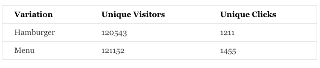
ExisWeb conducted a split test on the hamburger menu to see how it affected conversions.
This first variation uses the hamburger icon alone.
This second variation uses the word “MENU”.
Testing revealed that the MENU button was clicked 20% more times than the hamburger button.
While trendy design elements can be appealing and effective, it’s important to gauge how they actually effect conversions. However, this is a common convention, and it's growing in importance.
Conclusion
While getting your message across in a limited space, keeping bots from spreading malicious viruses and creating a professional site are really important factors – it’s ultimately conversions and how they affect your bottom line that matters.
So consider carefully before using standard interface elements because they are in common use, it doesn't mean they are 'silver bullet's. Instead consider alternatives that may allow you to do all these things without harming your bottom line.
Slow down picture slider speeds to allow for time to read messages, use images of the actual people that work for you, use the honey pot method for email submissions and provide clarity by using the word MENU to let visitors know how to open up your navigation.
Thanks to Marie Dean for sharing their advice and opinions in this post. Marie Dean is the Innovation Director at ConversionLifters and has been working in the field of conversion optimization for 12 years.
By Expert commentator
This is a post we've invited from a digital marketing specialist who has agreed to share their expertise, opinions and case studies. Their details are given at the end of the article.
Explore this Toolkit
The Digital Experience Management toolkit contains:
 Thanks to


