New research: The SimpleUsability Online Experience Index for UK Fashion E-commerce sites
This article summarises our review of the clothing retail websites for Marks & Spencer, Hobbs, Karen Millen, French Connection, Boden, Oasis and Fat Face. Reviews were performed in the week of 10 March 2014. The aim is to highlight best practices and areas for improvement that can be applied by retailers. You will see from the Radar charts for the retailers that there are substantial differences in experience of each of the customer journey and overall.
Understanding, measuring and improving the customer experience is a pretty fundamental part of everything we do at SimpleUsability.
Whether we’re working on competitor or comparator testing at the start of a project, multi-platform testing across a number of devices, or an expert review, our research and the resulting recommendations help our clients to improve their customer experience and benefit from the associated commercial gains around improved conversion or internal cost savings.
Whilst usability or accessibility scales are common place, our intention with the Online Experience Index is to apply 30+ years of combined user experience knowledge to benchmark the overall user experience, within specific ecommerce verticals and identify who is leading the way in delivering a powerful customer experience.
Key Findings from our review of the clothing retail websites:
- Most sites communicated their brand and purpose of their website well.
- The main navigation was clear and descriptive on most sites.
- Few provided support for search or clearly indicated the order of search results.
- Product pages were comprehensive and pricing clearly indicated.
- Most sites supported customers through the checkout process well, however, few allowed users to make a purchase without setting up an account.
Methodology of our E-commerce research
To score each site’s overall experience rating, a panel of expert UX professionals assessed the site in the context of a core user journey of browsing and purchasing an item.
The examiners rated the site on over 120 key touchpoints, which were tailored to provide a thorough, representative picture of the user experience.
These were systematically weighted to denote the relative importance of each individual aspect of the site, and were designed to span multiple facets of the user journey, including homepage, navigation, search and product pages, as well as the flow and usability of the checkout process. From this, an individual rating was able to be drawn up for each facet, based on the overall usability.
In order to emulate a naturalistic user experience, examiners conducted the review whilst undertaking the task of browsing for and selecting items for an outfit, and proceeded to purchase these items as a new customer to that online brand.
The Index, by facet - Individual Website Ratings
Considering each facet of the user journey in turn, we found a variation of design usability across the websites that is highlighted through their individual ratings. The following diagrams illustrate the best and worst individual ratings by facet of the user journey.
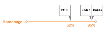
The homepage announces the brand identity and the purpose of the website. Most of the sites in this review did this well, with the identity in the header and purpose of the website clearly shown above the fold.
One site, French Connection, did something different. Their identity is dropped to the footer where it might be missed by users familiar with finding the logo and identity in the header
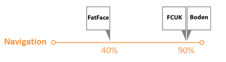 In general navigation was done well in these sites, using a top level menu in the header with drop downs for the sub categories. The labelling was clear and descriptive with few examples of jargon. All sites honoured the back-button and most made good use of breadcrumbs to help locate users and provide additional navigational routes.
Sites should, however, take care that navigation is clear and distinctive from other elements of the site.
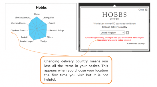
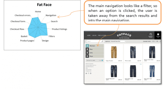
For example, the header on Hobbs crowds the main navigation menu with the search, basket and sign in elements that may overwhelm and confuse users. One site, Fat Face, used an innovative form of navigation that may confuse users new to the site.
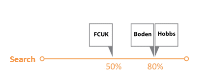
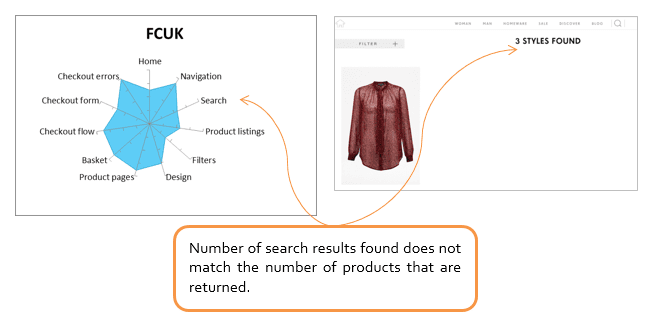
In general, search results were displayed in a similar layout to product listings, enabling users to interact with them in a familiar way. However, it was not always clear what order results were displayed in or how many results were available.
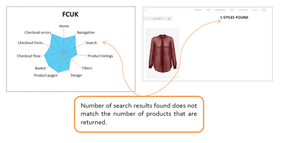
French Connection, for example, displays a count of results much higher than the number of items displayed and obscures the function to sort the results under the Filter link so the casual user may be very confused
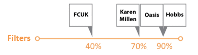
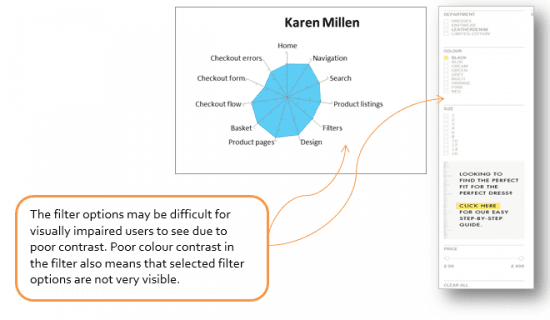
Most sites provided well organised filters that enabled users to narrow their results within several categories. For some sites, for example Karen Millen and French Connection, features within the filters were displayed with very low contrast that may cause problems for users with visual impairments.
-
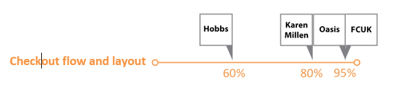
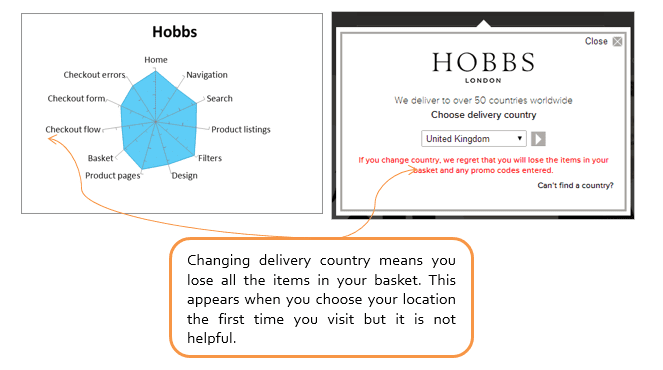
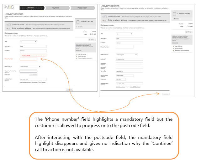
Website - checkout flow and layout
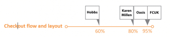
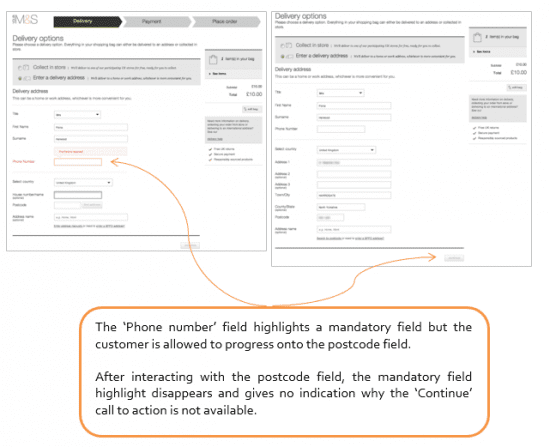
In general the sites broke down the process into several stages and clearly indicated the stages up front. Most also allowed users to move backwards and forwards in the stages to enable them to make changes.
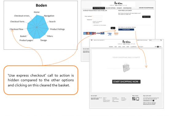
Few sites allowed users to make a purchase as a guest, so unlike buying from a high street store, the user was forced to set up an account with the site to make a purchase.
The Index visualisations
The following diagrams draw together the individual ratings to visualise, by retailer, the user experience across all facets of the user journey.
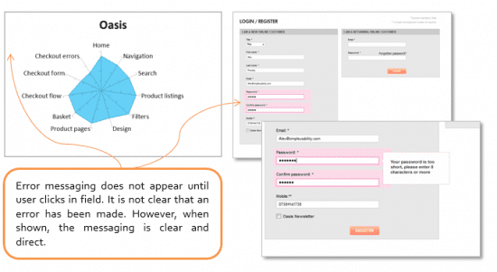
Oasis - Total index score: 80%
Karen Millen - Total index score: 78%
FCUK - Total index score: 74%
Hobbs - Total index score: 81%
Fat Face - Total index score: 72%
Boden - Total index score: 83%
Marks & Spencer - Total index score: 86%
Watch out for our next online experience index which will have some new features including; persuasion centred design and scores based on the mobile experience.
We’ll be adapting our index to add sector specific questions and omit areas of the index that are not as relevant depending on the subject that we are reviewing.
Our plan is to target particular categories and topics moving forward. We’ll be looking at how well department stores are bringing multiple department shopping experience to end customers, and looking at specific categories such as shoes and younger fashion.

Thanks to Guy Redwood for sharing his thoughts and opinions in this blog post. Guy is the MD and Founder of
SimpleUsability. Guy has nearly 20 years' experience managing and directing a successful media business. Guy has spoken at a range of conferences about X research methodologies and is recognised as a pioneer in the application of neuro-research techniques. You can connect via Twitter at
@SimpleUsability or
Facebook.