Best practice principles and examples showing how testing colour can boost conversion
In my previous post exploring research and examples showing the principles of Colour Psychology, I illustrated how colour choices can impact user engagement and conversion. There is so much to share on this topic, that in this follow-up I look into more detail on the use of colour for your Call To Actions (CTAs).
When you want visitors to out-click your competition, some people suggest that you do things with big, fancy names like use conversion-centered design principles. It would be a whole lot simpler to say 'design your pages so people are unable to avoid clicking where you want them to.'
One of the best ways to do this is to employ the proper combination of colour and contrast. The colour elements of a landing page work together to immediately capture the attention, and direct the visitor’s eye to that all important Call to Action (CTA) button. The best way to begin is to think about what your own eye is drawn to on a landing page (especially on pages which convince you to take that next step and click).
While people may go around and around extolling the virtues of red versus green CTA buttons, a reasonable amount of research and testing has gone into determining how colours translates into conversions and why (see Smashing Magazine and Hubspot).
Split-test experiment
One such experiment came in the form of split testing carried out by conversion optimization experts on the product landing page of a European e-commerce site dedicated to the sale of hand-painted porcelain. The process involved creating a cloned version of the landing page with no alterations except for a change of colour to the CTA button.
Visitors were shown either the original or the new version of the page in equal numbers, and the number of conversions for each version monitored. This simple change resulted in an astonishing 35.81% increase in conversions in favor of the altered version. Why? Because this seemingly unimportant change provided an important visual clue answering the consumer’s unspoken question 'where should I click?' The reason for the sudden increase was based less in the colour used itself than in the fact that the colour was the correct choice when it came to inspiring visitor confidence on that particular page.
Before you consider colour, there is the matter of 'message match'. People want to know that when they click 'Get your free, thirty-day trial today!' that is exactly what they’re going to get. No one wants to get all excited about a life-changing anti-aging serum only to be redirected to a pop-up ad for diabetic compression socks. When you tell someone where their click will take them, you’d darn well better take them there. Once they do, you then have to make sure that there is no question as to what you want them to do next.
In many cases, what you want most of all is for people to provide you with their contact information. This means getting them to fill out and submit your request for information form. This is most effective when people know that they will receive something of value in return, (a free eBook, webinar, podcast, consultation, etc.) Even more importantly, people need to be able to find your request box/CTA button instantly.
This is where colour plays an important role. The most important item on your landing page is your CTA button, so it has to attract attention. This means using colours which contrast with the rest of the page, and don’t find it necessary to compete with other colours.
For example, you may think it requires a rainbow to convey the character of your online quilting resource site, 'Patchwork Pam’'. Unfortunately, plastering a multi-coloured crazy quilt across your page make finding and purchasing the perfect rotary cutter a lot more difficult. What you need instead is the perfect combination of passive and action colours. Your background needs to reflect the personality of your brand while those related to your call to action contrast in a way which makes them impossible to miss.
Passive colours give your brand personality and add visual appeal, but without interfering with the business at hand….getting clicks. If you simply can’t get the thought of a patchwork background out of your mind, try using one composed of various shades of a single colour (blue for example).
As the #1 favorite colour of both males and females, blue is also the most common choice for branding as it is often associated with dependability, trustworthiness, responsibility, and other desirable qualities. It is believed to put people at ease, which is great when you want people to feel comfortable with what you’re offering. With that in mind, why not use a background/ body text consisting of blues to generate comfort and confidence.
Background in place, it’s time to choose an action colour which draws visitors to your CTA elements. While determining the personality of your page is up to you, consider the colour red, which is frequently mentioned in studies focusing on colours which increase sales. Aside from its attention-grabbing ability, red is believed to evoke a variety of passionate responses; from increasing heart rate and breathing, to activating pituitary gland function. Aggressive, provocative, and energetic, red provides the perfect contrast to a blue scheme.
However, it is important that you remember to use it only for the CTA button itself and items which direct attention to it.
Use of colour for CTA buttons
Dmix wrote a case study about one of their projects where they tested green and red button colours. They tested 600 users and determined that their conversion rate increased by 34% when took advantage of a red button.
Image credit: Dmix.ca
This case study test comes thanks to Visual Website Optimizer. The subject of the tests were users of an eCommerce site that sold mobile phones. They tested the ‘Buy Now’ button colors on the page. The variations were white button with green text, green button with white text and red (darker orange) button with white text.
Unsurprisingly, … the winner was the red button, but only by 5% 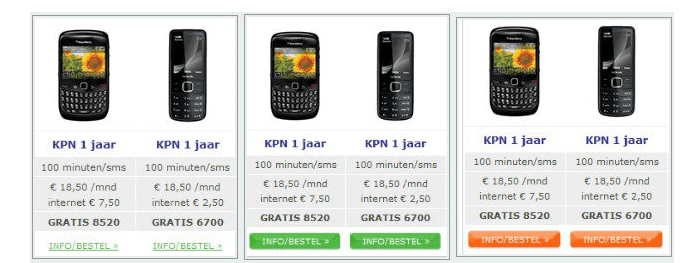
Image Credit: Vwo.com
Monetate
Thus far, red has been dominating and crushing its competition. It’s time things were more difficulty. How would red fair against blue? This was studied by Monetate. To our surprise, the blue button won by a 9% margin.

Image credit: Monetate.com
Again, split testing can provide invaluable information as to how colour-based optimization can boost conversions. Check out the results of this split test conducted on the registration page for a real estate agency conference call session.
Split-testing a landing page - use of colour


The test involved two new colour schemes (light blue with a yellow button and red with a yellow button) which could also be compared to an earlier design which used red, blue, and yellow).
The winning version (light blue with a yellow button) easily won the day. Despite the fact that no changes were made to the copy, adopting a tastefully-contrasting two-colour scheme in increased conversions by a whopping 141%!
Tickled Pink: Trust Elements that attract customers
People (yourself included) are unlikely to buy from someone they don’t trust, so it’s your job as an entrepreneur to do everything you can to inspire it. This involves finding ways to use colour to reduce anxiety and increase confidence.
This is best achieved by including trust elements to your landing page so people can see that others have used your product/service successfully, and that they aren’t going to be cheated or swindled. Trust elements show potential customers that you’re not just tossing around unproven results just to improve your image.
One of the most common trust elements is the testimonial. Nothing is better for increasing credibility than getting satisfied customers to go on record (and on camera) with a personal account of their experiences. Live Twitter streams which show the compliments have paid you are also becoming increasingly value for building trust. In addition, visual endorsements by high-profile customers can be a goldmine because most major corporations already possess highly-recognizable branding. When their eye-catching logos appear on your page, an influx of clicks is sure to follow.
Remember to include testimonials from people who belong to your intended audience. Let’s say you make and sell chic and colourful school supplies designed for giggling Tween girls. A video testimonial given by smiling young wearing pink will probably spark greater interest than one from a middle-aged man in a grey suit. Marketing yourself effectively through colour choices necessitates finding ones which reflect the appropriate age and gender of your intended audience. If high-end furnishings are your thing, the middle-aged guy in the suit may be just the thing you need.
Surround him with purple (a colour associated with aristocracy, nostalgia, and luxury may find that your sofa salesmanship skills take you straight to the bank).
A Colourful conclusion
While the influence of colour on purchasing decisions can always benefit from additional study, there is already a great deal of evidence to suggest that using colour in a context satisfies consumer expectations and relates to their previous experiences is an effective way to boost both conversions and your bottom line.
- Learning more about the way colours are perceived in a variety of cultural settings can help you keep from making colour choices which turn otherwise attractive products and services sour in the minds of site visitors.
- Split tests are an invaluable tool in gauging consumer response to website colour choice. While they can involve things as simple as changing the colour of an existing CTA button, or as complex as redesigning an entire page, the information they provide is valuable enough to make the extra effort or cost worthwhile.
Despite any personal feelings you make have about a particular shade, the right colour scheme can mean big benefits for your site’s conversion rate. So before you pass judgment on pink, ban the brown, or avoid orange altogether do your research; you could be missing out on a unique opportunity to turn colour into cold, hard cash.
 Thanks to David Rosenfeld for sharing his advice and opinions in this post. David is the Director at Infinite Conversions, a digital agency focusing on improving website’s sales and revenues through conversion rate optimization.


