Get more from your data with these answers to frequently asked questions from email marketers
Digital marketers love their statistics and are always looking for that next piece of insight to drive their business forward.
As Data Insight Manager at Communicator, I work daily with leading brands and I’m often contacted by Digital Marketers with a whole range of questions. Below are the three most popular questions I’m asked, with some actionable tips to help you make more impact.
Question 1: The big one! “When is the right time to send my emails?”
There’s no simple answer to this. As you can appreciate from the sheer scale of differences in businesses, brands, customers and even the devices they use, there’s (unfortunately) no one size fits all approach.
The send time is a vital piece of email campaign building which is often overlooked. After you’ve built countless emails, chosen your images and text then proof read every single line I understand that you just want to get it sent and ticked off your to-do list, but that won’t always get you the return you deserve. Sending at the right time and day for your audience will maximise your email’s exposure and therefore your ROI.
Action: optimise your send time based on your data
In the world of Big Data and predictive analytics we can see when your customers or readers have time to access your email, access your website and take the necessary action. This can be purchasing an item, downloading a voucher or watching a video for example. This data is all rolled up into your website tracking tool and leveraging the power of this customer intent data really empowers you on where you should start looking.
We’ve seen +7% conversion rate increases across our retail clients by sending email as usual, but using the power of customer intent data (readily available in your tracking tool) to show us when to send emails.
To lend a helping hand, I’ve created a Google Analytics dashboard which will advise you on how and where to get started. Simply click the link and apply the dashboard to your Google Analytics Account, set the necessary date period and review your data to align your peak sessions with the time you send your emails.
Question 2: “What value can I get from testing?”
Testing supports continuous improvement, optimises performances and lets you know what works and, more importantly, what doesn’t work for your customers.
All digital marketers should conduct tests in order to learn. Whether this is on a landing page by changing an image or on an email by testing a subject line or a call to action.
Action: measure the statistical significance
To get the real value from your tests you should ask yourself if your results are significant enough to take action by using a statistical significance calculator.
For example, you send out 2 offers to your customer base with the following results;
Example 1: 10,000 target customers. 120 conversions. 1.2% conversion rate
Example 2: 9,500 target customers. 90 conversions. 0.95% conversion rate.
By adding the statistics above to a significance calculator, the results return a 96% confidence rating. This indicates that these results weren’t down to chance. Using the significance calculator leverages the power of your tests and gives you a confidence rating on whether you should take action and base your business decisions on the tests that you do.
Question 3: “How can I get to know more from my data?”
To understand your data more, move beyond the averages.
Marketers use averages as they can be a good indicator of performance, but they don’t give us the full story behind what that data actually means nor do they account for the range in information you have. Only by using this information alongside a range of data can you gain further insight.
Here’s an example; the average height of men and women in the UK is 5ft 10’ and 5ft 4’ respectively. However, think about the sheer scale of difference in heights amongst millions of men and women; if we were to line them all up against each other you’d see that there was a large variation from 5ft 10’ and 5ft 4’. By doing this you’d see a huge range of heights and you could ask questions on what makes a specific man or woman taller than one another.
This is the same with our marketing stats.
For example:
Average conversion rate 2.5% - the percentage of sessions who go on to purchase.
If we took into account the range of visits before a transaction by looking at the range of data in Google Analytics we’d see the following:
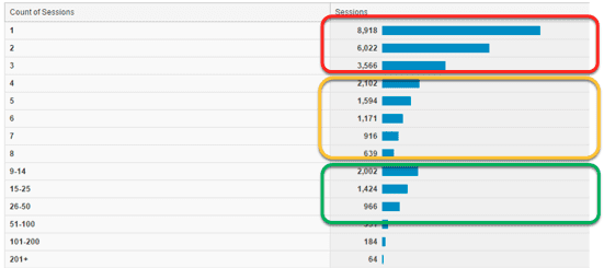
The red sector is gold dust for retailers. Customers purchasing for the least amount of sessions.
The amber sector shows customers requiring further sessions to purchase. Why is this the case? Is it a specific product which requires more time to consider or is the content not available? Are they shopping around?
The green sector shows an alarming cluster of customers who take up to 50 sessions to purchase. Is there any similarities between devices, products or content of their purchases which is taking so many sessions?
As marketers move beyond the averages, as in the example above. They will unlock questions and answers which wouldn’t be obvious to the majority of marketers with just an average stat alone.
Any questions?
Please share your thoughts below and ask any questions.
Andy is Data Insight Manager at Communicator and has a comprehensive understanding of digital and email marketing. Andy works with a range of brands to understand the problems they face and is responsible for providing insight and action.

Thanks to
Andy Ho for sharing their advice and opinions in this post. Andy is Data Insight Manager at
Communicator and has a comprehensive understanding of digital and email marketing. Andy works with a range of brands to understand the problems they face and is responsible for providing insight and action. You can follow him on
Twitter or connect on
LinkedIn.


