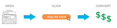
CONVERT: Achieving the final conversion on the landing page
This post is the final in a 3 part series (read Part 1 and Part 2 here) of articles addressing how to effectively increase your email marketing conversions – looking at the third and final step in this process.
When planning their email campaign, too many email marketers only plan for the first 2 conversions steps, however, the landing page/website/product page is the point where the final conversion happens.
No matter how successful we are at conversion steps #1 and #2 if we fail at the point of conversion then we have failed. I regularly quiz email marketers as to their KPI’s and the majority inform me that they’re rewarded on conversions (Step #3) – not on opens (Step #1) nor on clicks (Step #2). This article looks at the conversion part of the process and how to make sure you don’t throw those opens and clicks away with a poor performing conversion point.
It is crucial to test and optimise this page and indeed, this whole journey, as any disconnect with the email, too many options, a hard-to-find Call-To-Action or one that is placed outside of the users journey path can have an enormous impact on the success of your email campaign.
If they’ve arrived on the landing page – congratulations!- you’ve converted them to open the email, then converted them to click through on the email – so ensure that you succeed at this conversion step as well and prioritise the optimisation of your landing page.
Ensure there are no disconnects
All too often we focus the majority (or all!) of our efforts on designing and crafting the email itself, and spend no time on the landing page. By doing this we can inadvertently create a disconnect within our email and landing page, as although the email is linking to the landing page, we’ve not taken the time to ensure the message, imagery and offer are the same on the email.
You’ve just converted them to clicking through the email to the landing page, so ensure there is continuity within the email and landing page, in order to build upon what you have just converted them to click on. You don’t want to have to start again because the landing page or offer is so different – or even worse, you don’t want them to bounce off because they’re unsure of why they’re on this page.
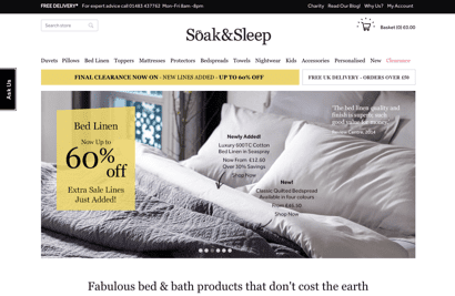
Soak&Sleep do a great job of ensuring there is no disconnect between their emails and landing pages. The look and feel of both marketing assets are the same, the offer is the same and is easily seen and this delivers a pleasing and reassuring experience to the customer.

Minimise the distractions
Often we design our landing pages with the ‘more is better’ adage in mind. We think, that whilst we’ve spent time and budget driving them to the landing page, we may as well make the most of this opportunity and offer them a bunch of options to look at.
Consumers look to the website to provide them with clear instructions as to what they should look at and action. Often, however, what we offer them is too much choice and instead of the decision being an easy one to make, as they have been driven to the page by the persuasive email we sent them, we complicate it by making to too busy and drive the customer away.
The 3 key things to remember when creating a landing page are: minimal or no distractions, focus on the objective and test and optimise the page.
As humans we have limited resources to call upon and can only process so much information at one time. This can impact our conversions greatly as the objective of the landing page may be missed entirely by being distracted by something else which doesn’t end in a conversion.
A world famous study by Daniel Simons and Christopher Chabris, authors of “The Invisible Gorilla – How Our Intuitions Deceive Us” involved instructing viewers to watch a video and count how many times the players wearing white t-shirts passed a basketball.
However, as viewers concentrated on counting the passes, a gorilla sauntered through the group of basketball players and beat its chest. The results found that half the people who watched the video missed seeing the gorilla! It’s not that they didn’t recognise the gorilla, they were simply focused on performing the task of counting and focusing on white — at the expense of their other mental applications.

So ensure there are little or no distractions. Test what combination of your page elements (copy, imagery, forms, call-to-action buttons etc.) result in the best conversions. Don’t be fooled by thinking little things don’t matter – they do. Too much copy, too long a form, a subtle sponsored ad or banner ad, all can impact your conversions negatively.
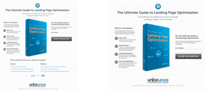
In the below test from Unbounce, they removed the “You may like” links from the bottom of the landing page (seen in the version on the left) so that the landing page was focused on one objective - downloading the guide. They were rewarded by a 31% increase in downloads for having a landing page with no distractions.
Be specific to the next action within your call-to-action
The more specific and relevant you are to the next step in the journey within your call-to-action, the more success you’ll have with your call-to-actions.
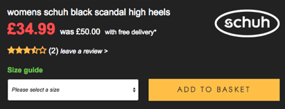
For example, the shoes retailer, Schuh, changed their ‘Buy Now’ button to being ‘Add to basket’ and it increased basket adds (conversions) by 17%. So why did replacing ‘buy now’ with ‘add to basket’ have such a positive impact?
Firstly, ‘add to basket’ is actually what happens when you click ‘add to basket’ – or indeed, even if you were to click the old ‘buy now’ call-to-action. It is the most appropriate call-to-action, reflecting what action actually takes place. Having ‘buy now’ at this stage in the buying journey could cause the customer to bounce, as they’re unsure of what actually happens next – it is unclear.
Secondly, ‘add to basket’ is a smaller ask than ‘buy now’. You are not asking them to commit fully to anything…so it is easier for them to commit to this small ask rather than a bigger ask.
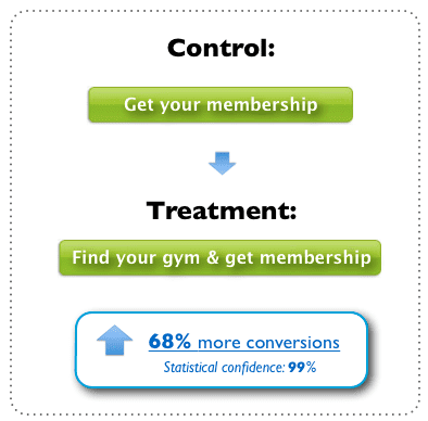
The below test from Contentverve is from a major chain of gyms in Scandinavia. The control ‘get your membership’ is a strong and persuasive call-to-action, however, it’s not addressing specifically what the next step in the process is – leaving the potential customer unclear as to when they select their gym.
Therefore, the treatment addressed this issue by creating a more specific call-to-action, providing reassurance to the potential customer with clarity as to what the next step in the journey entailed. ‘Find your gym & get membership’, resulted in a 68% lift!
Use Anchoring
Anchoring is a cognitive bias otherwise known as a heuristic, that describes the common human tendency to rely too heavily on the first piece of information you receive (the “anchor”) when making decisions.
The Psychology Dictionary says, “a heuristic is a mental shortcut that allows people to solve problems and make judgments quickly and efficiently. These rule-of-thumb strategies shorten decision-making time and allow people to function without constantly stopping to think about the next course of action.”
So in the example below from Joanna Wiebe of Copyhackers, we see that the cheapest pricing is on the left and the pricing increases as you progress to the right.
However, when the most expensive pricing was moved to the left and was used as the Anchor, there was an uplift of 500% in click through’s. By having the more expensive pricing as the first price, it has set our value of the product as being this price and anything less than this price is very good value.
This example also uses Goldilock’s principle (sometimes called the Goldilocks Effect) which was discovered by Joel Huber and Christopher Puto in the early 1980s.
The term ‘goldilocks effect’ derives from the children’s story Goldilocks and the Three Bears. In the story Goldilocks decides, amongst other things, to eat one of three bowls of porridge; the first being too hot, the next too cold, but the final one she picks for being 'just right'.
Applied to pricing, it is used to describe the practice of providing a premium as well as a budget option alongside the regularly priced product to make the standard option seem more appealing.
Leverage the Rule of 3
The rule of three is one of the oldest in the book. Aristotle wrote about the three unities in his book Rhetoric: dramatic unity of time, place and action.
Simply put, people tend to easily remember three things, thus making your messages sticky and engaging.
Throughout the years it’s been used from rhetoric to religion.
The Latin phrase "omne trium perfectum" (everything that comes in threes is perfect, or, every set of three is complete) conveys the same idea as the 'rule of three', while also (appropriately) using exactly three words.
It’s all to do with patterns - At the root of its success is we, as humans, have been programmed to learn from patterns and 3 is the smallest pattern that can be made.
Throughout history it has been used to communicate complex ideas simply – think of memorable phrases such as:
- “Blood, sweat and tears”
- “Faith, Hope and Charity”
- “Lights, camera, action”
When packaging our sales and marketing in threes we create something that is memorable: think of “It’s as easy as 1,2,3" & “It’s as easy as A,B,C”.
The below example is from one of Themeforests’ landing page templates, designed for Unbounce. This has been designed to leverage the Rule of Three quite powerfully as it has 3 sections of 3!
Follow the approaches and tactics covered in this post and you should be on your way to a landing page that converts those hard earned opens and clicks. But don’t forget to test and keep testing to find the best conversion driving combination of your landing page. You may always be testing to gradually improve on the conversions you are seeing, in line with the interests and motivations of your customers as they change over time.
There you have it – this was the last in a 3 part series of articles on how to increase conversions within your email marketing by ensuring you have all three steps covered. You can read the first two articles here:
Part 1: 3 Steps to Increasing Email Marketing Conversion
Part 2: 3 Steps to Increasing Email Marketing Conversions
To focus on one of the elements of your landing page discussed in this article – take a peek at our webinar all about ‘How to Create Calls-to-Action That Drive Conversions’


