Recommended design patterns and best practices for your Basket/Shopping Bag
Here is the 6th in my series of posts on recommended Ecommerce page layouts. We've been working our way down the funnel, so now we move from product pages to improving your Basket or Shopping Bag Page. Given it's the launchpad to checkout, it plays a vital driver in pushing the buyer down the conversion path.
As with checkout, the basket page has to serve two user types:
- 1. New users: Reduce barriers to purchase and persuade them to trust your brand and website, with their payment.
- 2. Returning users: Provide a quick transition to check-out, summarising key information which commit buyers to purchase.
If you work in an ecommerce team at a retailer, or are involved in design for your client’s accounts, then I hope these templates and tips will guide you along the design/re-evaluation process to maximise results for your pages.
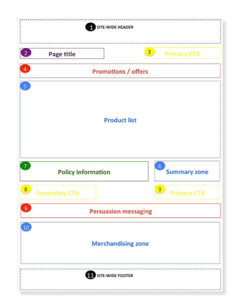
Key Ecommerce Basket Page Wireframe requirements
There are variety of UI Designs, but 3 core types: 1. Add to basket confirmation, 2. Mini-basket roll down and 3. Basket landing page. It's becoming more over to use a lightbox for the basket as is shown in the John Lewis example later in this post. Other examples of these are given in our guide from leading brands.
This template provides an outline of the core elements for an ecommerce basket page, for colour coding definitions please refer to the Guide. UX and UI designs can vary across sites according to your business and audience, so it’s designed as a good practice framework. For example, a multi-channel international retailer will have more complex delivery options and charges than a pureplay operating in a local market only.
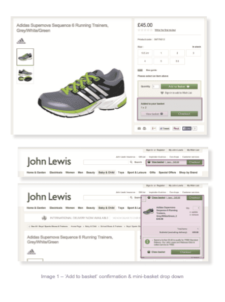
Basket Page case study with John Lewis
John Lewis displays the add-in basket success contextually next to the 'add to basket button'. It's arguably the most logic visual presentation style. The multi-channel delivery promise is clear and prominent, to be expected given how critical 'click and collect' is to the multi-channel offer.
It’s surprising that the mini-basket doesn’t expand on mouse-over. Perhaps this is a deliberate accessibility decision to ensure it works when JavaScript is disabled but in our view it’s better to provide the best UX possible for modern browsers and then ensure the site also works when elements like JavaScript are disabled by switching to clickable links.
Key requirements checklist for your Basket/Shopping Bag
- Q1. Do we use a clear visual sign to show when an item has been added to the basket?
- Q2. Do we provide a persistent mini-basket in the site wide header?
- Q3. Can users expand the mini-basket using mouse-over to show the content summary?
- Q4. Have we defined and understood the goals for the basket page?
- Q5. Have we defined a clear structure for the navigational elements?
- Q6. Do we know who are core visitor groups and personas are?
- Q7. Do we know what information each persona will need?
- Q8. Have we got the required content to answer key user questions?
- Q9. Do we make delivery options and charges obvious?
- Q10. In the primary CTA 'checkout' clear and easy to use?
- Q11. Have we identified web analytics requirements?
- Q12. Are we promoting relevant offers/discounts and how to redeem them?
- Q13. Do we use persuasion techniques such as displaying security messaging and payment options?
Additional requirements to consider in your Basket / Shopping Bag Page
In the full guide for members I go into much more detail on individual page elements and look at more examples of how these apply in practice from UK and US-based ecommerce sites.

Recommended Guide: Ecommerce Design Patterns
Use our wireframes and examples to test and create more persuasive Ecommerce designs to boost retail sales.
Download our Ecommerce Design Bible.


