Testing of over 900 Ecommerce sites shows how 'cleaner' designs can increase ecommerce sales
What can the fastest-growing eTailers teach us about visual design? Anyone involved in the design or marketing of ecommerce sites has had the discussion at some point: 'is this design too busy? Too cluttered?'
As it turns out, it probably is. And you can probably make more money by cleaning it up – at least according to our latest research here at EyeQuant, a German neurotechnology company that specialises in quantitative user experience metrics.
A classic debate put to rest by data
To examine the role of visual clarity in user experience, the EyeQuant team took a sample of 960 ecommerce designs and showed them to 500 users in pairs, asking which design felt 'cleaner'. After collecting responses from several hundred participants, the team ranked every design in the study and used this data to train an artificial intelligence that can assign a 0-100 'visual clarity' score to any design with 95% accuracy compared to the real user ratings. A 0 score means that a design is 'extremely cluttered' (think Ling’s Cars) and a 100 is essentially a blank page.
Next, the team used this 'visual clarity' scoring method to analyze websites featured on a list of the fastest growing ecommerce sites in the United States (by revenue growth).
The analysis showed that there is a relationship between growth rates and clarity scores (correlation 0.27; p-value 0.06). Not only did the 50 fastest growing ecommerce sites prove to be significantly 'cleaner' in design than the rest of the internet (as measured by the Alexa 5000), but the best-of-the-best (top 10) ecommerce sites noticeably outperformed the other high achievers.
This evidence suggests that clean design is winning in ecommerce, and while the fastest-growers know this, many companies are missing out.
Optimization goals
If cleaner designs lead to sales growth, then it makes sense to optimize. But what should your optimization goals be?
As with anything, you’ll find that improvements in visual clarity (and thus revenue) are subject to diminishing returns. At some point, your designs will be so clean that making it cleaner would mean removing content that’s really important to your users. In the EyeQuant study, this point seemed to be at a 'clarity score' around 90.
The most important thing is that the shopping experience on your site is better than realistic substitutes. If you sell fishing tackle online, the real ROI from clarity optimization is going to be in making your site cleaner than the other fishing tackle providers’ sites.
For that reason, it makes sense to perform an objective competitive analysis, either by mixing the 'clarity' question into your user tests, or using the aforementioned EyeQuant clarity analysis algorithm.
Making your design cleaner
Many marketers think of a 'clean' design as simply 'not having unnecessary stuff on the page'. Research shows that the truth is slightly more complex.
- Text vs. Images: unequivocally, nothing turns off users more than a wall of text. In the EyeQuant study, users were extremely harsh in rating text-heavy designs as 'cluttered'.
Since studies suggest that the average user only reads 20% of the text on a page anyway, removing some of the less critical text on a page is a sure-fire way to improve the visual clarity of your designs.
Users treat images much more favourably. Even if they have lots of visual content, images tend to be processed in the brain as a single, coherent picture, so users consider them to look much cleaner.
Case study of buyblindsdirect.co.uk
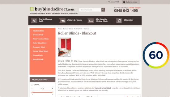
Take for example this product page from a website selling blinds online - BuyBlindsDirect.co.uk. It’s extremely text heavy, and features only a relatively small image. The page feels a bit cluttered, as evidenced by it’s EyeQuant visual clarity score of 60.
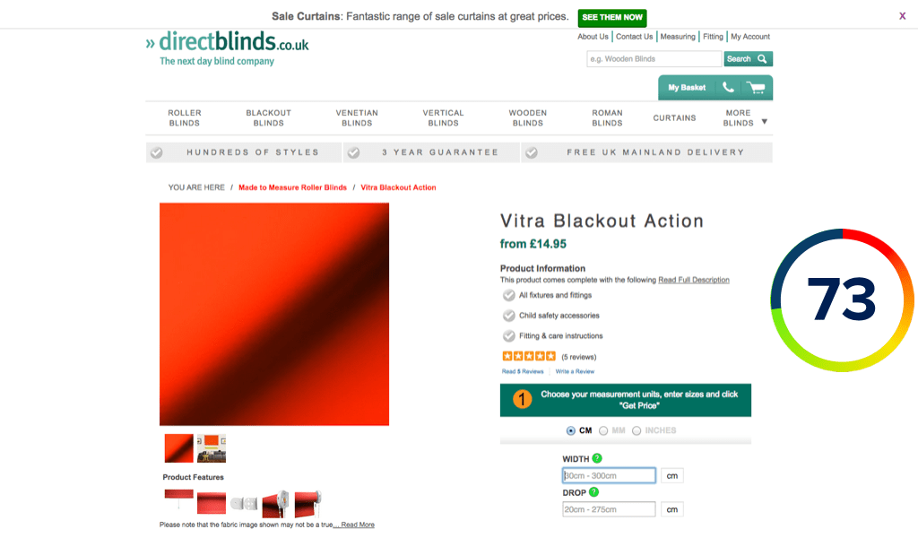
Now look at this design from a competitor, DirectBlinds.co.uk, which uses neatly organized bullet points instead of long-form sentences, and has a much larger image above-the-fold.
By doing this, they’ve managed to pitch the same product as our previous example, but with a much cleaner presentation (Clarity score: 73/100).
- White Space and Page Length: one of the easiest ways to boost design clarity is to space it out more. Marketers often try to cram too much content into one screen view, particularly above the fold. Processing content in bite sizes is more pleasant for users, as long as they know where to look.
Case study of REI
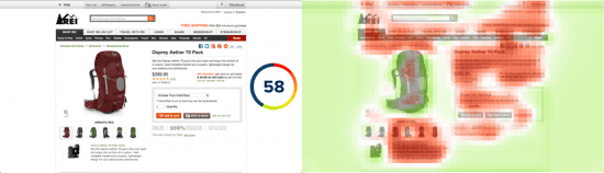
Here’s an example of a product page from REI where users can buy a camping backpack, which scored a 58 according to the EyeQuant algorithm. The accompanying 'clarity map' shows which parts of the page are the most cluttered. You can see that 2 major areas that cause trouble are the product description and the offer to watch a video of the backpack being used.
Compare that with this MEC page selling a camping backpack:
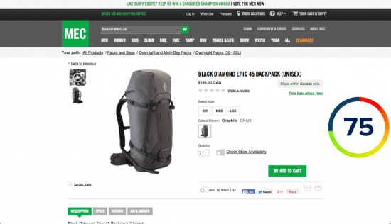
The product description is still present on the page and easy to find, but nestled slightly below the fold. This page achieves a 75 – significantly higher than the REI page, yet it contains virtually the same content, just presented more effectively without cramming too much onto the screen at once.
- Content Organization Cues: You might be surprised to hear that sometimes making a page cleaner looking means adding to the design, but it’s true if that content helps the user understand how the page is organized.For example, Epson recently redesigned some category pages to improve their clarity scores, and found that adding a button to a textual call-to-action actually increased the visual clarity of their design. Below you can see how a mockup on the left scored a 73, while adding the button – which makes it instantly more clear what the text is about – increased the score to a 75.

With these tips and a commitment to measuring the clarity of your designs, you can easily get a leg up on your competitors and improve sales. To try out the EyeQuant visual clarity algorithm for yourself, claim 2 free analysis credits on EyeQuant's site.
 Thanks to Kurtis Morrison for sharing his thoughts and opinions in this blog post. As Vice President of client services at EyeQuant, Kurtis Morrison is at the forefront of an exciting neuroscience startup whose technology is used by companies like Google, British Gas, and Epson to instantly measure and influence visual attention and perception of website designs. Prior to EyeQuant, Kurtis specialised in planning and marketing large-scale concert tours for classical musicians. He studied commerce at the University of Victoria and HHL Leipzig Graduate School of Management. You can connect with Kurtis on LinkedIn.