What Makes Great Ecommerce Website Design? Part 2: The Category Page
In Part Two of my series of blog posts looking at the factors that help make different parts of an ecommerce websites more effective in experience, merchandising and SEO, I review examples of category pages. In Part 1 I looked at 5 Ecommerce home page best design practices.
You can think of Category pages serving as the 'Departments' within your website like they do in a department store - the ladieswear department, childrens wear department and so on.
These areas in a department store are typically demarcated by very visual merchandising, such as mannequins dressed in the types of clothes that you'd find in that department, visual posters/ signage showing branding or imagery depicting the section you are in - smiling children on posters indicating that you are in the childrens' section.
These subtle visual prompts are often un-noticed yet serve to ensure that subconsciously shoppers are assured that they are in the correct area of the store and in some cases draw on the imagery to portray the idealistic lifestyle/ look that they could emanate.
Many websites however lose this altogether. Sometimes this is because of development issues (for example many sites I have reviewed tend to make the old query parameter mistake for category/ subcategory pages which will only inherit the parent category images and descriptions and do not allow unique ones to be shown). Sometimes the capacity is there and it is the website manager who 'never got around to putting anything on these pages' as it was lower down the list of priorities.
Both of these are issues that can be overcome and whilst this may be lower down the list of priorities it is certainly higher on that list that you'd think.
Category pages usually tend to be higher traffic pages and as such first impressions count (see my previous blog on Online Value Propositions for Ecommerce sites). Encouraging a conversion from category pages therefore becomes even more important, in some ways, than the product levels pages because of the higher levels of traffic typically entering the category level pages.
Let's look at some examples of category pages.
PJ Pan does a great job on category pages using both on and off page headings and descriptions (important for SEO) and banner imagery to make us aware which category page we are on.
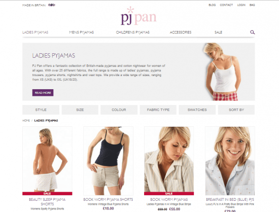
In addition the page clearly shows price points of all products as well as short descriptions so that we know exactly what we are looking at. What also works well here are the 'Sale' overlays on product images to draw your eyes immediately to the sale items / bargains on the page.
Cleverly the customer has the option of filtering through the category using the filter options which are laid out across the tabs at the top of the category - very accessible and yet not overbearing.
The image swatches on the site change on hover-over to allow you to see the material of the product in detail which helps to 'sell' the product.
All of this functionality and imagery helps to sell the product on the category page to the end user and can really help to increase overall conversion rate across the site.
Some other sites take this one step further. Take a look at zalando.co.uk. On their Ugg category page they show the familiar lifestyle imagery and descriptions, but additionally demonstrate many more value propositions including free delivery, trusted store badges, 100 day returns policies and more.
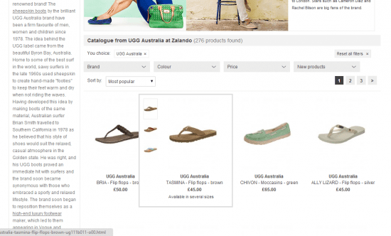
When hovering over the product images on this category page you can immediately see what sizes are available in the product and thumbnail images of other colours, avoiding an unnecessary click-through to the product page if the size/ colour isn't available and thus ensuring that the user journey through the site is shortened.
Whilst you cannot add to basket from the category page (which I might add would be the missing functionality to add to create a really great category page) they have gone someway in attempting to re-create this by allowing you to click on your size from the category page - but it doesn't actually add it to basket.
Both of these examples demonstrate some great ways in which you can help make your category pages better, and help increase add to baskets and ultimately conversion rates on your website. These are features that I have tried and testing for my clients over at Ambition Digital to great effect.

Recommended Guide: Ecommerce Design Patterns
Use our wireframes and examples to test and create more persuasive Ecommerce designs to boost retail sales.
Download our Ecommerce Design Bible.


