Examples of easily avoidable design mistakes which damage conversion
As grabbing the attention of customers online gets increasingly harder with so much distraction, competition and so many forms of communication on the internet alone, you may be left wondering how to develop your landing page into that gateway which will attract customers.
Creating a landing page that boosts your conversion is vital, especially when you consider the fact it costs your business every time someone lands on the page - your main aim should be to overwrite that cost.
If your landing page converts it should successfully engage your visitor and convince them to call-to-action, making them to do just one thing, and one thing only
I always see a lot of advice online advising me what I should do to develop a lucrative landing page, but I barely ever see guidelines on what to avoid. With this in mind I have summarised what I see as the 5 most common mistakes made on conversion-centred landing page designs.
5 common mistakes with landing pages
- 1. Inconsistent Call to Action
The main objective of your landing page should be to get the viewer to act. It will more than likely be the first time they have visited your site, therefore you need to make it as simple as possible for them to follow-up, as well as giving them a reason to journey on through to your website.
I would suggest when including links, if possible, stick to just one on the page (two including privacy policy). However if you feel you do actually need to have a number of links then avoid inter-changing format styles - keep them the same and your anchor text as concise as possible.
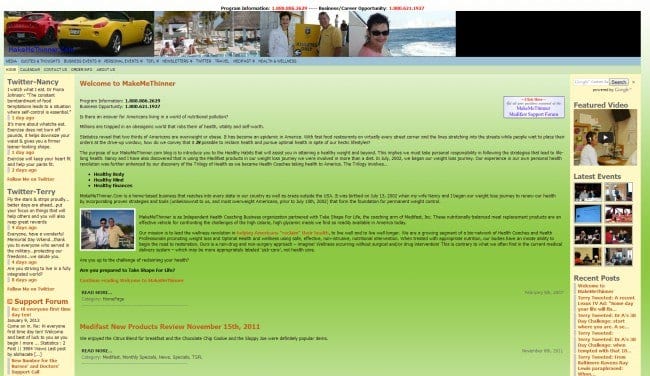
This example has at least three different links, in varying formats, which take you through to separate pages. It lacks the focus on one point, which is needed for a successful landing page and is confusing for the viewer.
Source: ConversionXL
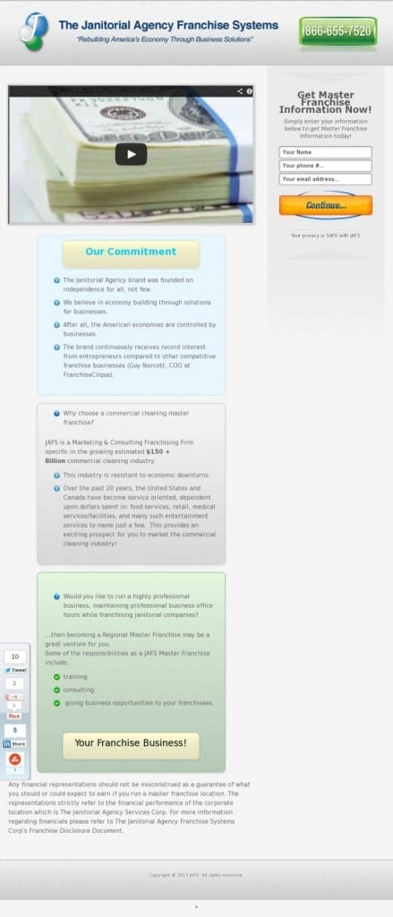
Continuing on the topic of linking; ensure your links take your potential customer directly to a page where they can interact further, or at least link to something useful for you as a company, whether it be them signing up to a mailing list or otherwise.
Links that take viewers to a page with no relevance and useless information are a waste of everyone’s time. This example shows a page full of irrelevant information and irrelevant links.

Source: ConversionXL
If a room was full of clutter, you wouldn’t want to sit in it, so why would anyone want to stay on a page, or delve further into it, if it is full of unnecessary links, photos, headings and forms?
The answer to that is, they wouldn’t. So only include on your landing page the most relevant information for your conversion. Avoid including long forms for your viewer to fill out, because it could push potential customers away. Simplicity, yet encapsulation is key.
Source: Instapage.com
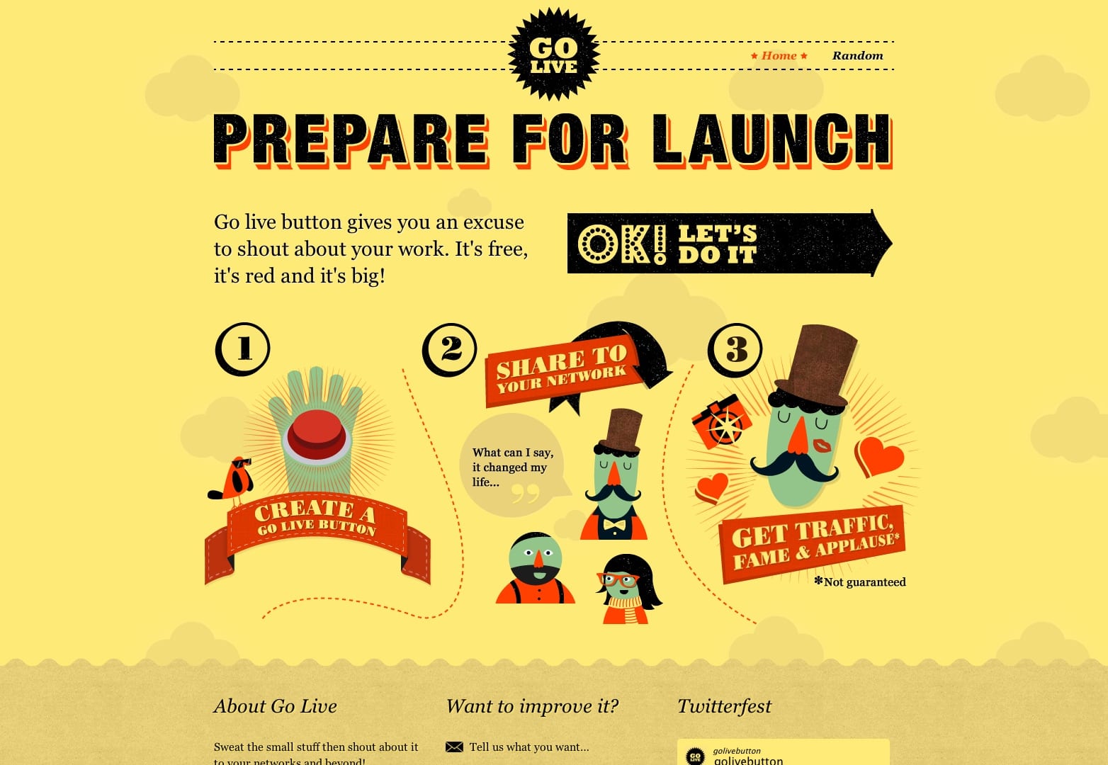
Internet users stumble across hundreds of websites a week, for yours to stand out it needs to be visually engaging. In doing this you should also keep in mind that it is just your landing page still so try and make it as simple as possible. Have fresh ideas, which grab the attention of your viewer like the example below, which uses a step by step format.
Remember to include: headings, subheadings and a bit of imagery to liven up the page.
This stands out nicely doesn't it? Of course, you need to check it's in keeping with the audience.
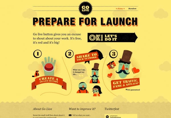
Source: webdesignerdepot.com
Finally, contrasting colour is a timeless way of catching the eye of your audience, as well as colour alone capturing emotions and encouraging consumers to engage.
Colour, may be just one element, but it can impact the way your company is viewed through psychological connotations.
Despite this, there is definitely a thing called 'too much colour'. You don’t want to overload your viewer with an abundance of colours. It will scare them off and could potentially look garish.
On this example there’s too much colour, too much text, too much everything (!)
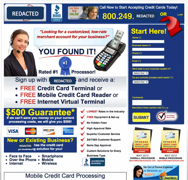
Source: searchengineland.com
Conclusion for your landing pages
These mistakes can be the fatal yes or no for a customer choosing to delve further into your company’s page, potentially costing you money, rather than acquiring new custom. Avoid making these errors on your landing page and hopefully you will see your conversion rate improve in no time.

Thank you to Maggie Majstrova for her sharing her advice and opinions in this blog post. Maggie is a Studio Manager at
Higher Ground Creative. With a background in Account Management and Web Development, she writes on better web building, all things search engine marketing, and how they affect business overall. You can connect with her at
LinkedIn or
Google+.